PyQt5 Common Controls Encyclopedia (detailed method + example operation, continuous update...)
posted on 2023-06-06 17:30 read(706) comment(0) like(25) collect(1)
Last update time: 2023-03-12 09:58
1. Label: label control
1.1 Introduction
The label control is mainly used to display the text that the user cannot edit, and to identify the object on the form (for example: add to the text box, list box, describe information, etc.). It corresponds to the QLabel class in PyQt5 , and the Label control is essentially an object of the QLabel class.
In the Qt Designer designer, its icon is shown below:
1.2 Set label text
There are 2 ways to set the text displayed by the label control:
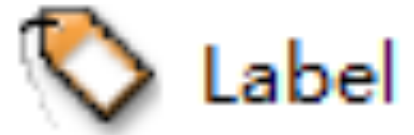
Method 1, directly set its text property in the property editor of the Qt Designer designer. As shown below:
Method 2, set by Python code:
- # 通过setText()方法将标签控件的显示内容设为“hello world”
- self.label.setText('hello world')
1.3 Set the alignment of the text in the label control
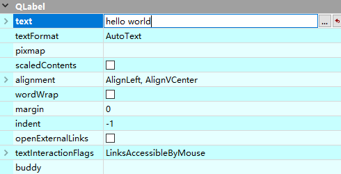
PyQt5 supports setting the alignment of the text in the label, mainly using the alignment attribute. Expand the alignment property in the property editor of the Qt Designer designer, and you can see that there are 2 values, namely Horizontal (horizontal) and Vertical (vertical).
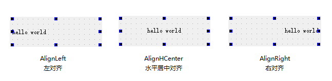
Among them, Horizontal means horizontal alignment, and there are 4 values, as shown in the following table:
| value | illustrate |
| AlignLeft | align left |
| AlignHCenter | horizontal center alignment |
| AlignRight | right align |
| AlignJustify | Align both ends (the effect is the same as AlignLeft) |
The position in the Qt Designer designer is shown in the figure below:
The effect of different values is shown in the figure below:
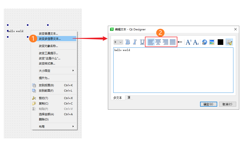
The above is the method of directly setting its properties in the property editor. In addition, there are 2 other methods:
Method 2: We click the Label control in the window, and then click "Change Rich Text" in the right-click menu, and a window for editing text pops up. There are 4 alignment methods that can be set in the top bar of this window, from From left to right are: Left Alignment , Center Alignment, Right Alignment, and Auto Adjust.
Method 3: Python code setting, the writing method is the same, only need to modify the last word at the end, the specific sample code is as follows:
- # AlignLeft:左对齐
- self.label.setAlignment(QtCore.Qt.AlignLeft)
-
- # AlignHCenter:水平居中对齐
- self.label.setAlignment(QtCore.Qt.AlignHCenter)
-
- # AlignRight:右对齐
- self.label.setAlignment(QtCore.Qt.AlignRight)
-
- # AlignJustify:两端对齐(效果同AlignLeft)
- self.label.setAlignment(QtCore.Qt.AlignJustify)
The running effect of the code is shown in the figure below (for easy identification, I changed the background color of the label control to pink):
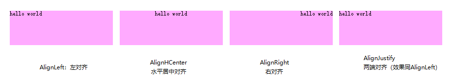
As you can see, they are all left-aligned at the top, horizontally centered, and right-aligned, and they are aligned, which is very ugly and not the result we want.
So you need to combine Vertical, which is used to set the vertical alignment of the label text, and there are 3 values. As shown in the following table:
| value | illustrate |
| AlignTop | align top |
| AlignVCenter | vertical center alignment |
| AlignBottom | Bottom alignment |
The position in the Qt Designer designer is shown in the figure below:

The effect of different values is shown in the figure below:
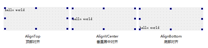
It can be seen that Vertical changes from top to bottom, while Horizontal changes from left to right. So as long as you combine the 2 of them, you can achieve true centering. The sample code is as follows:
- # 水平垂直居中
- self.label.setAlignment(QtCore.Qt.AlignHCenter | QtCore.Qt.AlignVCenter)
The code running effect is shown in the figure below:
1.4 Set text wrap display
Assuming that the label text is changed to "Though the road is far away, it will come; even if it is difficult, it will be accomplished". If the width of the label is not enough, the system will only display the front part of the text by default. When this happens, we need to use a newline display.
Line break display is one of the properties of the label control. In the property editor of the Qt Designer designer, select the check box behind the wordWrap property to realize line break display. As shown below:


Of course, it can also be implemented with Python code:
- # 通过QLabel类的setWordWrap()方法将文本设为换行显示
- self.label.setWordWrap(True)
1.5 Setting hyperlinks for labels
When setting hyperlinks for Label tags, you can directly use the <a> tag in HTML to set the hyperlink text in the setText() method of the QLabel class, and then set the setOpenExternalLinks() method in the Label tag to True to allow access to hyperlinks . link, the sample code is as follows:
- # 设置跳转链接和超链接文本(注意双引号和单引号)
- self.label.setText("<a href = 'https://www.baidu.com/'> 百度一下,你就知道 </a>")
-
- # 启用跳转
- self.label.setOpenExternalLinks(True)
After the code runs, the text inside the label turns blue and is underlined. When you click on the text, it will immediately jump to the target URL.
1.6 Set image for label
When setting a picture for a Label tag, you need to use the setPixmap() method of the QLabel class, which requires a QPixmap object to represent the icon object. The sample code is as follows:
- # 导入QPixmap类
- from PyQt5.QtGui import QPixmap
-
- # 通过setPixmap()方法将名为abc的图片在标签内显示出来
- self.label.setPixmap(QPixmap('abc.png'))
The effect after the code is run is as follows (in order to improve the recognition, the label is set in a horizontal layout in advance, so it covers the entire window):
It should be noted that the image file is in png format and placed under the same path as the code. In addition, this method is not supported in PyQt5 to display pictures in jpg format. You can use other tools to convert the format to png first, and then display it.
1.7 Set the bubble prompt information for the label
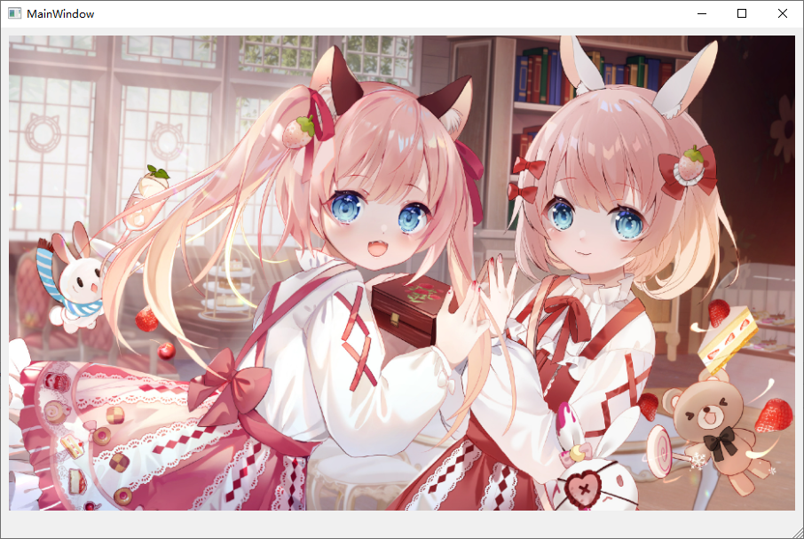
Bubble tips are when you move the cursor over a control, a prompt box will pop up. When the cursor is moved away, the prompt box will disappear automatically, most of which are used for explanation. I write here just to tell you that there is such a method, not limited to label controls~
- # 使用该方法需要导入2个模块:QToolTip和QFont
- from PyQt5.QtWidgets import QToolTip
- from PyQt5.QtGui import QFont
-
- # 设置气泡提示内容为“这是李白写的诗”
- self.label.setToolTip('这是李白写的诗')
-
- # 设置提示文本的字体为微软雅黑,字号为12
- QToolTip.setFont(QFont('微软雅黑', 12))
The code running effect is shown in the figure below:
2. LineEdit: single line text box
2.1 Introduction
LineEdit is a single-line text box, which can be understood literally, that is, it can only enter a single-line character string. Its icon in the Qt Designer designer is shown below:
The LineEdit control corresponds to the QLineEdit class in PyQt5. The common methods and descriptions of this class are shown in the following table:
| method | illustrate |
| setText() | Set the content of the text box |
| text() | Get the content of the text box |
| setPlaceholderText() | Set the floating text in the text box |
| setMaxLength() | Set the maximum length of characters allowed in the text box |
| setAlignment() | set text alignment |
| setReadOnly() | Set the content of the text box to read-only mode |
| setFocus() | focus the textbox |
| setEchoMode() | Set the mode of displaying characters in the text box, there are the following 4 modes: 1.QLineEdit.Normal: Normal display of input characters, this is the default setting 2. QLineEdit.NoEcho: Do not display any entered characters, suitable for passwords that need to be kept secret even if they meet the password length 3. QLineEdit.Password: Displays the platform-dependent password mask characters instead of the actual input characters 4. QLineEdit.PasswordEchoOnEdit: Display characters when editing, and display password mask characters after losing focus |
| setValidator() | Set the text box validator, there are the following 3 modes: 1. QIntValidator: limit input integer 2. QDoubleValidator: Limit the input of decimals 3. QRegExpValidator: Check whether the input matches the set regular expression |
| setInputMask() | Set the mask. The mask usually consists of a mask character and a separator, followed by a semicolon and a blank character. The blank character will be deleted from the text box after editing. Commonly used masks have the following three forms: 1. Date mask: 0000-00-00 2. Time mask: 00:00:00 3. Serial number mask: >AAAAA-AAAAA-AAAAA-AAAAA-AAAAA;# |
| clear() | Clear text box contents |
Common signals and descriptions of the QLineEdit class are shown in the following table:
| Signal | illustrate |
| textChanged() | This signal is emitted when the content of the textbox is changed |
| editingFinished() | This signal is emitted when the editing of the content in the text box ends, and pressing the <Enter> key marks the end of editing |
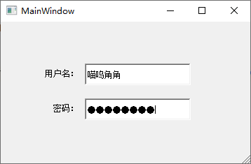
2.2 Example: Login window with username and password
Use the LineEdit control, combined with the Label control to make a simple login window, which contains user name and password input boxes. The password is required to be 8 digits and displayed in mask form, the steps are as follows:
Step 1. Open the Qt Designer designer, put two Label controls and two LineEdit controls from the toolbox into the main window according to the requirements, and then modify the text values of the two Label controls to "Username:" and " password:". As shown below:

Step 2. After the design is completed, save it as a .ui file, use the PyUIC tool to convert it into a .py file, and use the setEchoMode() method to set it as the password text under the LineEdit text box representing the password, and use setValidator() at the same time The method sets the validator for it, and the control can only input 8 digits, the code is as follows:
- # 设置文本框为密码
- self.lineEdit_2.setEchoMode(QtWidgets.QLineEdit.Password)
-
- # 限制只能输入8位数字
- self.lineEdit_2.setValidator(QtGui.QIntValidator(10000000, 99999999))
After the code runs and enters the content, the effect is shown in the figure below:
Of course, these properties can also be set directly in the property editor of the Qt Designer designer, as shown in the following figure:

Careful readers may have discovered that the property names in the property editor basically correspond to the method names. In practice, you can choose to use it according to your own preferences.
Some attributes may feel strange to you, so you might as well click and try in the designer, and observe the changes of the control at the same time, and you will know what this attribute is useful for.
In addition, remind you that some properties may not directly affect the appearance of the control. At this time, you need to observe further through the preview window.
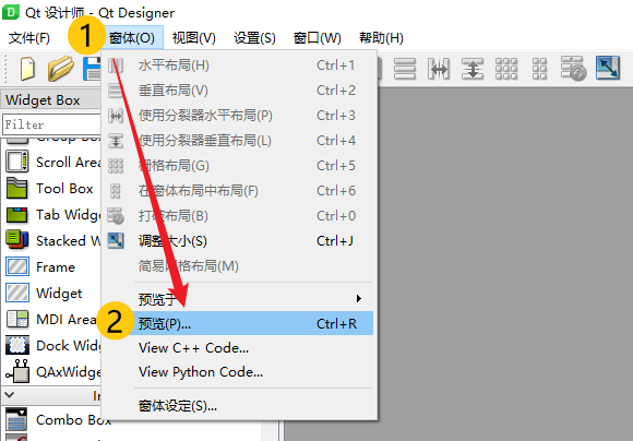
There are two ways to preview, method 1: press Ctrl + R to preview, method 2: click "Form (O)" in the menu bar at the top of the Qt Designer designer, and then click "Preview ( P)…" to preview. As shown below:
2.3 textChanged signal
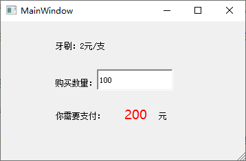
The textChanged signal is used in some scenarios that require real-time operations when inputting values. For example, when shopping online, if you change the quantity of purchased items, the total price will change in real time.
If you encounter a functional requirement like this during design, you can implement it through the textChanged signal in the LineEdit control.
Example demonstration: Suppose a toothbrush is 2 yuan per toothbrush, and I need to buy 100 toothbrushes. When I input the quantity of 100, the label control below shows that I need to pay 200 yuan in real time.
code show as below:
- # 1
- self.lineEdit.setValidator(QtGui.QIntValidator(10000000, 99999999))
-
- # 2
- self.lineEdit.textChanged.connect(self.total_price)
-
- # 3
- def total_price(self):
-
- # 4
- n = self.lineEdit.text()
-
- # 5
- buy_number = int(n)
-
- # 6
- self.label_4.setText(str(buy_number*2))

Due to the length of the text, the detailed notes are as follows:
# 1:限制单行输入框只能输入8位数字。因为购买数量也必须是数字,所以这里代码不变。
# 2:将单行输入框的textChanged信号和下面的自定义函数total_price关联起来,关联函数是connect()。
# 3:准备定义一个名为total_price的函数,参数默认为self。
# 4:获取单行输入框的内容并赋值给变量n。
# 5:由于通过text()函数获取的数据类型是字符串,这里通过int()函数转换成整型。
# 6:label_4是显示最终需要支付价格的标签控件,将数量buy_number乘以价格2元之后得到一个总价格是整型,但setText()函数的参数类型是字符串,所以我们计算完还要将结果再转换回字符串。通过setText()函数将label_4显示的内容变为需要支付的价格。
代码运行后,我们在输入框内输入数量100,下面的label_4标签控件就实时显示出需要支付的钱啦~ 如下图所示:
这里的代码讲解非常基础,希望刚上手PyQt的小伙伴能够理解并掌握,后面不再细讲。
3. TextEdit:多行文本框
3.1 简介
有单行输入框,那么就会有多行输入框,而TextEdit就是多行文本框控件。它主要用来显示多行的文本内容,当文本内容超出控件的显示范围时,该控件会自动显示滚动条。
另外,TextEdit控件不仅可以显示纯文本内容,还支持显示HTML网页。
TextEdit控件在Qt Designer设计器中的图标如下所示:
TextEdit控件对应PyQt5中的QTextEdit类,该类的常用方法及说明如下表:
| 方法 | 说明 |
| setPlainText() | 设置文本内容 |
| toPlainText() | 获取文本内容 |
| setTextColor() | 设置文本颜色,例:QtGui.QColor(255,0,0) |
| setTextBackgroundColor() | 设置文本背景色,参数同setTextColor() |
| setHtml() | 设置HTML文档内容 |
| toHtml() | 获取HTML文档内容 |
| setWordWrapMode() | 设置自动换行 |
| clear() | 清除所有内容 |
3.2 实例:设置多行文本和HTML文本的对比显示
使用Qt Designer设计器创建一个MainWindow窗口,其中添加2个TextEdit控件,然后保存为.ui文件,使用PyUIC工具将其转换为.py文件。
然后分别使用setPlainText()方法和setHtml()方法为2个TextEdit控件设置要显示的文本内容,代码如下:
- # 设置纯文本显示
- self.textEdit.setPlainText('假如生活欺骗了你'
- '不要悲伤,不要心急!'
- '忧郁的日子里需要镇静:'
- '相信吧,快乐的日子将会来临。'
- '心儿永远向往着未来,'
- '现在却常是忧郁;'
- '一切都是瞬息,'
- '一切都将会过去,'
- '而那过去了的,'
- '就会成为亲切的回忆。')
-
-
- # 设置HTML文本显示
- self.textEdit_2.setHtml(
- "假如生活欺骗了你 "
- "<font color = 'red' size = 10>
- 不要悲伤,不要心急!忧郁的日子里需要镇静:相信吧,快乐的日子将会来临。
- </font>"
- "心儿永远向往着未来,现在却常是忧郁;一切都是瞬息,一切都将会过去,而那过去了的,就会成为亲切的回忆。")
运行效果如下图:

4. SpinBox:整数数字选择控件
4.1 简介
SpinBox是一个整数数字选择控件,该控件提供了一对上下箭头,用户可以单击上下箭头选择数值,也可以直接输入。
如果输入的数值大于设置的最大值,或者小于设置的最小值,SpinBox将不会接受输入。SpinBox控件在Qt Designer中的图标如下图所示:
SpinBox控件对应PyQt5中的QSpinBox类,该类常用方法及说明如下表:
| 方法 | 说明 |
| setValue() | 设置当前值 |
| setMaximum() | 设置最大值 |
| setMinimum() | 设置最小值 |
| setRange() | 设置取值范围(包括最大值与最小值) |
| setSingleStep() | 设置单击上下箭头时的步长值 |
| value() | 获取控件中的值 |
在默认情况下,SpinBox控件的取值范围是0~99,步长值是1。
在单击SpinBox控件的上下箭头时,可以通过发射valueChanged信号,获取控件中的当前值。
4.2 实例:获取SpinBox中选择的数字
使用Qt Designer设计器创建一个MainWindow窗口,其中添加2个Label控件和1个SpinBox控件,然后保存为.ui文件,使用PyUIC工具将其转换为.py文件。
在转换后的.py文件中,分别设置数字选择控件的最小值、最大值和步长值。
代码如下:
- # 设置最小值为0
- self.spinBox.setMinimum(0)
-
- # 设置最大值为100
- self.spinBox.setMaximum(100)
-
- # 设置步长值为2
- self.spinBox.setSingleStep(2)
我们再使用setRange()方法,简写上面的3行代码:
- # 设置取值范围为:0~100
- self.spinBox.setRange(0, 100)
-
- # 设置步长值为2
- self.spinBox.setSingleStep(2)
虽然只减少了一行代码,但是看起来更直观一些,还是挺不错的。
下面我们自定义一个get_value函数,在函数体中我们使用value()方法获取SpinBox控件的当前值,并显示在Label标签控件中。代码如下:
- def get_value(self):
- self.label_2.setText(str(self.spinBox.value()))
将SpinBox控件的valueChanged信号和自定义函数get_value关联起来:
self.spinBox.valueChanged.connect(self.get_value)注意!关联代码要写在自定义函数之前。
以上代码运行结果如下图所示:

5. DoubleSpinBox:小数数字选择控件
5.1 简介
DoubleSpinBox与SpinBox类似,区别在于DoubleSpinBox是用来选择小数数字,并且默认保留2位小数。DoubleSpinBox对应PyQt5中的QDoubleSpinBox类。
DoubleSpinBox控件在Qt Designer中的图标如下图所示:
DoubleSpinBox控件和SpinBox控件的使用方法类似,由于它处理的是小数数字,因此该控件提供了一个setDecimals()方法,用于设置小数位数。
5.2 实例:设置DoubleSpinBox中的小数位数并获取选择的数字
使用Qt Designer创建一个MainWindow窗口,其中添加2个Label控件和1个DoubleSpinBox控件,然后保存为.ui文件,使用PyUIC工具将.ui文件转换为.py文件。
第一步,在.py文件中,分别设置小数数字选择控件的最小值、最大值、步长值,以及保留2位小数。代码如下:
- # 设置取值范围为:0 ~ 99.99
- self.doubleSpinBox.setRange(0, 99.99)
-
- # 设置步长值为:0.01
- self.doubleSpinBox.setSingleStep(0.01)
-
- # 保留2位小数
- self.doubleSpinBox.setDecimals(2)
第二步,自定义get_value函数,函数体中使用value()方法获取DoubleSpinBox的当前值,并显示在Label中。代码如下:
- def get_value(self):
- self.label_2.setText(str(self.doubleSpinBox.value()))
第三步,将DoubleSpinBox的valueChanged()和自定义函数get_value关联。代码如下:
self.doubleSpinBox.valueChanged.connect(self.get_value)注意!关联代码要写在自定义函数之前。
以上代码运行后,效果如下图所示:

6. LCDNumber:液晶数字显示控件
6.1 简介
LCDNumber控件主要用来显示液晶数字,在Qt Designer中的图标如下:
LCDNumber控件对应PyQt5中的QLCDNumber类,该类的常用方法及说明如下表:
| 方法 | 说明 |
| setDigitCount() | 设置可以显示的数字数量 |
| setProperty() | 设置相应属性的值 |
| setMode() | 设置显示数字的模式,有4种模式: 1. Bin:二进制 2. Oct:八进制 3.Dec:十进制 4. Hex:十六进制 |
| setSegmentStyle() | 设置显示样式,有3种样式: OutLine,Filled,Flat |
| value() | 获取显示的数值 |
6.2 实例:设置液晶显示屏中的数字显示
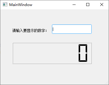
使用Qt Designer创建一个MainWindow窗口,其中添加1个Label、1个LineEdit、1个LCDNumber。其中,LCDNumber用来显示LineEdit中输入的数字。
将设计完成的窗口保存为.ui文件,使用PyUIC工具将其转换成.py文件。在转化后的.py文件中,设置LCDNumber的最大显示数字位数、显示样式及模式。
代码如下:
- # 设置最大显示7位数字
- self.lcdNumber.setDigitCount(7)
-
- # 设置以十进制显示数字
- self.lcdNumber.setMode(QtWidgets.QLCDNumber.Dec)
-
- # 设置数字显示屏的显示样式
- self.lcdNumber.setSegmentStyle(QtWidgets.QLCDNumber.Flat)
运行看下效果:
这个Flat样式还是挺好看的。接下来,自定义一个set_value()函数,使用setProperty()方法为LCDNumber设置要显示的数字为LineEdit中输入的数字,代码如下:
- def set_value(self):
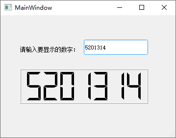
- self.lcdNumber.setProperty('value', self.lineEdit.text())
再将自定义函数set_value()和LineEdit的editingFinished信号关联起来。这个信号的作用是:当你输入完成后按<Enter>键该信号就会发射。代码如下:
self.lineEdit.editingFinished.connect(self.set_value)注意!关联代码要写在自定义函数之前。
以上代码运行后,我们在LineEdit中输入5201314,然后按<Enter>键。效果如下图所示:
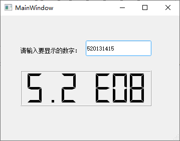
我们在前面的代码中限制了LCDNumber最大显示7位数字,如果超过7位,那么它会以科学计数法的形式进行显示。如下图所示:
7. PushButton:按钮
7.1 简介
PushButton是PyQt5中最常用的控件之一,允许用户通过单击来执行操作。PushButton既可以显示文本,也可以显示图像。当该控件被单击时,它看起来的状态像是被按下,然后被释放。
在Qt Designer中,它的图标如下图所示:
PushButton控件对应PyQt5中的QPushButton类,该类的常用方法及说明如下表:
| 方法 | 说明 |
| setText() | 设置按钮呈现的文本 |
| text() | 获取按钮呈现的文本 |
| setIcon() | 设置按钮上的图标,可以将参数设置为:QtGui.QIcon('图标路径') |
| setIconSize() | 设置按钮图标的大小,参数可以设置为:QtCore.QSize(int width, int height) |
| setEnabled() | 设置按钮是否可用,参数设置为False时,按钮不可用 |
| setShortcut() | 设置按钮的快捷键,参数可以设置为键盘中的按键或者组合键,例如<Alt + 0> |
PushButton按钮中最常用的信号时clicked,作用是:当按钮被单击时,会发射该信号执行相应的操作。
7.2 实例:制作登录窗口
在Qt Designer中创建一个MainWindow窗口,添加“登录”和“退出”按钮。单击“登录”按钮时,弹出用户输入的用户名和密码。单击“退出”按钮时,则关闭当前登录窗口。
步骤1:从图标素材网站下载2个自己喜欢的图标,1个是登录,1个是退出,然后用代码设置到2个按钮中。当然,直接在按钮控件的属性编辑器中设置也是可以的。这里我们用代码进行演示:
- self.pushButton.setIcon(QIcon(QPixmap('登录.png')))
- self.pushButton_2.setIcon(QIcon(QPixmap('退出登录.png')))
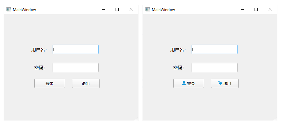
对比设置前后的效果,是不是高大上许多了呢?
步骤2:下面对密码输入框也就是lineEdit_2进行一些限制设置,代码如下:
- # 将输入框设置为密码模式
- self.lineEdit_2.setEchoMode(QtWidgets.QLineEdit.Password)
-
- # 设置输入框内只能输入8位数字
- self.lineEdit_2.setValidator(QtGui.QIntValidator(10000000, 99999999))
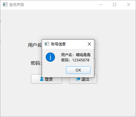
步骤3:自定义一个函数,使用information()方法弹出登录信息提示框,并将登录按钮和函数关联。代码如下:
- # 将登录按钮和自定义函数login关联起来
- self.pushButton.clicked.connect(self.login)
-
- # 弹出登录信息提示框
- def login(self):
- # 导入提示框需要用到的模块
- from PyQt5.QtWidgets import QMessageBox
-
- # 设置提示框内要显示的信息
- QMessageBox.information(self, '账号信息',
- '用户名:' + self.lineEdit.text() + '\n密码:' + self.lineEdit_2.text(),
- QMessageBox.Ok)
运行上面代码,调出登录界面,输入信息后单击登录按钮,效果如下图:
我们也可以给登录按钮设置快捷键,方式1代码如下:
self.pushButton = QtWidgets.QPushButton('登录(&D)', self.centralwidget)有Bug,而且是<Alt + D>组合键,很呆的方法,不推荐。
方法2:绑定小键盘的回车键<Enter>,代码如下:
- self.pushButton.setShortcut('enter')
- self.pushButton.setShortcut('Enter')
代码简短,而且确实是一键登录,后面的参数enter / Enter皆可。弊端是只对数字小键盘里的回车键有效。
方法3:绑定键盘中间的回车键<Enter>,代码如下:
- # 参数return首字母大小写均可
- self.pushButton.setShortcut('return')
- self.pushButton.setShortcut('Return')
8. ToolButton:工具按钮
9. CommandLinkButton:命令链接按钮
10. RadioButton:单选按钮
11. CheckBox:复选框
11.1 简介
CheckBox复选框控件用来表示是否选取了某个选项条件,常用于为用户提供具有是或否、真或假的选项。它对应PyQt5中的QCheckBox类。
在Qt Designer中的图标如下:
CheckBox控件的使用与RadioButton控件类似,但它是为用户提供“多选多”的选择。什么是“多选多”?就是CheckBox可以存在很多个,用户也可以同时选中很多个。而RadioButton控件是“多选一”,即:它可以存在很多个,但用户最终只能选择一个。
CheckBox控件有3种状态:选中、未选中、半选中。什么?还有半选中状态?
是的,除了常用的选中和未选中两种状态,CheckBox还提供了第三种状态来表明“没有变化”,也就是半选中状态。当需要为用户提供一个选中或者未选中复选框的选择时,这种状态还是很有用的哦~
什么?你没懂啥意思?算了,没关系,等你做项目的时候多遇到几次自然就会了。如果你需要第三种状态,可以通过setTristate()来使它生效,并使用checkState()来查询当前的切换状态。
CheckBox最常用的信号是stateChanged(),即:状态改变时发射,发射,发射……
QCheckBox类中的常用方法如下表:
| 方法 | 说明 |
| setChecked() | 设置复选框的状态,设置为True时表示选中复选框,设置为False时表示取消选中复选框 |
| setText() | 设置复选框的显示文本 |
| text() | 返回复选框的显示文本 |
| isChecked() | 检查复选框是否被选中 |
| setTriState() | 设置复选框为一个三态复选框 |
三态复选框有3种状态,如下表:
| 名称 | 值 | 说明 |
| Qt.Checked | 2 | 组件没有被选中(默认值) |
| Qt.PartiallyChecked | 1 | 组件被半选中 |
| Qt.Unchecked | 0 | 组件被选中 |
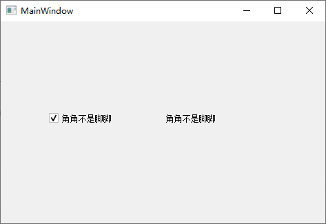
11.2 实例讲解(1)
举个栗子~
在Qt Designer里新建一个窗口,拖进去1个CheckBox和1个Label,保存为.ui文件,然后用PyUIC转换成.py文件。
问题来了,当CheckBox状态改变时,就把CheckBox的文本显示到Label中。这个代码怎么写?
- # 当复选框为选中状态时,把文本显示在Label中
- self.checkBox.stateChanged.connect(lambda: self.label.setText(self.checkBox.text()))
这里其实就是用了一个Python中的匿名函数lambda。虽然这一句有点长,但是总少了很多行代码,整体代码看上去也会简洁许多。下面我把另一个版本也写出来,就是不用lambda的版本,你自己对比一下。
- # 将CheckBox的状态改变和自定义函数get_value关联起来
- self.checkBox.stateChanged.connect(self.get_value)
-
- # 自定义一个函数,获取CheckBox的文本并设置到Label中
- def get_value(self):
- self.label.setText(self.checkBox.text())
2种写法运行的结果都是一样的,如下图:
如果项目简单,这样写是没啥问题的,但是如果代码量大了,那密密麻麻的那么多行代码,真能把眼睛看瞎。
强烈建议你把这个匿名函数掌握了,因为PyQt里面用到的很多。
11.3 实例讲解(2)
接下来把问题升级一下,当CheckBox是选中状态时就把它的文本显示到Label,反之则不显示。就是你第一次点击,文本显示,第二次文本不显示,如此往复。
老实本分写法:
- self.checkBox.stateChanged.connect(self.get_value)
-
- def get_value(self):
- state = self.checkBox.isChecked()
-
- if state == True:
- self.label.setText(self.checkBox.text())
-
- if state == False:
- self.label.clear()
一本正经写法:
- self.checkBox.stateChanged.connect(self.get_value)
-
- def get_value(self):
- state = self.checkBox.isChecked()
-
- if state:
- self.label.setText(self.checkBox.text())
-
- if not state:
- self.label.clear()
11.4 实例讲解(3)
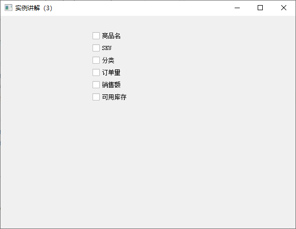
再举一个实际点的例子,假设现在有个列表head_name = ['商品名', 'SKU', '分类', '订单量', '销售额', '可用库存'],把里面的元素分别生成CheckBox,并添加到verticalLayout也就是垂直布局中,6个元素就是6个CheckBox。
- head_name = ['商品名', 'SKU', '分类', '订单量', '销售额', '可用库存']
-
- # for循环遍历列表,用元素作为CheckBox的控件名
- for name in head_name:
- ck = QCheckBox(name)
- self.verticalLayout.addWidget(ck)
-
- # 在垂直布局中添加1个弹簧,避免生成的CheckBox太分散
- self.wwww = QSpacerItem(0, 0, QSizePolicy.Minimum, QSizePolicy.Expanding)
- self.verticalLayout.addItem(self.wwww)
运行结果如下图:
12. ComboBox:下拉组合框
13. FontComboBox:字体组合框
14. ListWidget:列表
15. GroupBox:分组框
16. TabWidget:选项卡
17. ToolBox:工具盒
18. 日期和时间控件
19. CalendarWidget:日历控件
20. ProgressBar:进度条
21. 滑块控件
21.1 简介
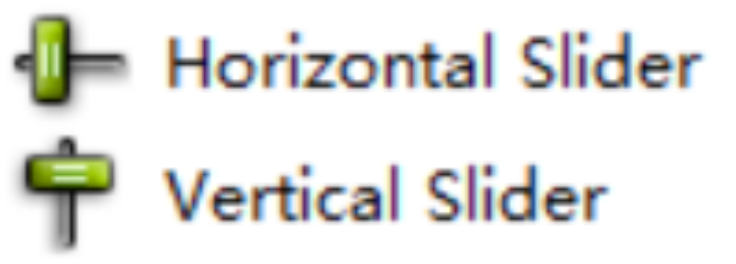
PyQt5中提供了2种滑块控件,分别是:水平滑块(HorizontalSlider)、垂直滑块(VerticalSlider)。
它们对应的类都是QSlider类,这个类中有1个 setOrientation() 方法,通过设置该方法的参数,就可以将滑块显示为水平或者垂直。
它们在Qt Designer中的图标如下所示:
21.2 QSlider 滑块类的常用方法、常用信号
| 方法 | 说明 |
| setMinimum() | 设置滑块最小值 |
| setMaximum() | 设置滑块最大值 |
| setOrientation() | 设置滑块显示方向,取值如下: Qt.Horizontal:水平滑块 Qt.Vertical:垂直滑块 |
| setPageStep() | 设置步长值,通过鼠标点击滑块时使用 |
| setSingleStep() | 设置步长值,通过鼠标拖动滑块时使用 |
| setValue() | 设置滑块的值 |
| setTickInterval() | 设置滑块的刻度间隔 |
| setTickPosition() | 设置滑块刻度的标记位置,取值如下: QSlider.NoTicks:不显示刻度(默认设置) QSlider.TicksBothSides:在滑块的两侧都显示刻度 QSlider.TicksAbove:在水平滑块的上方显示刻度 QSlider.TicksBelow:在水平滑块的下方显示刻度 QSlider.TicksLeft:在垂直滑块的左侧显示刻度 QSlider.TicksRight:在垂直滑块的右侧显示刻度 |
| value() | 获取滑块的当前值 |
| 信号 | 说明 |
| valueChanged | 当滑块的值发生变化时发射 |
| sliderPressed | Emitted when the user presses the slider |
| sliderMoved | Emitted when the user drags the slider |
| sliderReleased | Emitted when the user releases the slider |
Notice! Sliders can only control integer ranges, so it is not suitable for scenarios that require accurate large ranges of values.
21.3 Example: Creative Emoji Slider
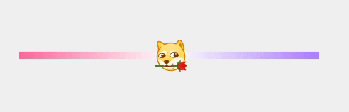
This is actually very simple, the core is a gradient color setting and several states in the style sheet. But when this control is actually used, it will not be so fancy. I have pasted the specific style sheet code below. If you are too lazy to write, just copy it and change the parameters a little and change the picture~
- QSlider{
- background-color: transparent;
- }
-
- QSlider::add-page:horizontal {
- background: qlineargradient(x1:0, y1:0, x2:1, y2:0, stop:0 #ffffff, stop:1 #ab7bff);
- }
-
- QSlider::sub-page:horizontal {
- background: qlineargradient(x1:0, y1:0, x2:1, y2:0, stop:0 #ff6699, stop:1 #ffffff);
- }
-
- QSlider::groove:horizontal{
- height: 10px;
- background-color: transparent;
- }
-
- QSlider::handle:horizontal {
- image: url(:/icon/atxmr-bwdq6.png);
- background-color: transparent;
- margin: -20px -20px -20px -20px;
- }
-
- QSlider::handle:horizontal:hover {
- image: url(:/icon/a8tyb-42rrh.png);
- }
-
- QSlider::handle:horizontal:pressed {
- image: url(:/icon/arv9v-8m1je.png);
- }
22. TreeView: tree view
23. TreeWidget: tree control
24. Divider control
25. Spring controls
26. Dial: knob control
27. Scroll bar control
28. To be continued...
Category of website: technical article > Blog
Author:kimi
link:http://www.pythonblackhole.com/blog/article/83085/95d88d5446eb6988ad84/
source:python black hole net
Please indicate the source for any form of reprinting. If any infringement is discovered, it will be held legally responsible.
name:
Comment content: (supports up to 255 characters)