
Python epidemic data visualization (crawler + data visualization) (Jupyter environment)
posted on 2023-06-06 11:46 read(366) comment(0) like(11) collect(2)
Table of contents
3.1.2 Find the url where the data is located
3.2.2 Bar chart of the number of confirmed cases and the number of deaths in each region
3.2.3 Map of the number of confirmed cases in each region
3.2.4 Ring diagram of the distribution of the number of confirmed cases in each region
3.2.4 Line chart of the distribution of the number of confirmed cases in each region
1 item background
At the end of 2019 , pneumonia (COVID-19) broke out in the world, which was later confirmed to be caused by a new type of coronavirus (SARS-CoV-2).
2 project goals
Under the condition of crawling public data, we have carried out some visualization work, hoping to help everyone better understand the current development of the epidemic, and have more confidence to defeat the raging virus together.
3 Item Analysis
3.1 Data Acquisition
3.1.1 Analysis Website
Go first and find the target data to be crawled today:
https://news.qq.com/zt2020/page/feiyan.htm#/

3.1.2 Find the url where the data is located
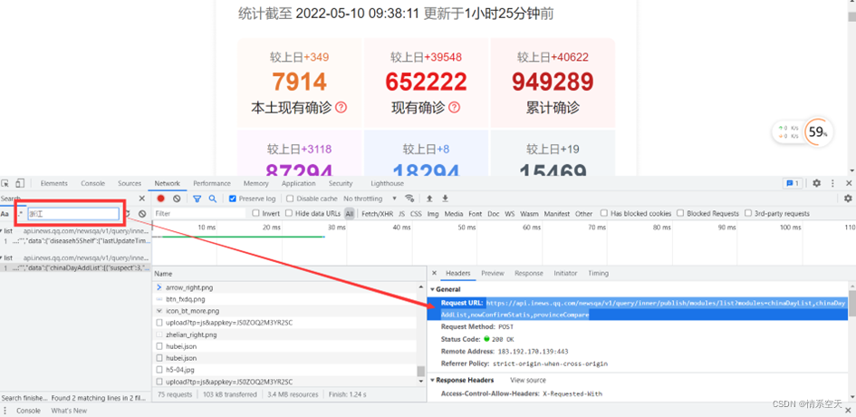
url='https://api.inews.qq.com/newsqa/v1/query/inner/publish/modules/list?modules=statisGradeCityDetail,diseaseh5Shelf'3.1.3 Get data
Get its json data through a crawler:
- url='https://api.inews.qq.com/newsqa/v1/query/inner/publish/modules/list?modules=statisGradeCityDetail,diseaseh5Shelf'
-
- response = requests.get(url, verify=False)
-
- json_data = response.json()['data']
-
- china_data = json_data['diseaseh5Shelf']['areaTree'][0]['children'] # 列表
3.1.4 Analyzing data
Value our list through a for loop and store it in our dictionary
- data_set = []
-
- for i in china_data:
-
- data_dict = {}
-
- # 地区名称
-
- data_dict['province'] = i['name']
-
- # 新增确认
-
- data_dict['nowConfirm'] = i['total']['nowConfirm']
-
- # 死亡人数
-
- data_dict['dead'] = i['total']['dead']
-
- # 治愈人数
-
- data_dict['heal'] = i['total']['heal']
-
-
-
- data_set.append(data_dict)

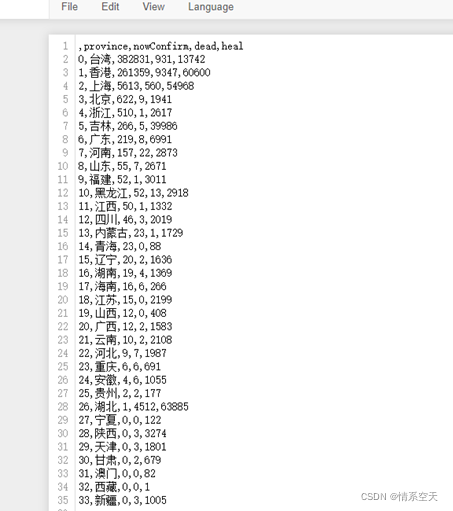
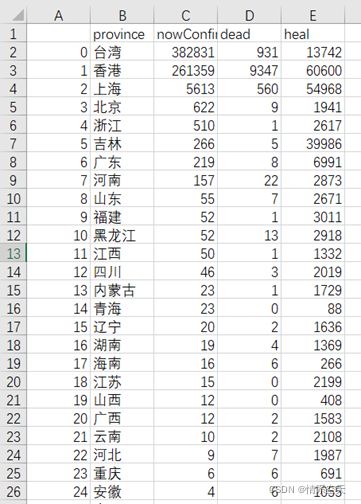
3.1.5 Saving data
df = pd.DataFrame(data_set)
df.to_csv('yiqing_data.csv')
3.2 Data Visualization
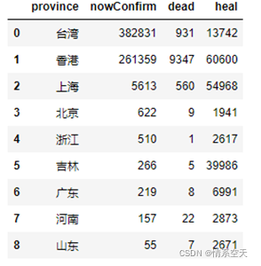
3.2.1 Read data
df2 = df.sort_values(by=['nowConfirm'],ascending=False)[:9]
df2
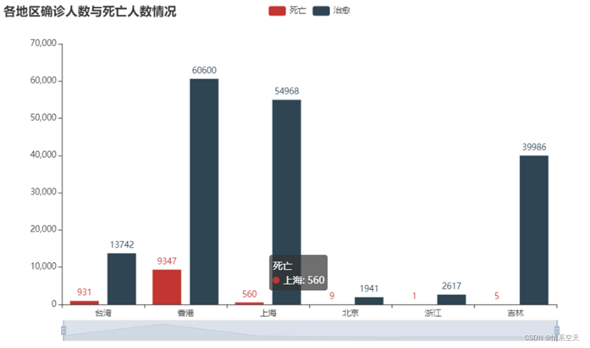
3.2.2 Bar chart of the number of confirmed cases and the number of deaths in each region
- bar = (
-
- Bar()
-
- .add_xaxis(list(df['province'].values)[:6])
-
- .add_yaxis("死亡", df['dead'].values.tolist()[:6])
-
- .add_yaxis("治愈", df['heal'].values.tolist()[:6])
-
- .set_global_opts(
-
- title_opts=opts.TitleOpts(title="各地区确诊人数与死亡人数情况"),
-
- datazoom_opts=[opts.DataZoomOpts()],
-
- )
-
- )
-
- bar.render_notebook()
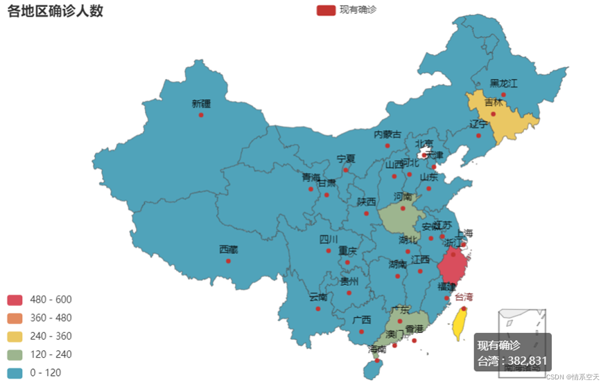
3.2.3 Map of the number of confirmed cases in each region
- china_map = (
-
- Map()
-
- .add("现有确诊", [list(i) for i in zip(df['province'].values.tolist(),df['nowConfirm'].values.tolist())], "china")
-
- .set_global_opts(
-
- title_opts=opts.TitleOpts(title="各地区确诊人数"),
-
- visualmap_opts=opts.VisualMapOpts(max_=600, is_piecewise=True),
-
- )
-
- )
-
- china_map.render_notebook()
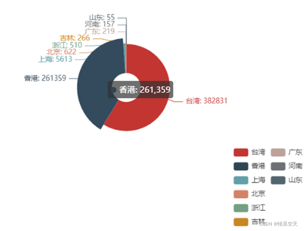
3.2.4 Ring diagram of the distribution of the number of confirmed cases in each region
- pie = (
-
- Pie()
-
- .add(
-
- "",
-
- [list(i) for i in zip(df2['province'].values.tolist(),df2['nowConfirm'].values.tolist())],
-
- radius = ["10%","30%"]
-
- )
-
- .set_global_opts(
-
- legend_opts=opts.LegendOpts(orient="vertical", pos_top="70%", pos_left="70%"),
-
- )
-
- .set_series_opts(label_opts=opts.LabelOpts(formatter="{b}: {c}"))
-
- )
-
- pie.render_notebook()
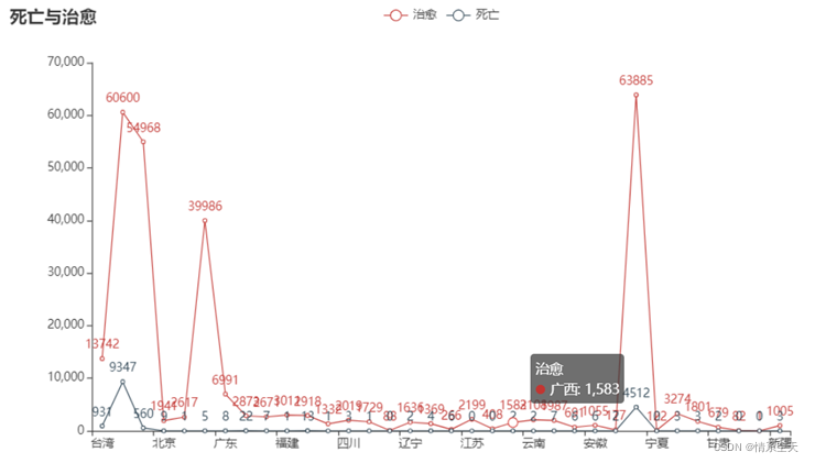
3.2.4 Line chart of the distribution of the number of confirmed cases in each region
- line = (
-
- Line()
-
- .add_xaxis(list(df['province'].values))
-
- .add_yaxis("治愈", df['heal'].values.tolist())
-
- .add_yaxis("死亡", df['dead'].values.tolist())
-
- .set_global_opts(
-
- title_opts=opts.TitleOpts(title="死亡与治愈"),
-
-
-
- )
-
- )
-
- line.render_notebook()
Project source code:
- import requests # 发送网络请求模块
- import json
- import pprint # 格式化输出模块
- import pandas as pd # 数据分析当中一个非常重要的模块
- from pyecharts import options as opts
- from pyecharts.charts import Bar,Line,Pie,Map,Grid
- import urllib3
- from pyecharts.globals import CurrentConfig, NotebookType
- # 配置对应的环境类型
- CurrentConfig.NOTEBOOK_TYPE = NotebookType.JUPYTER_NOTEBOOK
- CurrentConfig.ONLINE_HOST='https://assets.pyecharts.org/assets/'
-
- urllib3.disable_warnings()#解决InsecureRequestWarning: Unverified HTTPS request is being made to host 'api.inews.qq.com'. 问题
-
-
- url = 'https://api.inews.qq.com/newsqa/v1/query/inner/publish/modules/list?modules=statisGradeCityDetail,diseaseh5Shelf'
-
- response = requests.get(url, verify=False)
- json_data = response.json()['data']
-
-
- china_data = json_data['diseaseh5Shelf']['areaTree'][0]['children'] # 列表
-
- data_set = []
- for i in china_data:
- data_dict = {}
- # 地区名称
- data_dict['province'] = i['name']
- # 新增确认
- data_dict['nowConfirm'] = i['total']['nowConfirm']
- # 死亡人数
- data_dict['dead'] = i['total']['dead']
- # 治愈人数
- data_dict['heal'] = i['total']['heal']
-
- data_set.append(data_dict)
- df = pd.DataFrame(data_set)
- df.to_csv('yiqing_data.csv')
-
-
- df2 = df.sort_values(by=['nowConfirm'],ascending=False)[:9]
- df2
-
-
-
- # bar = (
- # Bar()
- # .add_xaxis(list(df['province'].values)[:6])
- # .add_yaxis("死亡", df['dead'].values.tolist()[:6])
- # .add_yaxis("治愈", df['heal'].values.tolist()[:6])
- # .set_global_opts(
- # title_opts=opts.TitleOpts(title="各地区确诊人数与死亡人数情况"),
- # datazoom_opts=[opts.DataZoomOpts()],
- # )
- # )
- # bar.render_notebook()
- # china_map = (
- # Map()
- # .add("现有确诊", [list(i) for i in zip(df['province'].values.tolist(),df['nowConfirm'].values.tolist())], "china")
- # .set_global_opts(
- # title_opts=opts.TitleOpts(title="各地区确诊人数"),
- # visualmap_opts=opts.VisualMapOpts(max_=600, is_piecewise=True),
- # )
- # )
- # china_map.render_notebook()
-
- # pie = (
- # Pie()
- # .add(
- # "",
- # [list(i) for i in zip(df2['province'].values.tolist(),df2['nowConfirm'].values.tolist())],
- # radius = ["10%","30%"]
- # )
- # .set_global_opts(
- # legend_opts=opts.LegendOpts(orient="vertical", pos_top="70%", pos_left="70%"),
- # )
- # .set_series_opts(label_opts=opts.LabelOpts(formatter="{b}: {c}"))
- # )
- # pie.render_notebook()
- line = (
- Line()
- .add_xaxis(list(df['province'].values))
- .add_yaxis("治愈", df['heal'].values.tolist())
- .add_yaxis("死亡", df['dead'].values.tolist())
- .set_global_opts(
- title_opts=opts.TitleOpts(title="死亡与治愈"),
-
- )
- )
- line.render_notebook()
Category of website: technical article > Blog
Author:Fiee
link:http://www.pythonblackhole.com/blog/article/80209/df5b972574692ebf6c02/
source:python black hole net
Please indicate the source for any form of reprinting. If any infringement is discovered, it will be held legally responsible.
name:
Comment content: (supports up to 255 characters)
no articles