Python heart disease visualization and classification prediction
posted on 2023-06-06 09:46 read(570) comment(0) like(18) collect(5)
1. Background and significance of problem analysis
Background: Heart disease is the number one killer of human health, and 1/3 of the world's population deaths are caused by heart disease. In my country, hundreds of thousands of people die of heart disease every year. If the impact of different characteristics on heart disease can be analyzed through data mining by extracting body-related physical indicators , it will play a vital role in the prevention of heart disease.
Significance: This data set can be used to analyze whether a patient's heart disease is related to other diseases, and provide decision support for predicting heart disease. For example, by analyzing the heart disease classification prediction data set, we can conclude that older and inactive patients are more likely to have heart disease, or that there is a relationship between certain diseases that patients themselves have and heart disease. Significant correlation etc.
2. Data sources
The data file heart.csv has been put into the network disk, you can download it yourself if you need it
Link: https://pan.baidu.com/s/1xjMOCrEzLLHkARP90q2iAw
Extraction code: 2323
Dataset description: The heart disease classification prediction data set refers to the related data set for the classification of heart disease patients. Such datasets usually contain basic information about patients, including age, gender, resting blood pressure, cholesterol, etc., as well as information about whether the patient has other diseases, including angina, diabetes, thalassemia, etc.
3. Data preprocessing
1. Load third-party library
import numpy as np
import pandas as pd
import matplotlib.pyplot as plt
import seaborn as sns
sns.set_style('darkgrid')
import warnings
warnings.filterwarnings('ignore')
import matplotlib
from sklearn import metrics
from scipy.stats import pearsonr
from sklearn.metrics import accuracy_score
from sklearn.metrics import classification_report
plt.rcParams['font.sans-serif']=['SimHei']
plt.rcParams['axes.unicode_minus'] = False
print('第三方库加载成功')
2. Read the data file and display the data information
heart = pd.read_csv('heart.csv')
heart.head()

3. Make a copy of the data set, check the data type, data size, descriptive statistics
data = heart.copy()
data.dtypes
data.shape
data.describe()
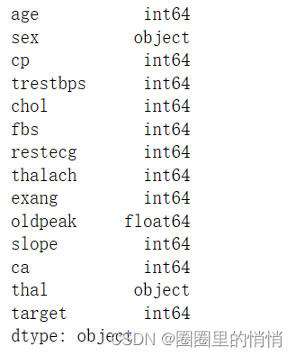


4. View duplicate and missing values
data.drop_duplicates()
data.isnull().sum()
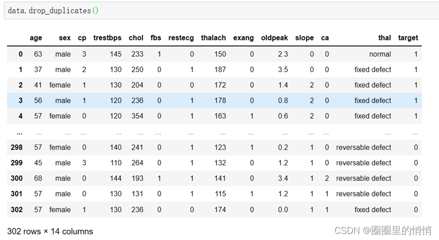
After removing duplicate values in the data, the size of the data is the same as before, indicating that there are no duplicate values.
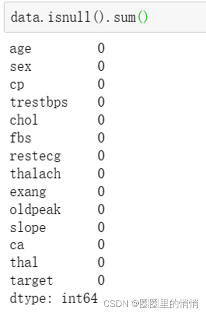
The number of missing values in each column of the query is 0, and no data is missing.
5. View the outlier judgment of the age column
X = 'age'
print(X+':')
mean1 = data[X].quantile(q = 0.25)  # 下四分位差
mean2 = data[X].quantile(q = 0.75)  # 上四分位差
mean3 = mean2 - mean1  # 中位差
topnum2 = mean2 + 1.5*mean3
bottomnum2 = mean2 - 1.5*mean3
print("正常值的范围:", topnum2, bottomnum2)
print("是否存在超出正常范围的值:", any(data[X]>topnum2))
print("是否存在小于正常范围的值:", any(data[X]<bottomnum2))
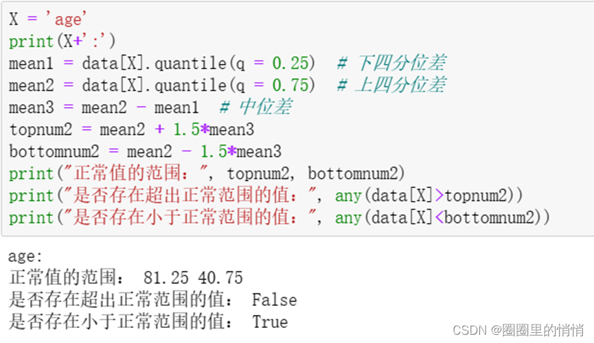
Using the upper four medians and the lower four medians to determine the outliers, the range of normal values is between 40-81 years old. Since this attribute column is age, it can only show that most of the values are between 40-81 years old. age, but there are also cases outside these ages, so ages beyond this range are not considered outliers.
6. Feature Encoding
# 特征编码
size_mapping = {'male': 1,'female': 0}
data['sex'] = data['sex'].map(size_mapping)
size_mapping1 = {'normal': 1,'fixed defect': 2,'reversable defect':3}
data['thal'] = data['thal'].map(size_mapping1)
data
Encode the features of the data set, and convert the text data in the data set into numerical data.
4. Data visualization analysis (using pyecharts library)
1. Number of illnesses or not – pie chart
data['target'].value_counts()

from pyecharts import Pie
attr = ['正常','患病']
data = [138,165]
pie = Pie("是否患病情况数量")
# 是否直接显示label信息
pie.add("", attr, data, is_label_show=True)
pie.render("issick.html")

from IPython.display import IFrame
IFrame(src='./issick.html', width=800, height=450)
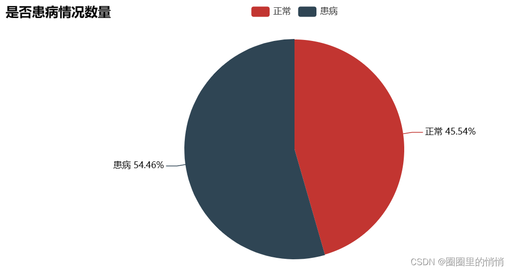
The number without heart disease: 138, the proportion without heart disease: 45.54%; the number with heart disease: 165, the proportion with heart disease: 54.46%. The difference between the two types of people in the data set is not very large.
2. Heart disease prevalence in different age groups – bar chart
# 由于年龄过于分散,将年龄拆分成不同段
age_distDf = pd.DataFrame()

# 用pd.cut() 将年龄进行分割
age_distDf['age_range']  = pd.cut(x = data['age'],
                                  bins = [0,18,40,60,100],
                                  include_lowest = True,right=False,
                                  labels = ['儿童','青年','中年','老年'])

# 将原数据集的target合并到age_distDf中
age_distDf = pd.concat([age_distDf['age_range'],data['target']],axis=1)
age_distDf.head()

at = age_distDf.groupby(["age_range","target"]).agg({'target':'count'})
at.rename(columns={'target':'amount'},inplace=True)
at = at.reset_index()
print(at)

from pyecharts import Bar
columns = ['儿童','青年','中年','老年']
data1 = [0, 4, 82, 52]
data2 = [0, 12, 115, 38]
bar = Bar("不同年龄段的人患心脏病的情况")
bar.add("未得心脏病的人数", columns, data1)
bar.add("患心脏病的人数", columns, data2)
bar.render("agesick.html")

from IPython.display import IFrame
IFrame(src='./agesick.html', width=800, height=450)
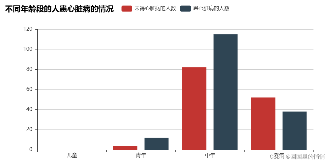
Among the people with heart disease, there are 0 children, 12 young people, 115 middle-aged people, and 38 old people; among the people without heart disease, there are 0 children, 4 young people, and 82 middle-aged people , aged 52 people. Among the people suffering from heart disease, there are more middle-aged and elderly people.
3. The prevalence of different age groups – 3d histogram
from pyecharts import Bar3D

bar3d = Bar3D("3D 柱状图示例", width=1200, height=600)
x_axis = [
    '儿童', '青年',
    '中年', '老年'
    ]
y_axis = [
    '健康', '患病'
    ]
data = [
    [0, 0, 0], [1, 0, 0],
    [0, 1, 4], [1, 1, 12],
    [0, 2, 82], [1, 2, 115],
    [0, 3, 52], [1, 3, 38]
    ]
range_color = ['#313695', '#4575b4']
bar3d.add(
    "",
    x_axis,
    y_axis,
    [[d[1], d[0], d[2]] for d in data],
    is_visualmap=True,
    visual_range=[0, 20],
    visual_range_color=range_color,
    grid3d_width=200,
    grid3d_depth=80,
)
bar3d.render("bar3d.html")

from IPython.display import IFrame
IFrame(src='./bar3d.html', width=1000, height=600)
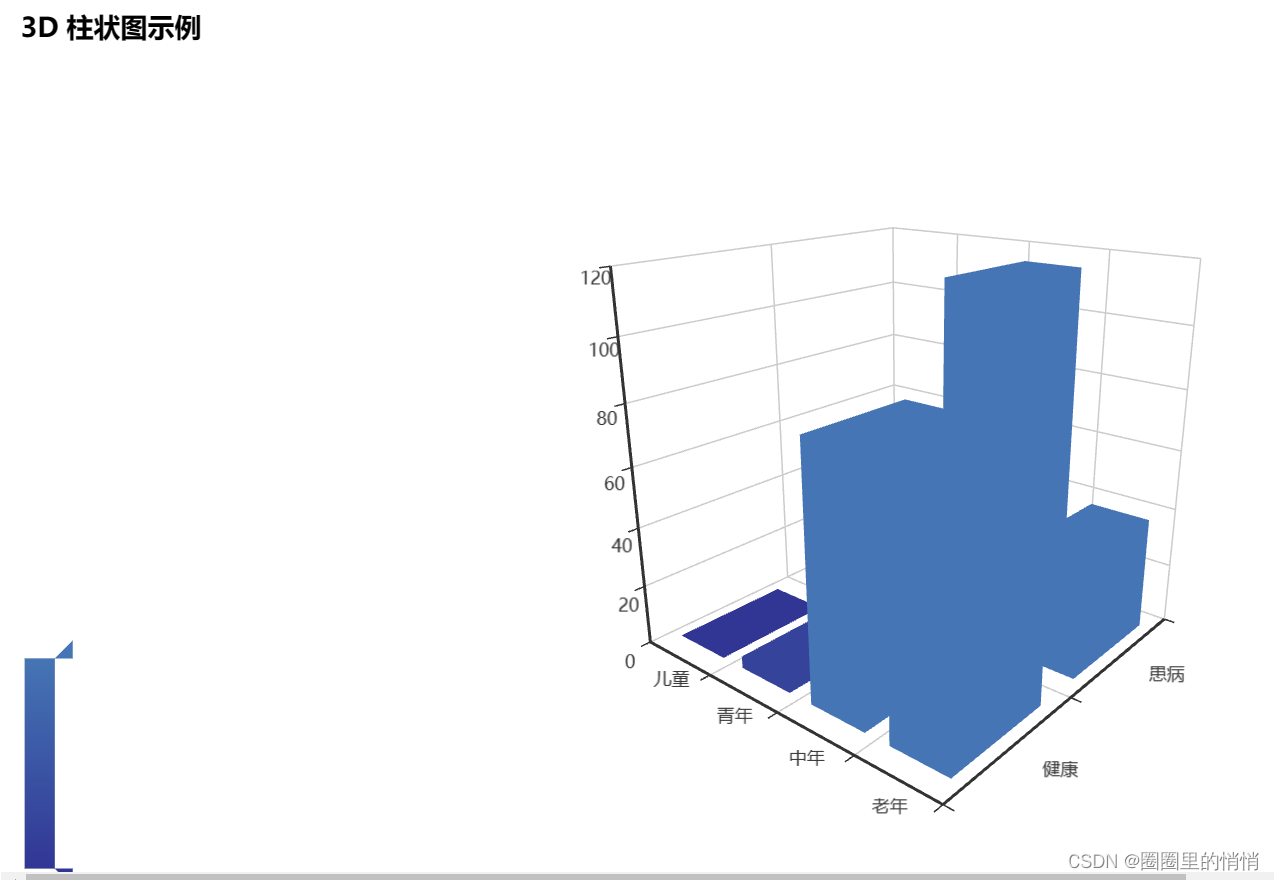
The prevalence of young people is higher than that of the elderly, which is largely related to the unhealthy lifestyles of modern young people such as high stress, staying up late, and lack of exercise.
4. Prevalence of different gender groups – funnel diagram
atyy = data.groupby(["sex","target"]).agg({'target':'count'})
atyy.rename(columns={'target':'amount'},inplace=True)
atyy = atyy.reset_index()
print(atyy)

from pyecharts import Funnel

x_movies_name = ["女性正常", "女性患心脏病", "男性患心脏病病", "男性正常"]
y_16 = [24, 72, 93, 114]
funnel = Funnel("不同性别人群患病情况")
funnel.add("不同性别人群患病情况", x_movies_name, y_16)
funnel.render("funnel.html")

from IPython.display import IFrame
IFrame(src='./funnel.html', width=900, height=450)
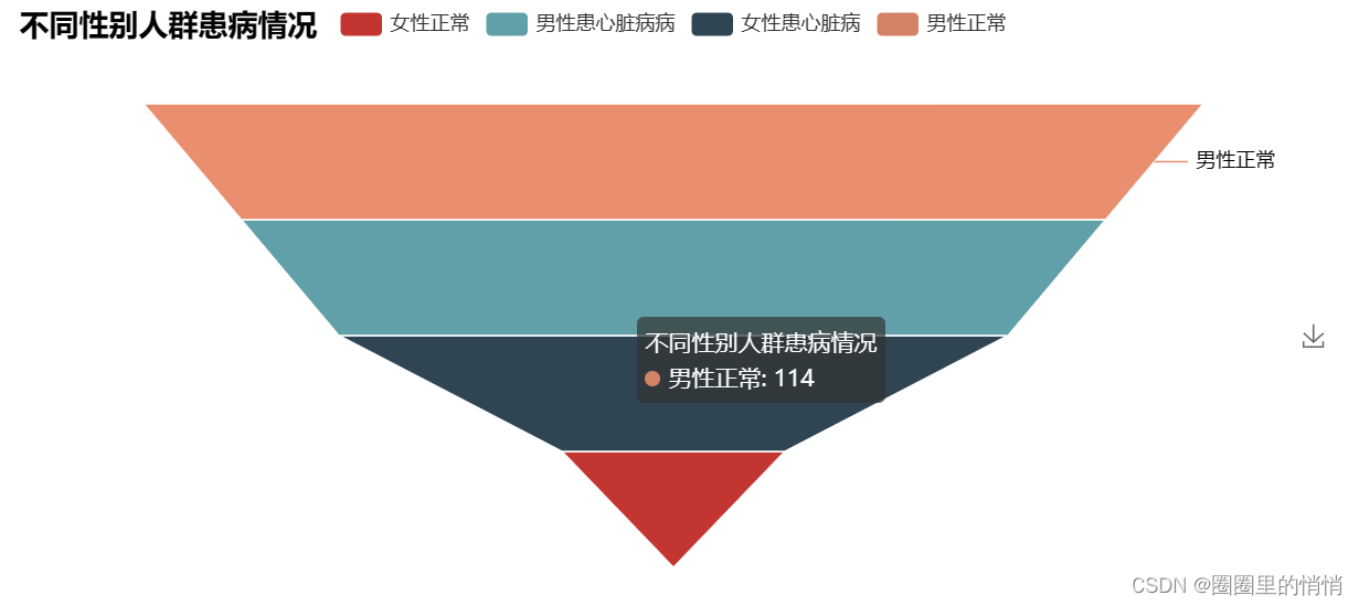
As can be seen from the figure above, there are 24 normal women and 72 women with heart disease; 114 normal men and 93 men with heart disease. Overall, women suffer from heart disease at a higher rate than men.
5. Prevalence of different chest pain types – line chart
atcp = data.groupby(["cp","target"]).agg({'target':'count'})
atcp.rename(columns={'target':'amount'},inplace=True)
atcp = atcp.reset_index()
print(atcp)

from pyecharts import Page
from pyecharts import Line
page = Page()
attr = ['典型心绞痛', '非典型心绞痛', '非心绞痛', '没有症状']
line1 = Line("不同胸痛类型与患病的关系")
line1.add(
    "正常人群",
    attr,
    [104,9,18,7],
    mark_point=["max", "min"],
    mark_line=["average"],
    mark_point_symbol="arrow",
    mark_point_textcolor="#40ff27",
    mark_point_symbolsize=25,
)
line1.add(
    "患心脏病人群",
    attr,
    [39,41,69,16],
    mark_point=["max", "min"],
    mark_line=["average"],
    yaxis_formatter="",
    mark_point_symbol="diamond",
    mark_point_symbolsize=25,
)
page.add(line1)
page.render("line.html")

from IPython.display import IFrame
IFrame(src='./line.html', width=800, height=450)
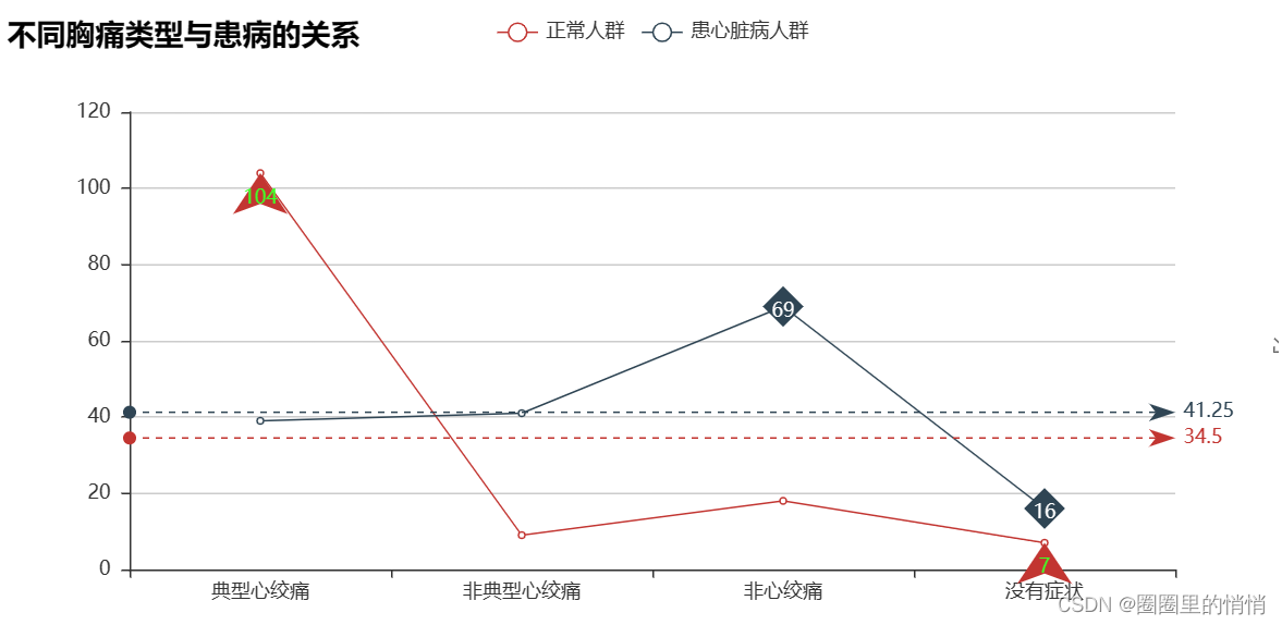
The probability of heart disease in patients with typical angina is relatively low, just pure angina, not heart disease, while the probability of heart disease in patients with other types of angina is relatively high, indicating that there is a certain relationship between heart disease and the type of angina.
6. The relationship between heart rate and resting blood pressure – scatter plot
tandt = data[['trestbps','thalach']]
print(tandt)
from pyecharts import Scatter   #散点图
v1 =tandt.trestbps
v2 =tandt.thalach
scatter =Scatter("心率与静息血压的关系", title_pos='center', background_color='white', title_top='90%')
scatter.add("静息血压", v1, v2)
scatter.add("心率", v1[::-1], v2)
scatter.show_config()
scatter.render("scatter.html")

from IPython.display import IFrame
IFrame(src='./scatter.html', width=800, height=450)
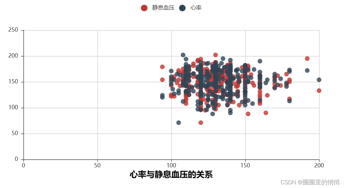
As can be seen from the above figure, the correlation between heart rate and resting blood pressure is very high, and the data points are relatively concentrated. The horizontal axis represents resting blood pressure, most of the values are between 80-200, and the vertical axis represents heart rate. Partial values are also between 80-200.
7. The relationship between exercise and heart disease – a ladder diagram
atex = data.groupby(["exang","target"]).agg({'target':'count'})
atex.rename(columns={'target':'amount'},inplace=True)
atex = atex.reset_index()
print(atex)

from pyecharts import Line

data_x = ['不运动的正常人群', '不运动的患病人群', '运动的正常人群', '运动的患病人群']
data_y = [62,142,76,23]

line = Line(title='运动与心脏病关系阶梯图')
line.add(name='Sum', x_axis=data_x, y_axis=data_y, is_step=True, is_label_show=True, yaxis_min=15, yaxis_max=160, legend_text_color='red')
line.render('step.html')

from IPython.display import IFrame
IFrame(src='./step.html', width=800, height=450)
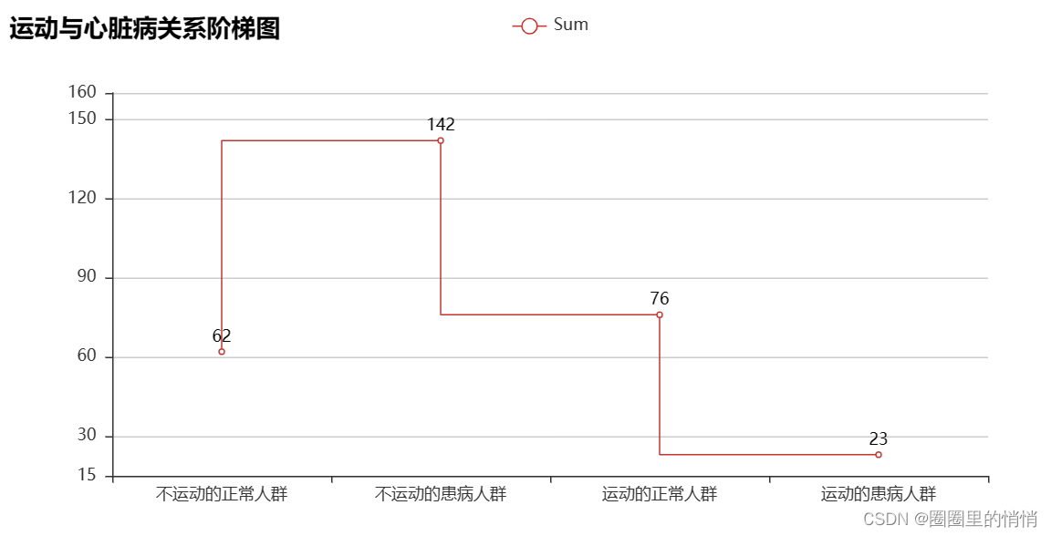
Exercise-induced angina is less likely to be diagnosed as heart disease. Therefore, it is only exercise that causes angina pectoris. The first consideration is that it may be other diseases. However, if you have heart disease, you should follow the doctor's advice and rest. High-intensity exercise will still cause angina pectoris.
8. Thalassemia Blood Disorders Relationship with Heart Disease – Ring Chart
t = data.groupby(["thal","target"]).agg({'target':'count'})
t.rename(columns={'target':'amount'},inplace=True)
t = t.reset_index()
print(t)

from pyecharts import Pie
from pyecharts import options as opts
c = Pie()
L1 = ["thal=1,正常","thal=1,患心脏病","thal=2,正常","thal=2,患心脏病","thal=3,正常","thal=3,患心脏病"]
num = [13,7,36,130,89,28]
c.add("",attr = L1,value =num,radius=["40%","75%"])
# c.set_global_opts(title_opts=opts.TitleOpts(title='Pie圆环'),
#                 legend_opts=opts.LegendOpts(orient='vertical',pos_top='5%',pos_left="2%"))
# c.set_series_opts(label_opts=opts.LabelOpts(formatter="{b}:{c}"))
c.render("c.html")

from IPython.display import IFrame
IFrame(src='./c.html', width=800, height=450)
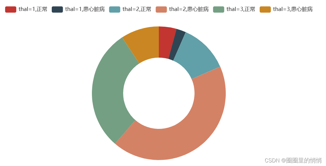
When the type of thalassemia is 2, that is, fixed defects, and the group with the largest number of people suffering from heart disease is 130 people, which may indicate that there is a certain relationship between thalassemia and heart disease.
9. Quantity of various types of ECG at peak exercise – linear_flicker diagram
data['slope'].value_counts()

from pyecharts import Line,EffectScatter,Overlap
attr = ['上坡','平坦','下坡']
v1 = [21,140,142]
line = Line('线性_闪烁图示例')
line.add('',attr,v1,is_random = True)

es = EffectScatter()
es.add('',attr,v1,effect_scale=8)   #闪烁
overlop = Overlap()
overlop.add(line)                   #必须先添加line,在添加es
overlop.add(es)
overlop.render('./line-es01.html')

from IPython.display import IFrame
IFrame(src='./line-es01.html', width=800, height=450)
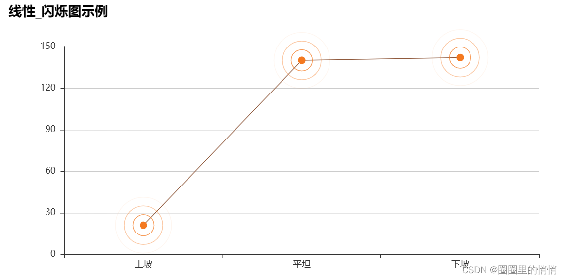
When the type of ECG at the peak of exercise is uphill, there are 21 people, when the type of ECG at the peak of exercise is flat, there are 140 people, and when the type of ECG at the peak of exercise is downhill, there are 142 people.
10. Fasting blood glucose of people of different genders – linear_histogram
s = data.groupby(["sex","fbs"]).agg({'fbs':'count'})
s.rename(columns={'fbs':'amount'},inplace=True)
s = s.reset_index()
print(s)

from pyecharts import Bar,Line,Overlap
attr = ['女性血糖<120mg/d','女性血糖>120mg/d','男性血糖<120mg/d','男性血糖>120mg/d']
v1 = [84,12,174,33]
v2 = [84,12,174,33]
bar = Bar('Line - Bar示例')
bar.add('bar',attr,v1)
line = Line()
line.add('line',attr,v2)

overlop = Overlap()
overlop.add(bar)
overlop.add(line)
overlop.render('./line-bar01.html')

from IPython.display import IFrame
IFrame(src='./line-bar01.html', width=800, height=450)
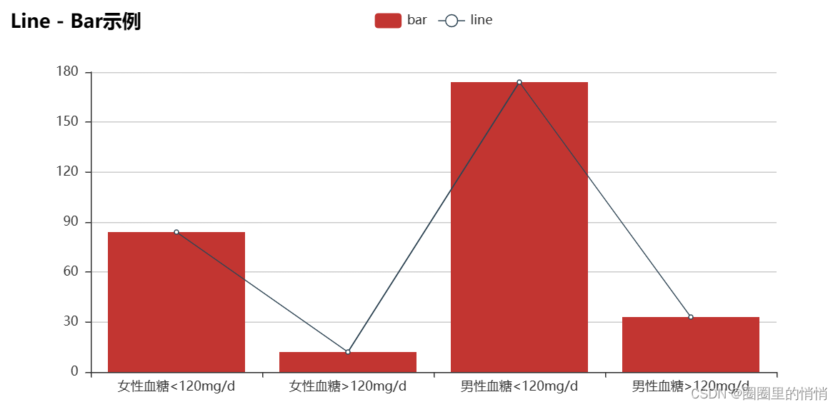
When the blood sugar of women was <120mg/d, there were 84 people, when the blood sugar of women was >120mg/d, it was 12 people, when the blood sugar of men was <120mg/d, it was 174 people, and when the blood sugar of men was >120mg/d, it was 33 people. It can be seen from this that the blood sugar of men or women in the data set is generally lower than 120mg/d.
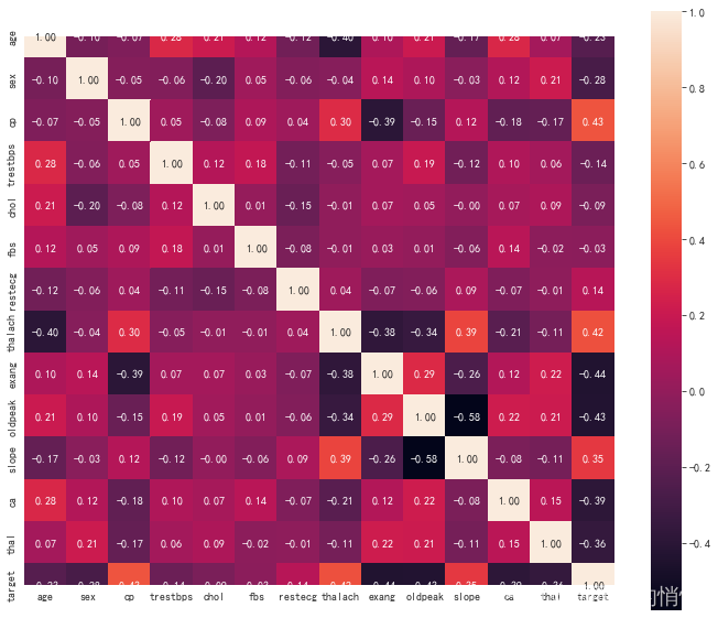
11. View correlations between different features
# 查看不同特征之间的相关关系
plt.figure(figsize=(12,10))
corr =  data.corr()
sns.heatmap(data=corr,annot=True, square=True,fmt='.2f')
plt.show()
5. Modeling and forecasting
1. Single heat treatment
# 采用get_dummies()编码方式处理非连续性分类数据
cp_dummies= pd.get_dummies(data['cp'],prefix = 'cp')
restecg_dummies =  pd.get_dummies(data['restecg'],prefix='restecg')
slope_dummies =  pd.get_dummies(data['slope'],prefix='slope')
thal_dummies = pd.get_dummies(data['thal'],prefix='thal')

# 将原数据中经过独热编码的列删除
heart_new =  data.drop(['cp','restecg','slope','thal'],axis=1)
heart_new = pd.concat([heart_new,cp_dummies,restecg_dummies,slope_dummies,thal_dummies],axis=1)
heart_new.head()

2. Separate data and labels
# 分离出数据和标签
label =  heart_new['target']
data =  heart_new.drop('target',axis=1)
data.shape

3. Normalization processing
# 数据集合的不同特征之间数据相差有点大,对于SVM、KNN等算法,会产生权重影响,因此需要归一化处理数据
from sklearn.preprocessing import StandardScaler
standardScaler = StandardScaler()
standardScaler.fit(data)
data =  standardScaler.transform(data)
4. Split training set, test set
# 拆分训练集,测试集
from sklearn.model_selection import train_test_split
train_X,test_X,train_y,test_y = train_test_split(data,label,random_state=3)
train_X.shape

5. KNN nearest neighbor method
# 构建模型
from sklearn.neighbors import KNeighborsClassifier
knn =  KNeighborsClassifier()
#训练数据
knn.fit(train_X,train_y)
# 预测数据
knn_pred_y = knn.predict(test_X)
# 评估模型
knn.score(train_X,train_y)

knn.score(test_X,test_y)

accuracy_score(test_y,knn_pred_y)
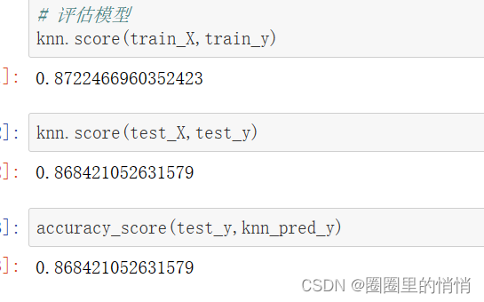
The test set score and accuracy of the model is 86.842%
6. Use grid search to find better model parameters
from sklearn.model_selection import GridSearchCV
knn =  KNeighborsClassifier()
param_test =  [
    {'n_neighbors':[i for i in range(1,31)],
    'weights':['uniform']},

    {'n_neighbors':[i for i in range(1,21)],
    'weights':['distance'],
    'p':[i for i in range(1,6)]}
]
knn_gv = GridSearchCV(estimator = knn,param_grid=param_test,cv=5)
knn_gv.fit(train_X,train_y)

# 最优参数
knn_gv.best_params_

knn =  KNeighborsClassifier(n_neighbors=16,p=3,weights='distance')

#训练数据
knn.fit(train_X,train_y)

# 预测数据
knn_pred_y = knn.predict(test_X)

# 评估模型
knn.score(train_X,train_y)
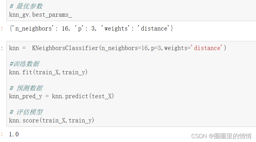
The optimal parameters of KNN found by using the model are n_neighbors=16, p=3, weights=distance. Using the optimal parameters, the obtained model training set score is 1.
7. View model accuracy and recall
# 预测数据
knn_pred_y = knn_gv.predict(test_X)

# 查看主要分类指标文本报告
print(classification_report(test_y,knn_pred_y))
print(knn_gv.score(test_X,test_y))
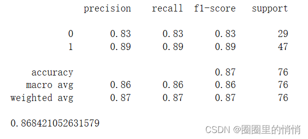
The precision rate, recall rate, and F1 value of the model are 0.86, 0.86, and 0.87, respectively.
8. Calculation of evaluation indicators
MSE = metrics.mean_squared_error(test_y,knn_pred_y)
RMSE = np.sqrt(MSE)
R = pearsonr(test_y, knn_pred_y)[0]
std = np.std(test_y-knn_pred_y)
RMSE,R,std

The RMSE of the model is 0.3627, the R is 0.7212, and the std is 0.3627.
Category of website: technical article > Blog
Author:Poison
link:http://www.pythonblackhole.com/blog/article/79555/2101b70bc344620799d2/
source:python black hole net
Please indicate the source for any form of reprinting. If any infringement is discovered, it will be held legally responsible.
name:
Comment content: (supports up to 255 characters)
no articles
