
[Data Analysis and Visualization] Use Python to perform visual analysis on student performance (with source code)
posted on 2023-06-06 09:36 read(246) comment(0) like(11) collect(4)
If you need source code and data sets, please like and follow the collection and leave a private message in the comment area~~~
The following is a visual analysis of data such as students' sentence formation and performance
1: import module
- import pandas as pd
- import numpy as np
- import seaborn as sns
- import matplotlib.pyplot as plt
- plt.rcParams['font.sans-serif']=['simhei']
- plt.rcParams['font.serif'] = ['simhei']
-
- import warnings
- warnings.filterwarnings('ignore')
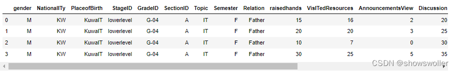
2: Get the data and print the first four lines
- from matplotlib.font_manager import FontProperties
- myfont=FontProperties(fname=r'C:\Windows\Fonts\SimHei.ttf',size=12)
- sns.set(font=myfont.get_name())
- df = pd.read_csv('.\data\StudentPerformance.csv')
- df.head(4)
The corresponding meaning of the attribute list is as follows
Gender
Nationality
Place of Birth
Stageid school level
Gradeid
Sectionid class
Topic subjects
semester semester
ralation child family education director
raisedhands The number of times students raised their hands in class
announcementviews The number of times students viewed online courseware
discussion The number of times students participated in classroom discussions
parentanswersurvey Did the parents fill out the school's questionnaire
parentsschoolsatisfaction Parents' satisfaction with the school
studentabsencedays student absence days
3: Data visualization analysis
Next, modify the table column name to Chinese

- df.rename(columns={'gender':'性别','NationalITy':'国籍','PlaceofBirth':'出生地',
- 'StageID':'学段','GradeID':'年级','SectionID':'班级','Topic':'科目',
- 'Semester':'学期','Relation':'监管人','raisedhands':'举手次数',
- 'VisITedResources':'浏览课件次数','AnnouncementsView':'浏览公告次数',
- 'Discussion':'讨论次数','ParentAnsweringSurvey':'父母问卷',
- 'ParentschoolSatisfaction':'家长满意度','StudentAbsenceDays':'缺勤次数',
- 'Class':'成绩'},inplace=True)
- df.replace({'lowerlevel':'小学','MiddleSchool':'中学','HighSchool':'高中'},inplace=True)
- df.columns
Display the values of term and period
![]()
Then modify the data

- df.replace({'lowerlevel':'小学','MiddleSchool':'中学','HighSchool':'高中'},inplace=True)
- df['性别'].replace({'M':'男','F':'女'},inplace=True)
- df['学期'].replace({'S':'春季','F':'秋季'},inplace=True)
- df.head(4)
View vacancies

df.isnull().sum()View data statistics

Then draw a histogram of counts by grade

sns.countplot(x = '成绩', order = ['L', 'M', 'H'], data = df, linewidth=2,edgecolor=sns.color_palette("dark",4))Then draw a histogram of counts by gender
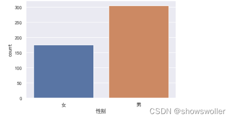
sns.countplot(x = '性别', order = ['女', '男'],data = df)Draw a histogram of counts by subject

- sns.set_style('whitegrid')
- sns.set(rc={'figure.figsize':(16,8)},font=myfont.get_name(),font_scale=1.5)
- sns.countplot(x = '科目', data = df)
Draw a histogram of counts of different grades by subject

Plot a histogram of counts by gender and grade

sns.countplot(x = '性别', hue = '成绩',data = df, order = ['女', '男'], hue_order = ['L', 'M', 'H'])View grade distribution ratio by class
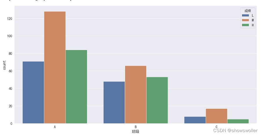
- sns.countplot(x = '班级', hue='成绩', data=df, hue_order = ['L','M','H'])
- # 从这里可以看出虽然每个班人数较少,但是没有那个班优秀的人数的比例比较突出,这个特征可以删除
Analyze the correlation between 4 performance and grades

- # 了解四个课堂和课后表现与成绩的相关性
- fig, axes = plt.subplots(2,2,figsize=(14,10))
- sns.barplot(x='成绩', y='浏览课件次数',data=df,order=['L','M','H'],ax=axes[0,0])
- sns.barplot(x='成绩', y='浏览公告次数',data=df,order=['L','M','H'],ax=axes[0,1])
- sns.barplot(x='成绩', y='举手次数',data=df,order=['L','M','H'],ax=axes[1,0])
- sns.barplot(x='成绩', y='讨论次数',data=df,order=['L','M','H'],ax=axes[1,1])
- # 在sns.barplot中,默认的计算方式为计算平均值
Analyze the discussion of students with different grades

- # 了解举手次数与成绩之间的相关性
- sns.set(rc={'figure.figsize':(8,6)},font=myfont.get_name(),font_scale=1.5)
- sns.boxplot(x='成绩',y='讨论次数',data=df,order=['L','M','H'])
Analyze the correlation between the number of hands raised and the number of discussions participated

- # 了解四个课堂后量化表现之间的相关性
- # fig,axes = plt.subplots(2,1,figsize=(10,10))
- sns.regplot(x='举手次数',y='讨论次数',order =4,data=df)
- # sns.regplot(x='浏览公告次数',y='浏览课件次数',order=4,data=df,ax=axes[1]) ,ax=axes[0]
Analyze the correlation between the number of times of browsing courseware, the number of times of raising hands, the number of times of browsing announcements, and the number of discussions

- # Correlation Matrix 相关性矩阵
- corr = df[['浏览课件次数','举手次数','浏览公告次数','讨论次数']].corr()
- corr
Finally, visualize the correlation matrix with a heat map
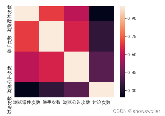
- # Correlation Matrix Visualization 相关性可视化
- sns.heatmap(corr,xticklabels=corr.columns,yticklabels=corr.columns)
It's not easy to create and find it helpful, please like, follow and collect~~~
Category of website: technical article > Blog
Author:Disheartened
link:http://www.pythonblackhole.com/blog/article/79525/0abb96e7708654d11e86/
source:python black hole net
Please indicate the source for any form of reprinting. If any infringement is discovered, it will be held legally responsible.
name:
Comment content: (supports up to 255 characters)
no articles