
Python画图常用代码总结,这20个画图代码现拿现用
posted on 2023-06-03 19:55 read(564) comment(0) like(2) collect(2)
Table of contents
3. Scatter plot with line of best fit for linear regression
12. Divergent package point map
13. Marked divergent lollipop chart
20. Histogram of continuous variables
foreword
Summary of commonly used codes for Python drawing, ready to use! Summary of commonly used codes for Python drawing, ready to use!
Hello everyone, today I would like to share with you a summary of 20 Matplotlib graphs, which are very useful in data analysis and visualization, and you can collect them and practice slowly.
1. Scatter plot
Scatteplot is a classic and fundamental plot for studying the relationship between two variables. If you have multiple groups in your data, you may want to visualize each group in a different color. In Matplotlib, you can conveniently use .
-
- # Import dataset
- midwest = pd.read_csv("https://raw.githubusercontent.com/selva86/datasets/master/midwest_filter.csv")
-
- # Prepare Data
- # Create as many colors as there are unique midwest['category']
- categories = np.unique(midwest['category'])
- colors = [plt.cm.tab10(i/float(len(categories)-1)) for i in range(len(categories))]
-
- # Draw Plot for Each Category
- plt.figure(figsize=(16, 10), dpi= 80, facecolor='w', edgecolor='k')
-
- for i, category in enumerate(categories):
- plt.scatter('area', 'poptotal',
- data=midwest.loc[midwest.category==category, :],
- s=20, c=colors[i], label=str(category))
-
- # Decorations
- plt.gca().set(xlim=(0.0, 0.1), ylim=(0, 90000),
- xlabel='Area', ylabel='Population')
-
- plt.xticks(fontsize=12); plt.yticks(fontsize=12)
- plt.title("Scatterplot of Midwest Area vs Population", fontsize=22)
- plt.legend(fontsize=12)
- plt.show()

plan:

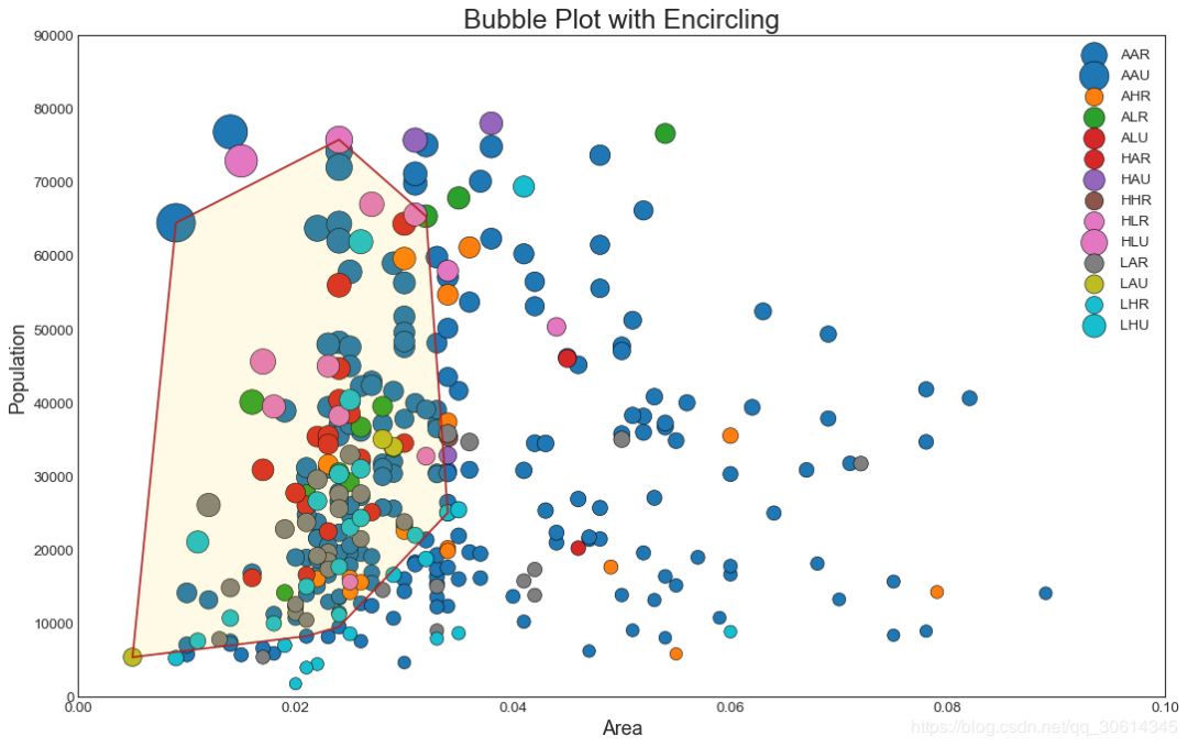
2. Bubble chart with border
Sometimes, you want to display a group of points within a boundary to emphasize their importance. In this example, you are taking the records from the dataframe that should be wrapped and passing it the records described in the code below. encircle()
- from matplotlib import patches
- from scipy.spatial import ConvexHull
- import warnings; warnings.simplefilter('ignore')
- sns.set_style("white")
-
- # Step 1: Prepare Data
- midwest = pd.read_csv("https://raw.githubusercontent.com/selva86/datasets/master/midwest_filter.csv")
-
- # As many colors as there are unique midwest['category']
- categories = np.unique(midwest['category'])
- colors = [plt.cm.tab10(i/float(len(categories)-1)) for i in range(len(categories))]
-
- # Step 2: Draw Scatterplot with unique color for each category
- fig = plt.figure(figsize=(16, 10), dpi= 80, facecolor='w', edgecolor='k')
-
- for i, category in enumerate(categories):
- plt.scatter('area', 'poptotal', data=midwest.loc[midwest.category==category, :], s='dot_size', c=colors[i], label=str(category), edgecolors='black', linewidths=.5)
-
- # Step 3: Encircling
- # https://stackoverflow.com/questions/44575681/how-do-i-encircle-different-data-sets-in-scatter-plot
- def encircle(x,y, ax=None, **kw):
- if not ax: ax=plt.gca()
- p = np.c_[x,y]
- hull = ConvexHull(p)
- poly = plt.Polygon(p[hull.vertices,:], **kw)
- ax.add_patch(poly)
-
- # Select data to be encircled
- midwest_encircle_data = midwest.loc[midwest.state=='IN', :]
-
- # Draw polygon surrounding vertices
- encircle(midwest_encircle_data.area, midwest_encircle_data.poptotal, ec="k", fc="gold", alpha=0.1)
- encircle(midwest_encircle_data.area, midwest_encircle_data.poptotal, ec="firebrick", fc="none", linewidth=1.5)
-
- # Step 4: Decorations
- plt.gca().set(xlim=(0.0, 0.1), ylim=(0, 90000),
- xlabel='Area', ylabel='Population')
-
- plt.xticks(fontsize=12); plt.yticks(fontsize=12)
- plt.title("Bubble Plot with Encircling", fontsize=22)
- plt.legend(fontsize=12)
- plt.show()
plan:
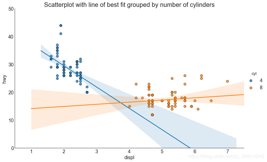
3. Scatter plot with line of best fit for linear regression
If you want to understand how two variables change each other, then the line of best fit is the way to go. The following plot shows the difference in the lines of best fit between the groups in the data. To disable grouping and draw only one line of best fit for the entire dataset, remove the argument from the call below.
- # Import Data
- df = pd.read_csv("https://raw.githubusercontent.com/selva86/datasets/master/mpg_ggplot2.csv")
- df_select = df.loc[df.cyl.isin([4,8]), :]
-
- # Plot
- sns.set_style("white")
- gridobj = sns.lmplot(x="displ", y="hwy", hue="cyl", data=df_select,
- height=7, aspect=1.6, robust=True, palette='tab10',
- scatter_kws=dict(s=60, linewidths=.7, edgecolors='black'))
-
- # Decorations
- gridobj.set(xlim=(0.5, 7.5), ylim=(0, 50))
- plt.title("Scatterplot with line of best fit grouped by number of cylinders", fontsize=20)
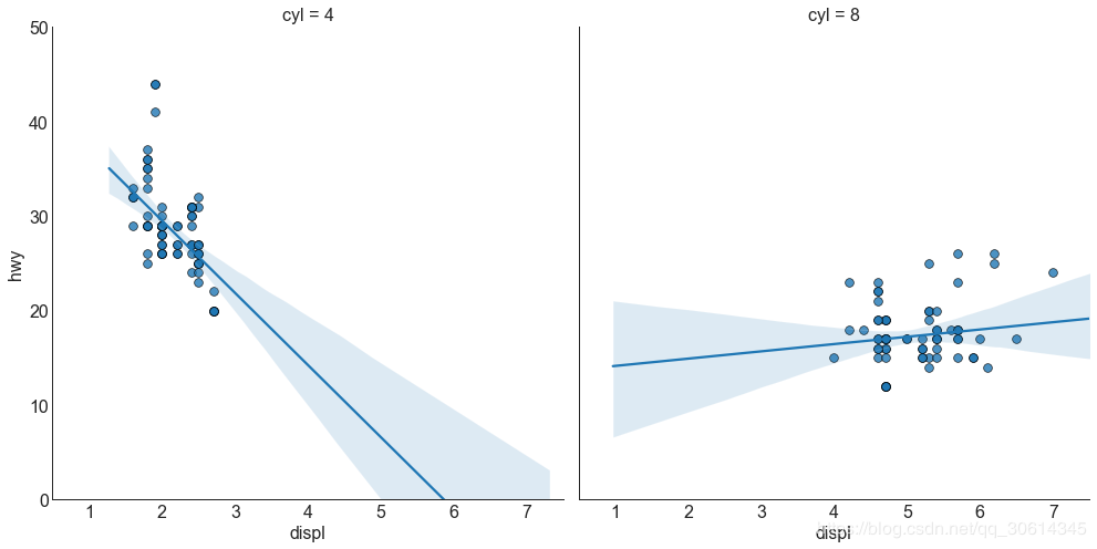
Each regression line is in its own column
Alternatively, you can display the line of best fit for each group in its own column. You can do this by setting parameters in it.
- # Import Data
- df = pd.read_csv("https://raw.githubusercontent.com/selva86/datasets/master/mpg_ggplot2.csv")
- df_select = df.loc[df.cyl.isin([4,8]), :]
-
- # Each line in its own column
- sns.set_style("white")
- gridobj = sns.lmplot(x="displ", y="hwy",
- data=df_select,
- height=7,
- robust=True,
- palette='Set1',
- col="cyl",
- scatter_kws=dict(s=60, linewidths=.7, edgecolors='black'))
-
- # Decorations
- gridobj.set(xlim=(0.5, 7.5), ylim=(0, 50))
- plt.show()
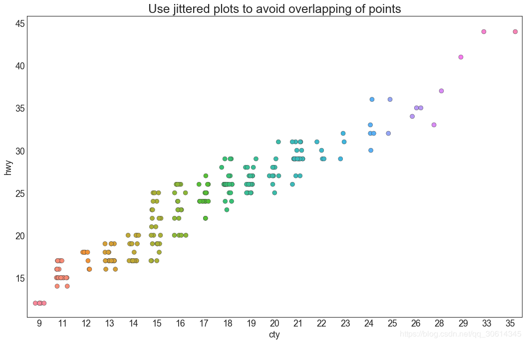
4. Jitter diagram
Often, multiple data points have the exact same X and Y values. As a result, multiple points are drawn over each other and hidden. To avoid this, it's handy to jitter a bit so you can see them visually.
- # Import Data
- df = pd.read_csv("https://raw.githubusercontent.com/selva86/datasets/master/mpg_ggplot2.csv")
-
- # Draw Stripplot
- fig, ax = plt.subplots(figsize=(16,10), dpi= 80)
- sns.stripplot(df.cty, df.hwy, jitter=0.25, size=8, ax=ax, linewidth=.5)
-
- # Decorations
- plt.title('Use jittered plots to avoid overlapping of points', fontsize=22)
- plt.show()
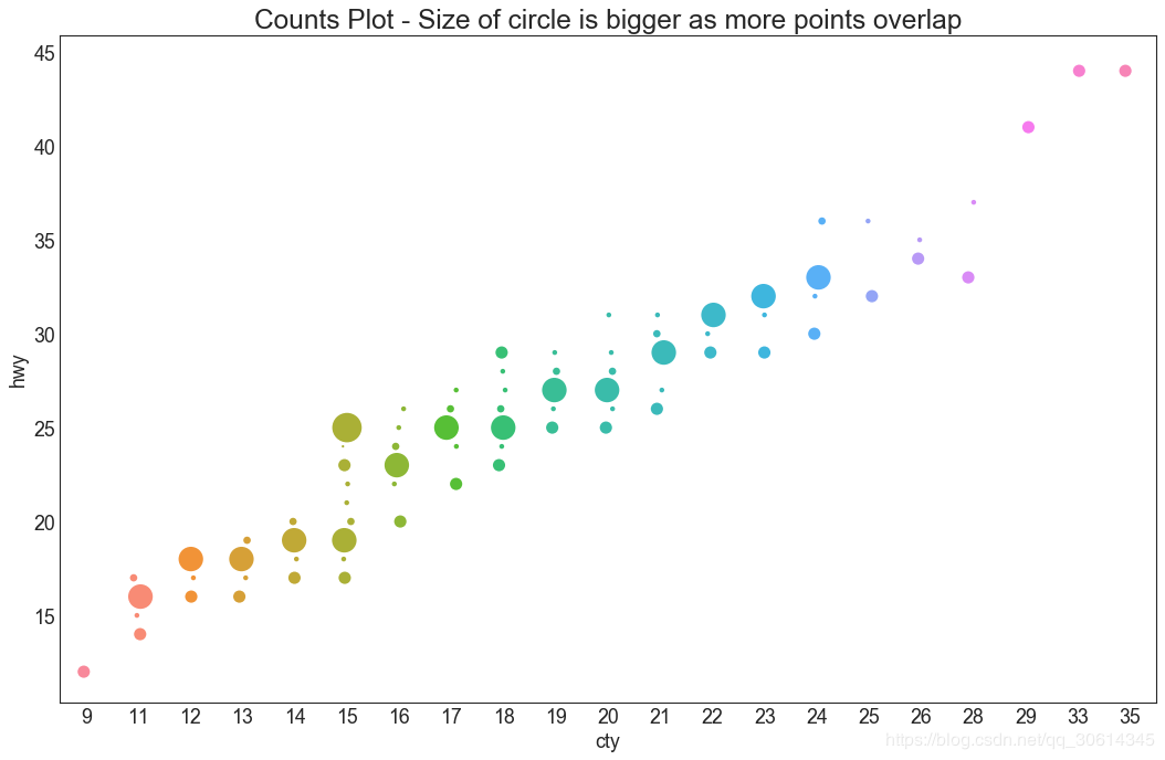
5. Count chart
Another option to avoid the point overlapping problem is to increase the point size, depending on how many points are in that point. Therefore, the larger the point size, the greater the concentration of surrounding points.
- # Import Data
- df = pd.read_csv("https://raw.githubusercontent.com/selva86/datasets/master/mpg_ggplot2.csv")
- df_counts = df.groupby(['hwy', 'cty']).size().reset_index(name='counts')
-
- # Draw Stripplot
- fig, ax = plt.subplots(figsize=(16,10), dpi= 80)
- sns.stripplot(df_counts.cty, df_counts.hwy, size=df_counts.counts*2, ax=ax)
-
- # Decorations
- plt.title('Counts Plot - Size of circle is bigger as more points overlap', fontsize=22)
- plt.show()
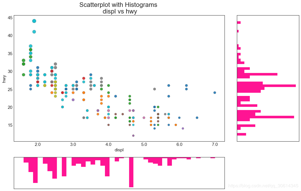
6. Edge histogram
A marginal histogram has a histogram of variables along the X and Y axes. This is used to visualize the relationship between X and Y as well as the univariate distribution of X and Y alone. This graph if often used in exploratory data analysis (EDA).
- # Import Data
- df = pd.read_csv("https://raw.githubusercontent.com/selva86/datasets/master/mpg_ggplot2.csv")
-
- # Create Fig and gridspec
- fig = plt.figure(figsize=(16, 10), dpi= 80)
- grid = plt.GridSpec(4, 4, hspace=0.5, wspace=0.2)
-
- # Define the axes
- ax_main = fig.add_subplot(grid[:-1, :-1])
- ax_right = fig.add_subplot(grid[:-1, -1], xticklabels=[], yticklabels=[])
- ax_bottom = fig.add_subplot(grid[-1, 0:-1], xticklabels=[], yticklabels=[])
-
- # Scatterplot on main ax
- ax_main.scatter('displ', 'hwy', s=df.cty*4, c=df.manufacturer.astype('category').cat.codes, alpha=.9, data=df, cmap="tab10", edgecolors='gray', linewidths=.5)
-
- # histogram on the right
- ax_bottom.hist(df.displ, 40, histtype='stepfilled', orientation='vertical', color='deeppink')
- ax_bottom.invert_yaxis()
-
- # histogram in the bottom
- ax_right.hist(df.hwy, 40, histtype='stepfilled', orientation='horizontal', color='deeppink')
-
- # Decorations
- ax_main.set(title='Scatterplot with Histograms
- displ vs hwy', xlabel='displ', ylabel='hwy')
- ax_main.title.set_fontsize(20)
- for item in ([ax_main.xaxis.label, ax_main.yaxis.label] + ax_main.get_xticklabels() + ax_main.get_yticklabels()):
- item.set_fontsize(14)
-
- xlabels = ax_main.get_xticks().tolist()
- ax_main.set_xticklabels(xlabels)
- plt.show()
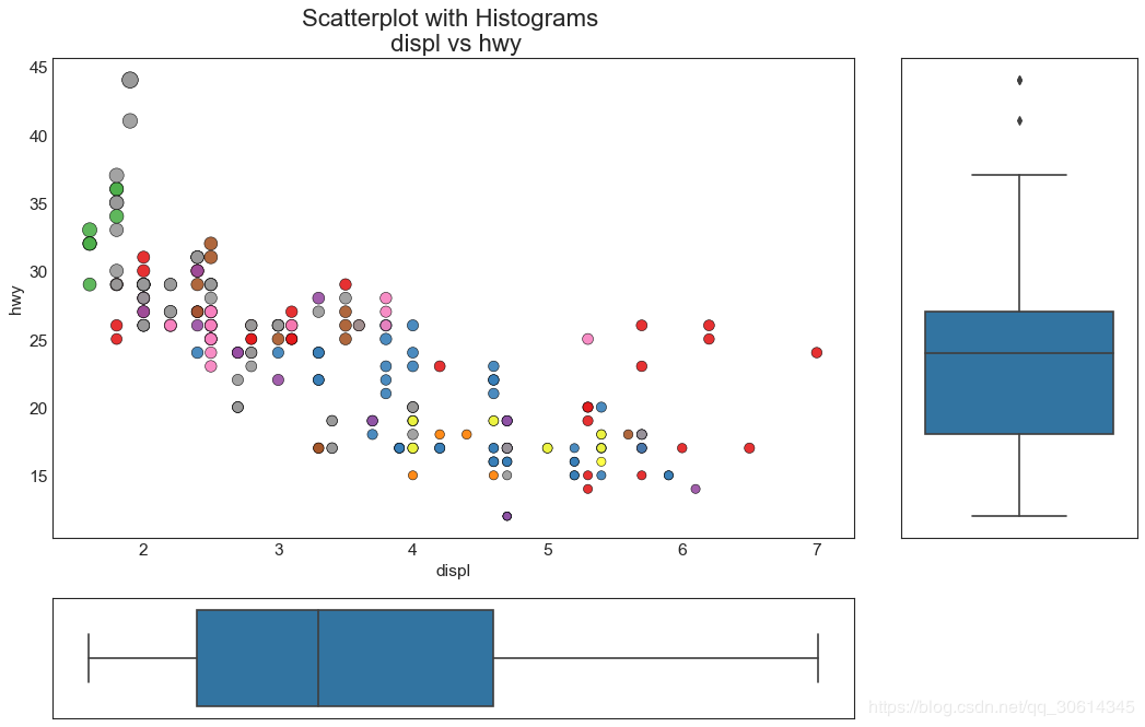
7. Edge box plot
Marginal boxplots serve a similar purpose to marginal histograms. However, boxplots are helpful in pinpointing the X and Y medians, 25th and 75th percentiles.
- # Import Data
- df = pd.read_csv("https://raw.githubusercontent.com/selva86/datasets/master/mpg_ggplot2.csv")
-
- # Create Fig and gridspec
- fig = plt.figure(figsize=(16, 10), dpi= 80)
- grid = plt.GridSpec(4, 4, hspace=0.5, wspace=0.2)
-
- # Define the axes
- ax_main = fig.add_subplot(grid[:-1, :-1])
- ax_right = fig.add_subplot(grid[:-1, -1], xticklabels=[], yticklabels=[])
- ax_bottom = fig.add_subplot(grid[-1, 0:-1], xticklabels=[], yticklabels=[])
-
- # Scatterplot on main ax
- ax_main.scatter('displ', 'hwy', s=df.cty*5, c=df.manufacturer.astype('category').cat.codes, alpha=.9, data=df, cmap="Set1", edgecolors='black', linewidths=.5)
-
- # Add a graph in each part
- sns.boxplot(df.hwy, ax=ax_right, orient="v")
- sns.boxplot(df.displ, ax=ax_bottom, orient="h")
-
- # Decorations ------------------
- # Remove x axis name for the boxplot
- ax_bottom.set(xlabel='')
- ax_right.set(ylabel='')
-
- # Main Title, Xlabel and YLabel
- ax_main.set(title='Scatterplot with Histograms
- displ vs hwy', xlabel='displ', ylabel='hwy')
-
- # Set font size of different components
- ax_main.title.set_fontsize(20)
- for item in ([ax_main.xaxis.label, ax_main.yaxis.label] + ax_main.get_xticklabels() + ax_main.get_yticklabels()):
- item.set_fontsize(14)
-
- plt.show()
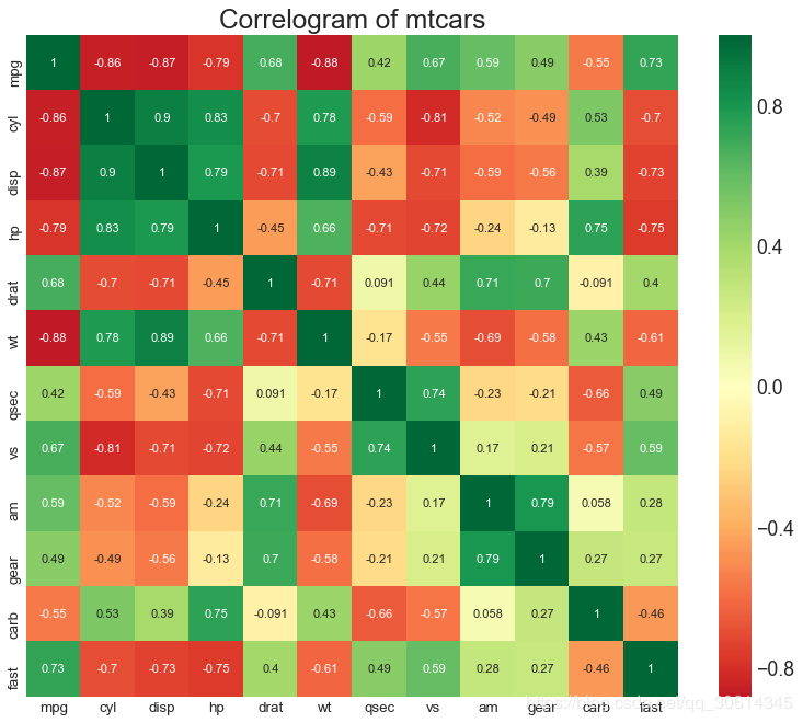
8. Correlation diagram
Correlogram is used to visualize the correlation measures between all possible pairs of numerical variables in a given data frame (or 2D array).
- # Import Dataset
- df = pd.read_csv("https://github.com/selva86/datasets/raw/master/mtcars.csv")
-
- # Plot
- plt.figure(figsize=(12,10), dpi= 80)
- sns.heatmap(df.corr(), xticklabels=df.corr().columns, yticklabels=df.corr().columns, cmap='RdYlGn', center=0, annot=True)
-
- # Decorations
- plt.title('Correlogram of mtcars', fontsize=22)
- plt.xticks(fontsize=12)
- plt.yticks(fontsize=12)
- plt.show()
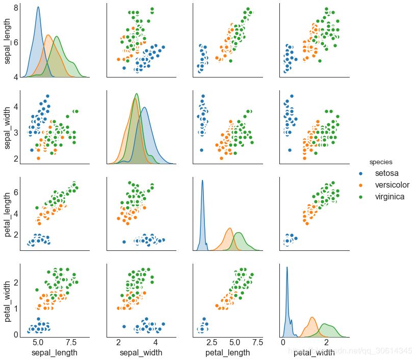
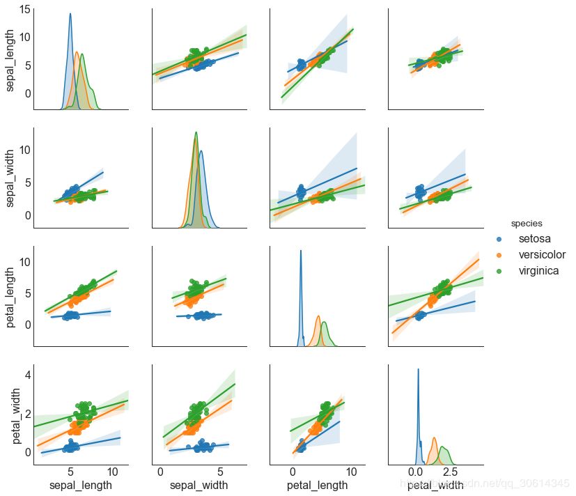
9. Matrix diagram
Pairplots are a favorite in exploratory analysis to understand the relationship between all possible pairs of numeric variables. It is an essential tool for bivariate analysis.
- # Load Dataset
- df = sns.load_dataset('iris')
-
- # Plot
- plt.figure(figsize=(10,8), dpi= 80)
- sns.pairplot(df, kind="scatter", hue="species", plot_kws=dict(s=80, edgecolor="white", linewidth=2.5))
- plt.show()
- # Load Dataset
- df = sns.load_dataset('iris')
-
- # Plot
- plt.figure(figsize=(10,8), dpi= 80)
- sns.pairplot(df, kind="reg", hue="species")
- plt.show()
10. Divergent bar chart
Divergence bars are a great tool if you want to see how items have changed based on a single metric, and visualize the order and magnitude of this difference. It helps to quickly differentiate the performance of groups in the data and is very intuitive and communicates this immediately.
- # Prepare Data
- df = pd.read_csv("https://github.com/selva86/datasets/raw/master/mtcars.csv")
- x = df.loc[:, ['mpg']]
- df['mpg_z'] = (x - x.mean())/x.std()
- df['colors'] = ['red' if x < 0 else 'green' for x in df['mpg_z']]
- df.sort_values('mpg_z', inplace=True)
- df.reset_index(inplace=True)
-
- # Draw plot
- plt.figure(figsize=(14,10), dpi= 80)
- plt.hlines(y=df.index, xmin=0, xmax=df.mpg_z, color=df.colors, alpha=0.4, linewidth=5)
-
- # Decorations
- plt.gca().set(ylabel='$Model$', xlabel='$Mileage$')
- plt.yticks(df.index, df.cars, fontsize=12)
- plt.title('Diverging Bars of Car Mileage', fontdict={'size':20})
- plt.grid(linestyle='--', alpha=0.5)
- plt.show()

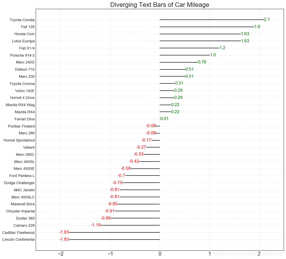
11. Divergent text
Scattered text is similar to diverging bars, it's preferred if you want to show the value of each item in the chart in a nice and presentable way.
- # Prepare Data
- df = pd.read_csv("https://github.com/selva86/datasets/raw/master/mtcars.csv")
- x = df.loc[:, ['mpg']]
- df['mpg_z'] = (x - x.mean())/x.std()
- df['colors'] = ['red' if x < 0 else 'green' for x in df['mpg_z']]
- df.sort_values('mpg_z', inplace=True)
- df.reset_index(inplace=True)
-
- # Draw plot
- plt.figure(figsize=(14,14), dpi= 80)
- plt.hlines(y=df.index, xmin=0, xmax=df.mpg_z)
- for x, y, tex in zip(df.mpg_z, df.index, df.mpg_z):
- t = plt.text(x, y, round(tex, 2), horizontalalignment='right' if x < 0 else 'left',
- verticalalignment='center', fontdict={'color':'red' if x < 0 else 'green', 'size':14})
-
- # Decorations
- plt.yticks(df.index, df.cars, fontsize=12)
- plt.title('Diverging Text Bars of Car Mileage', fontdict={'size':20})
- plt.grid(linestyle='--', alpha=0.5)
- plt.xlim(-2.5, 2.5)
- plt.show()
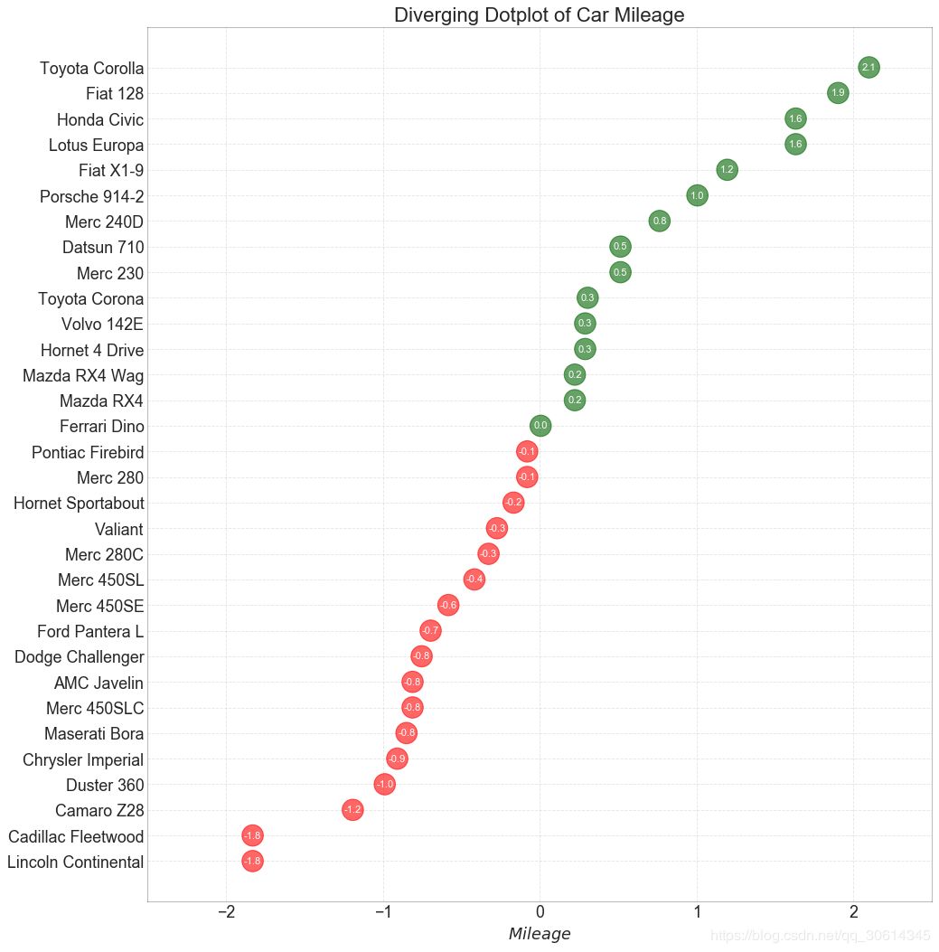
12. Divergent package point map
A divergence point plot is also similar to a divergence bar. However, the absence of bars reduces contrast and differences between groups compared to diverging bars.
- # Prepare Data
- df = pd.read_csv("https://github.com/selva86/datasets/raw/master/mtcars.csv")
- x = df.loc[:, ['mpg']]
- df['mpg_z'] = (x - x.mean())/x.std()
- df['colors'] = ['red' if x < 0 else 'darkgreen' for x in df['mpg_z']]
- df.sort_values('mpg_z', inplace=True)
- df.reset_index(inplace=True)
-
- # Draw plot
- plt.figure(figsize=(14,16), dpi= 80)
- plt.scatter(df.mpg_z, df.index, s=450, alpha=.6, color=df.colors)
- for x, y, tex in zip(df.mpg_z, df.index, df.mpg_z):
- t = plt.text(x, y, round(tex, 1), horizontalalignment='center',
- verticalalignment='center', fontdict={'color':'white'})
-
- # Decorations
- # Lighten borders
- plt.gca().spines["top"].set_alpha(.3)
- plt.gca().spines["bottom"].set_alpha(.3)
- plt.gca().spines["right"].set_alpha(.3)
- plt.gca().spines["left"].set_alpha(.3)
-
- plt.yticks(df.index, df.cars)
- plt.title('Diverging Dotplot of Car Mileage', fontdict={'size':20})
- plt.xlabel('$Mileage$')
- plt.grid(linestyle='--', alpha=0.5)
- plt.xlim(-2.5, 2.5)
- plt.show()
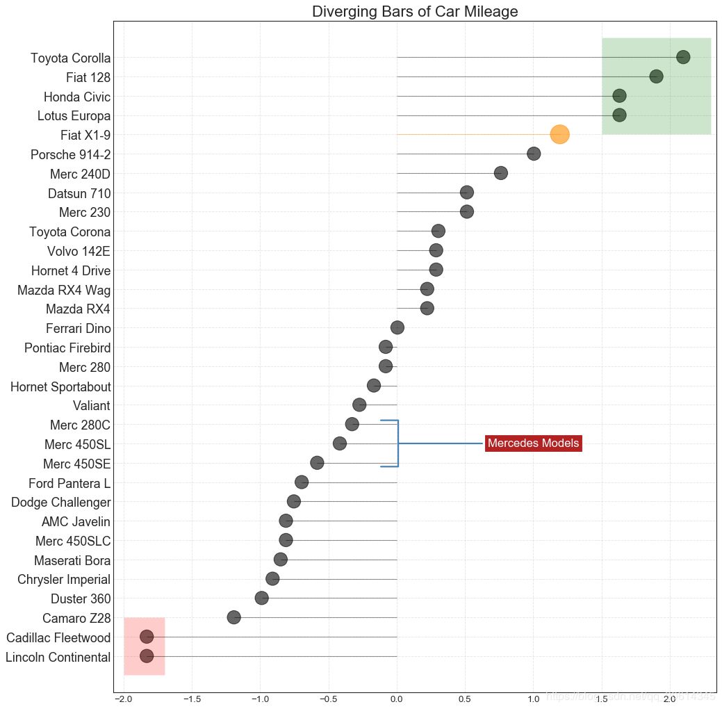
13. Marked divergent lollipop chart
Marked lollipops provide a flexible way to visualize divergence by highlighting any important data points you want to draw attention to and giving reasoning appropriately in the graph.
- # Prepare Data
- df = pd.read_csv("https://github.com/selva86/datasets/raw/master/mtcars.csv")
- x = df.loc[:, ['mpg']]
- df['mpg_z'] = (x - x.mean())/x.std()
- df['colors'] = 'black'
-
- # color fiat differently
- df.loc[df.cars == 'Fiat X1-9', 'colors'] = 'darkorange'
- df.sort_values('mpg_z', inplace=True)
- df.reset_index(inplace=True)
-
-
- # Draw plot
- import matplotlib.patches as patches
-
- plt.figure(figsize=(14,16), dpi= 80)
- plt.hlines(y=df.index, xmin=0, xmax=df.mpg_z, color=df.colors, alpha=0.4, linewidth=1)
- plt.scatter(df.mpg_z, df.index, color=df.colors, s=[600 if x == 'Fiat X1-9' else 300 for x in df.cars], alpha=0.6)
- plt.yticks(df.index, df.cars)
- plt.xticks(fontsize=12)
-
- # Annotate
- plt.annotate('Mercedes Models', xy=(0.0, 11.0), xytext=(1.0, 11), xycoords='data',
- fontsize=15, ha='center', va='center',
- bbox=dict(boxstyle='square', fc='firebrick'),
- arrowprops=dict(arrowstyle='-[, widthB=2.0, lengthB=1.5', lw=2.0, color='steelblue'), color='white')
-
- # Add Patches
- p1 = patches.Rectangle((-2.0, -1), width=.3, height=3, alpha=.2, facecolor='red')
- p2 = patches.Rectangle((1.5, 27), width=.8, height=5, alpha=.2, facecolor='green')
- plt.gca().add_patch(p1)
- plt.gca().add_patch(p2)
-
- # Decorate
- plt.title('Diverging Bars of Car Mileage', fontdict={'size':20})
- plt.grid(linestyle='--', alpha=0.5)
- plt.show()
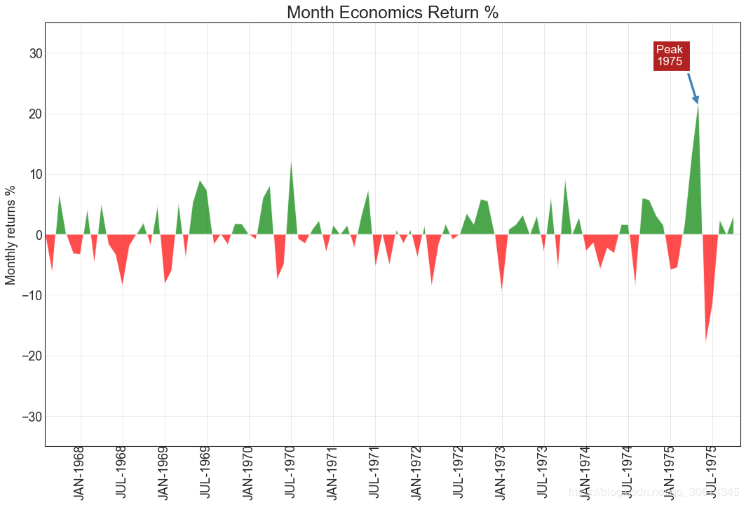
14. Area chart
By coloring the area between the axes and lines, area charts emphasize not only peaks and troughs, but also the duration of highs and lows. The longer the high lasts, the larger the area below the line.
- import numpy as np
- import pandas as pd
-
- # Prepare Data
- df = pd.read_csv("https://github.com/selva86/datasets/raw/master/economics.csv", parse_dates=['date']).head(100)
- x = np.arange(df.shape[0])
- y_returns = (df.psavert.diff().fillna(0)/df.psavert.shift(1)).fillna(0) * 100
-
- # Plot
- plt.figure(figsize=(16,10), dpi= 80)
- plt.fill_between(x[1:], y_returns[1:], 0, where=y_returns[1:] >= 0, facecolor='green', interpolate=True, alpha=0.7)
- plt.fill_between(x[1:], y_returns[1:], 0, where=y_returns[1:] <= 0, facecolor='red', interpolate=True, alpha=0.7)
-
- # Annotate
- plt.annotate('Peak
- 1975', xy=(94.0, 21.0), xytext=(88.0, 28),
- bbox=dict(boxstyle='square', fc='firebrick'),
- arrowprops=dict(facecolor='steelblue', shrink=0.05), fontsize=15, color='white')
-
-
- # Decorations
- xtickvals = [str(m)[:3].upper()+"-"+str(y) for y,m in zip(df.date.dt.year, df.date.dt.month_name())]
- plt.gca().set_xticks(x[::6])
- plt.gca().set_xticklabels(xtickvals[::6], rotation=90, fontdict={'horizontalalignment': 'center', 'verticalalignment': 'center_baseline'})
- plt.ylim(-35,35)
- plt.xlim(1,100)
- plt.title("Month Economics Return %", fontsize=22)
- plt.ylabel('Monthly returns %')
- plt.grid(alpha=0.5)
- plt.show()
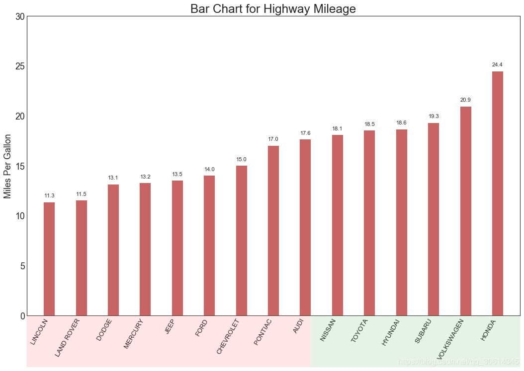
15. Ordered bar chart
An ordered bar chart effectively communicates the ranking order of items. However, by adding the value of the metric above the graph, the user can get precise information from the graph itself.
- # Prepare Data
- df_raw = pd.read_csv("https://github.com/selva86/datasets/raw/master/mpg_ggplot2.csv")
- df = df_raw[['cty', 'manufacturer']].groupby('manufacturer').apply(lambda x: x.mean())
- df.sort_values('cty', inplace=True)
- df.reset_index(inplace=True)
-
- # Draw plot
- import matplotlib.patches as patches
-
- fig, ax = plt.subplots(figsize=(16,10), facecolor='white', dpi= 80)
- ax.vlines(x=df.index, ymin=0, ymax=df.cty, color='firebrick', alpha=0.7, linewidth=20)
-
- # Annotate Text
- for i, cty in enumerate(df.cty):
- ax.text(i, cty+0.5, round(cty, 1), horizontalalignment='center')
-
-
- # Title, Label, Ticks and Ylim
- ax.set_title('Bar Chart for Highway Mileage', fontdict={'size':22})
- ax.set(ylabel='Miles Per Gallon', ylim=(0, 30))
- plt.xticks(df.index, df.manufacturer.str.upper(), rotation=60, horizontalalignment='right', fontsize=12)
-
- # Add patches to color the X axis labels
- p1 = patches.Rectangle((.57, -0.005), width=.33, height=.13, alpha=.1, facecolor='green', transform=fig.transFigure)
- p2 = patches.Rectangle((.124, -0.005), width=.446, height=.13, alpha=.1, facecolor='red', transform=fig.transFigure)
- fig.add_artist(p1)
- fig.add_artist(p2)
- plt.show()
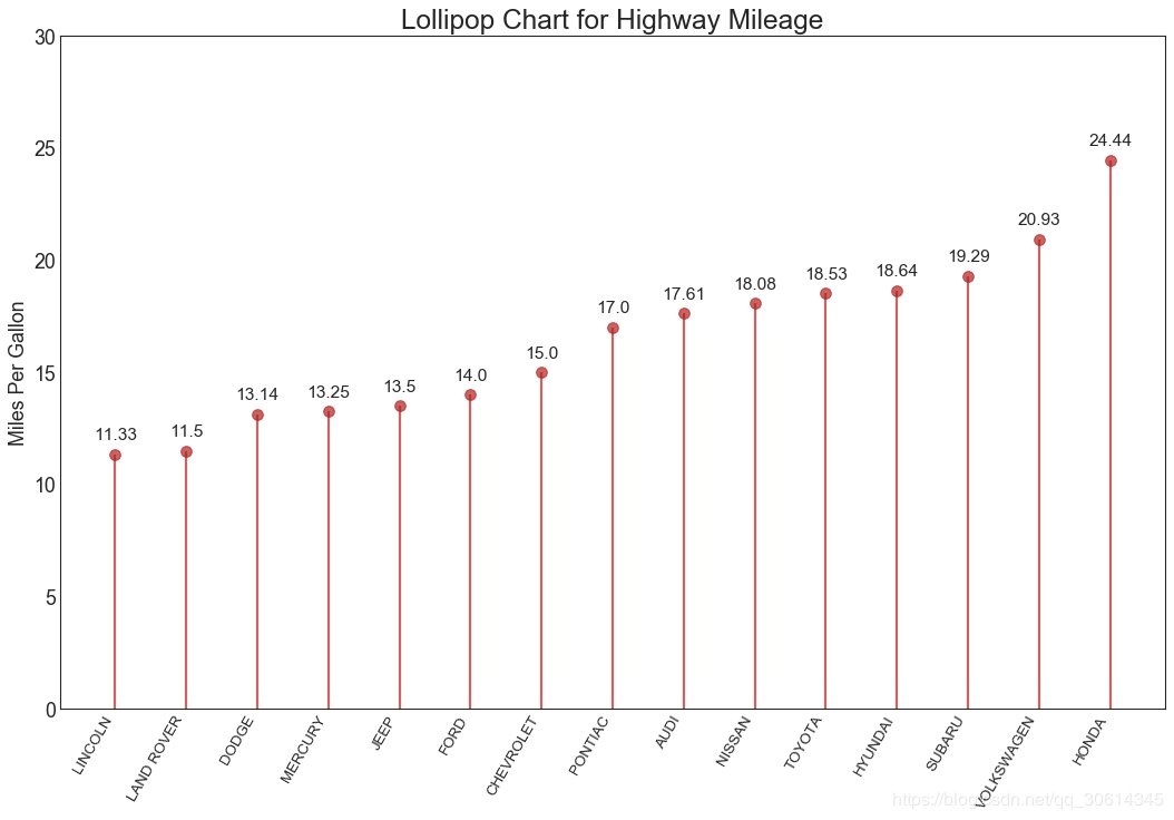
16. Lollipop map
Lollipop charts serve a similar purpose to ordered bar charts in a visually pleasing manner.
- # Prepare Data
- df_raw = pd.read_csv("https://github.com/selva86/datasets/raw/master/mpg_ggplot2.csv")
- df = df_raw[['cty', 'manufacturer']].groupby('manufacturer').apply(lambda x: x.mean())
- df.sort_values('cty', inplace=True)
- df.reset_index(inplace=True)
-
- # Draw plot
- fig, ax = plt.subplots(figsize=(16,10), dpi= 80)
- ax.vlines(x=df.index, ymin=0, ymax=df.cty, color='firebrick', alpha=0.7, linewidth=2)
- ax.scatter(x=df.index, y=df.cty, s=75, color='firebrick', alpha=0.7)
-
- # Title, Label, Ticks and Ylim
- ax.set_title('Lollipop Chart for Highway Mileage', fontdict={'size':22})
- ax.set_ylabel('Miles Per Gallon')
- ax.set_xticks(df.index)
- ax.set_xticklabels(df.manufacturer.str.upper(), rotation=60, fontdict={'horizontalalignment': 'right', 'size':12})
- ax.set_ylim(0, 30)
-
- # Annotate
- for row in df.itertuples():
- ax.text(row.Index, row.cty+.5, s=round(row.cty, 2), horizontalalignment= 'center', verticalalignment='bottom', fontsize=14)
-
- plt.show()
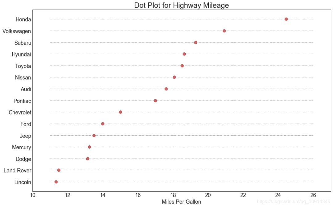
17. Package map
The dot chart conveys the rank order of the items. Since it's aligned along the horizontal axis, you can more easily see how far the points are from each other.
- # Prepare Data
- df_raw = pd.read_csv("https://github.com/selva86/datasets/raw/master/mpg_ggplot2.csv")
- df = df_raw[['cty', 'manufacturer']].groupby('manufacturer').apply(lambda x: x.mean())
- df.sort_values('cty', inplace=True)
- df.reset_index(inplace=True)
-
- # Draw plot
- fig, ax = plt.subplots(figsize=(16,10), dpi= 80)
- ax.hlines(y=df.index, xmin=11, xmax=26, color='gray', alpha=0.7, linewidth=1, linestyles='dashdot')
- ax.scatter(y=df.index, x=df.cty, s=75, color='firebrick', alpha=0.7)
-
- # Title, Label, Ticks and Ylim
- ax.set_title('Dot Plot for Highway Mileage', fontdict={'size':22})
- ax.set_xlabel('Miles Per Gallon')
- ax.set_yticks(df.index)
- ax.set_yticklabels(df.manufacturer.str.title(), fontdict={'horizontalalignment': 'right'})
- ax.set_xlim(10, 27)
- plt.show()
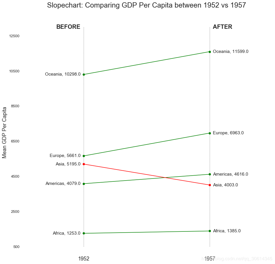
18. Slope map
Slope charts are best for comparing the "before" and "after" positions of a given person/item.
- import matplotlib.lines as mlines
- # Import Data
- df = pd.read_csv("https://raw.githubusercontent.com/selva86/datasets/master/gdppercap.csv")
-
- left_label = [str(c) + ', '+ str(round(y)) for c, y in zip(df.continent, df['1952'])]
- right_label = [str(c) + ', '+ str(round(y)) for c, y in zip(df.continent, df['1957'])]
- klass = ['red' if (y1-y2) < 0 else 'green' for y1, y2 in zip(df['1952'], df['1957'])]
-
- # draw line
- # https://stackoverflow.com/questions/36470343/how-to-draw-a-line-with-matplotlib/36479941
- def newline(p1, p2, color='black'):
- ax = plt.gca()
- l = mlines.Line2D([p1[0],p2[0]], [p1[1],p2[1]], color='red' if p1[1]-p2[1] > 0 else 'green', marker='o', markersize=6)
- ax.add_line(l)
- return l
-
- fig, ax = plt.subplots(1,1,figsize=(14,14), dpi= 80)
-
- # Vertical Lines
- ax.vlines(x=1, ymin=500, ymax=13000, color='black', alpha=0.7, linewidth=1, linestyles='dotted')
- ax.vlines(x=3, ymin=500, ymax=13000, color='black', alpha=0.7, linewidth=1, linestyles='dotted')
-
- # Points
- ax.scatter(y=df['1952'], x=np.repeat(1, df.shape[0]), s=10, color='black', alpha=0.7)
- ax.scatter(y=df['1957'], x=np.repeat(3, df.shape[0]), s=10, color='black', alpha=0.7)
-
- # Line Segmentsand Annotation
- for p1, p2, c in zip(df['1952'], df['1957'], df['continent']):
- newline([1,p1], [3,p2])
- ax.text(1-0.05, p1, c + ', ' + str(round(p1)), horizontalalignment='right', verticalalignment='center', fontdict={'size':14})
- ax.text(3+0.05, p2, c + ', ' + str(round(p2)), horizontalalignment='left', verticalalignment='center', fontdict={'size':14})
-
- # 'Before' and 'After' Annotations
- ax.text(1-0.05, 13000, 'BEFORE', horizontalalignment='right', verticalalignment='center', fontdict={'size':18, 'weight':700})
- ax.text(3+0.05, 13000, 'AFTER', horizontalalignment='left', verticalalignment='center', fontdict={'size':18, 'weight':700})
-
- # Decoration
- ax.set_title("Slopechart: Comparing GDP Per Capita between 1952 vs 1957", fontdict={'size':22})
- ax.set(xlim=(0,4), ylim=(0,14000), ylabel='Mean GDP Per Capita')
- ax.set_xticks([1,3])
- ax.set_xticklabels(["1952", "1957"])
- plt.yticks(np.arange(500, 13000, 2000), fontsize=12)
-
- # Lighten borders
- plt.gca().spines["top"].set_alpha(.0)
- plt.gca().spines["bottom"].set_alpha(.0)
- plt.gca().spines["right"].set_alpha(.0)
- plt.gca().spines["left"].set_alpha(.0)
- plt.show()
19. Dumbbell diagram
The dumbbell diagram communicates the "front" and "back" positions of various items and the ordering of the items. It is useful if you want to visualize the impact of a particular project/plan on different objects.
- import matplotlib.lines as mlines
-
- # Import Data
- df = pd.read_csv("https://raw.githubusercontent.com/selva86/datasets/master/health.csv")
- df.sort_values('pct_2014', inplace=True)
- df.reset_index(inplace=True)
-
- # Func to draw line segment
- def newline(p1, p2, color='black'):
- ax = plt.gca()
- l = mlines.Line2D([p1[0],p2[0]], [p1[1],p2[1]], color='skyblue')
- ax.add_line(l)
- return l
-
- # Figure and Axes
- fig, ax = plt.subplots(1,1,figsize=(14,14), facecolor='#f7f7f7', dpi= 80)
-
- # Vertical Lines
- ax.vlines(x=.05, ymin=0, ymax=26, color='black', alpha=1, linewidth=1, linestyles='dotted')
- ax.vlines(x=.10, ymin=0, ymax=26, color='black', alpha=1, linewidth=1, linestyles='dotted')
- ax.vlines(x=.15, ymin=0, ymax=26, color='black', alpha=1, linewidth=1, linestyles='dotted')
- ax.vlines(x=.20, ymin=0, ymax=26, color='black', alpha=1, linewidth=1, linestyles='dotted')
-
- # Points
- ax.scatter(y=df['index'], x=df['pct_2013'], s=50, color='#0e668b', alpha=0.7)
- ax.scatter(y=df['index'], x=df['pct_2014'], s=50, color='#a3c4dc', alpha=0.7)
-
- # Line Segments
- for i, p1, p2 in zip(df['index'], df['pct_2013'], df['pct_2014']):
- newline([p1, i], [p2, i])
-
- # Decoration
- ax.set_facecolor('#f7f7f7')
- ax.set_title("Dumbell Chart: Pct Change - 2013 vs 2014", fontdict={'size':22})
- ax.set(xlim=(0,.25), ylim=(-1, 27), ylabel='Mean GDP Per Capita')
- ax.set_xticks([.05, .1, .15, .20])
- ax.set_xticklabels(['5%', '15%', '20%', '25%'])
- ax.set_xticklabels(['5%', '15%', '20%', '25%'])
- plt.show()

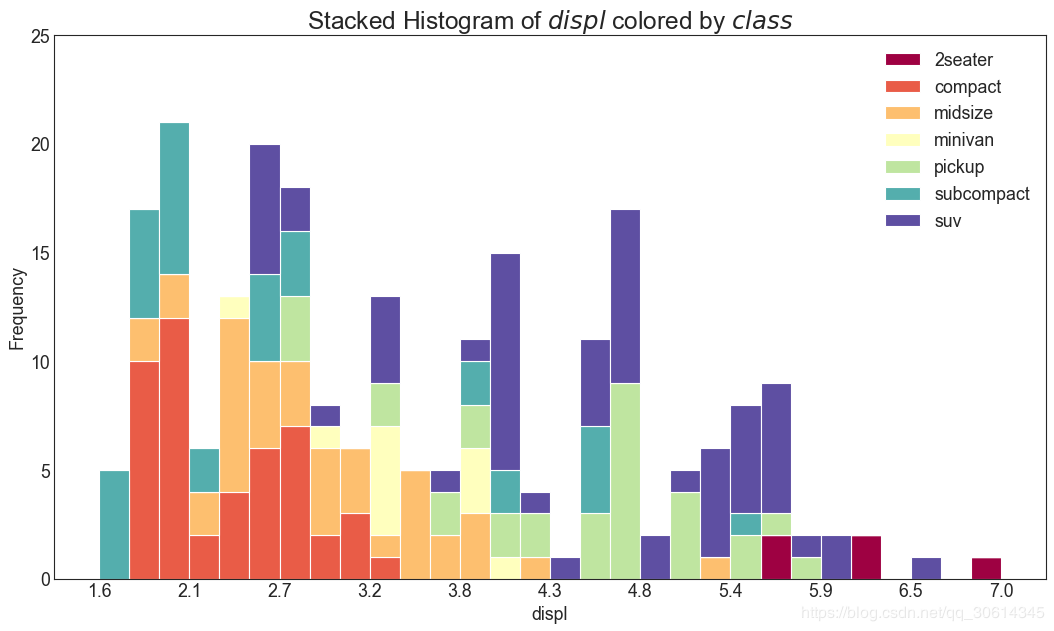
20. Histogram of continuous variables
A histogram shows the frequency distribution of a given variable. The representation below groups frequency bars based on categorical variables, allowing for better understanding of continuous and series variables.
- # Import Data
- df = pd.read_csv("https://github.com/selva86/datasets/raw/master/mpg_ggplot2.csv")
-
- # Prepare data
- x_var = 'displ'
- groupby_var = 'class'
- df_agg = df.loc[:, [x_var, groupby_var]].groupby(groupby_var)
- vals = [df[x_var].values.tolist() for i, df in df_agg]
-
- # Draw
- plt.figure(figsize=(16,9), dpi= 80)
- colors = [plt.cm.Spectral(i/float(len(vals)-1)) for i in range(len(vals))]
- n, bins, patches = plt.hist(vals, 30, stacked=True, density=False, color=colors[:len(vals)])
-
- # Decoration
- plt.legend({group:col for group, col in zip(np.unique(df[groupby_var]).tolist(), colors[:len(vals)])})
- plt.title(f"Stacked Histogram of ${x_var}$ colored by ${groupby_var}$", fontsize=22)
- plt.xlabel(x_var)
- plt.ylabel("Frequency")
- plt.ylim(0, 25)
- plt.xticks(ticks=bins[::3], labels=[round(b,1) for b in bins[::3]])
- plt.show()
Category of website: technical article > Blog
Author:python98k
link:http://www.pythonblackhole.com/blog/article/78488/4e69a8588b420c95a2aa/
source:python black hole net
Please indicate the source for any form of reprinting. If any infringement is discovered, it will be held legally responsible.
name:
Comment content: (supports up to 255 characters)