
Python visualization - detailed explanation of basic parameters of matplotlib.pyplot drawing
posted on 2023-05-07 20:22 read(868) comment(0) like(29) collect(4)
Table of contents
2. Function usage of graphic components
2.1. figure(): background color
2.2 xlim() and ylim(): Set the numerical display range of the x and y axes
2.3 xlabel() and ylabel(): Set the label text of the x and y axes
2.4 grid(): Draw the grid lines of the tick marks
2.5 axhline(): Draw a horizontal reference line parallel to the x-axis
2.6 axvspan(): Draw a reference area perpendicular to the x-axis
2.8 annotate(): Add point-to-point annotation text for graphic content details
2.9 bbox: add a frame to the title
2.10 . text(): A non-pointing comment text (watermark) that adds graphic content details
2.11. title(): Add the title of the graphic content
2.12. legend(): Mark the text label legend of different graphics
2.13 table(): add a table to the subgraph
4. The line style of the line chart
5. Commonly used color abbreviations
1. Introduction to matplotlib
The matplotlib library is a data visualization tool for drawing 2D and 3D charts in Python
Features:
Use simple drawing statements to achieve complex drawing effects Use
interactive operations to achieve progressively finer graphics effects
Use embedded LaTex to output charts, scientific expressions, and symbolic texts with printed grades
Realize fine-grained control over the constituent elements of charts
Three drawing interfaces
pyplot: face the current plot
axes: object-oriented
Pylab: follow the matlab style
This article uses plot drawing ( displaying the trend change of variables ) to display the basic parameters of the drawing, and uses the numpy library to obtain the drawing data (random). The final graphics are not carefully thought out, and everything is mainly to display the graphics parameters! ! !
Libraries used:
- import matplotlib.pyplot as plt
- import numpy as np
2. Function usage of graphic components
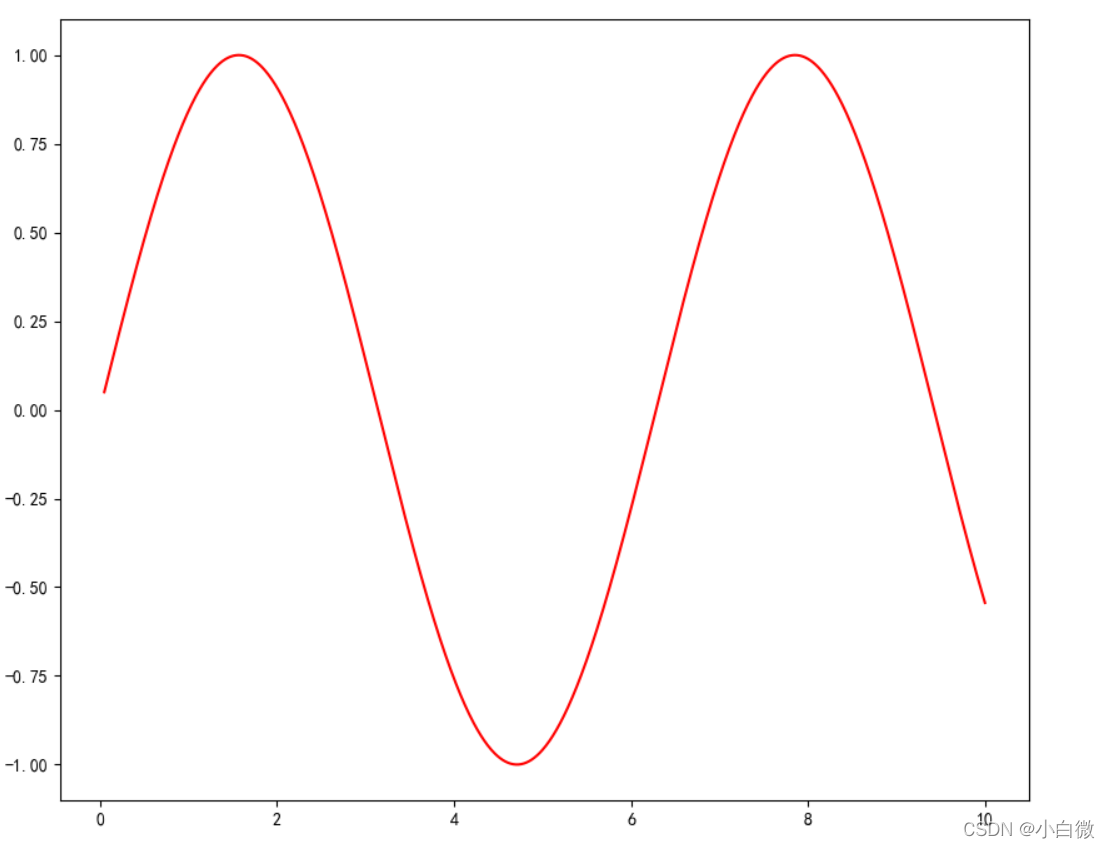
plot(): Display the trend change of variables
- plt.figure(figsize=(10, 10))
- x = np.linspace(0.05, 10, 1000) # 在0.05到10的区间中,等差选取1000个,端点不属于
- y = np.sin(x)
- plt.rcParams['font.sans-serif'] = ['SimHei']
- plt.rcParams['axes.unicode_minus'] = False
- plt.plot(x, y,
- color='red',
- ls='-',
- label='sinx')
- plt.show()
 2.2 xlim() and ylim(): Set the numerical display range of the x and y axes
2.3 xlabel() and ylabel(): Set the label text of the x and y axes
2.4 grid(): Draw the grid lines of the tick marks
How to use: plt.grid(linestyle, color)
2.5 axhline(): Draw a horizontal reference line parallel to the x-axis
- plt.figure(figsize=(10, 10))
- x = np.linspace(0.05, 10, 1000) # 在0.05到10的区间中,等差选取1000个,端点不属于
- y = np.sin(x)
- plt.rcParams['font.sans-serif'] = ['SimHei']
- plt.rcParams['axes.unicode_minus'] = False
- plt.plot(x, y,
- color='red',
- ls='-',
- label='sinx')
- plt.xlim(1, 10)
- plt.ylim(-1, 1)
- plt.xlabel('x轴')
- plt.ylabel('y轴')
- plt.grid(ls=':',
- color='blue') # 设置网格,颜色为蓝色
- plt.axhline(0.5, color='green', lw=2, label="分割线") # 绘制平行于x轴的水平参考线,绿色,名称
- plt.show()

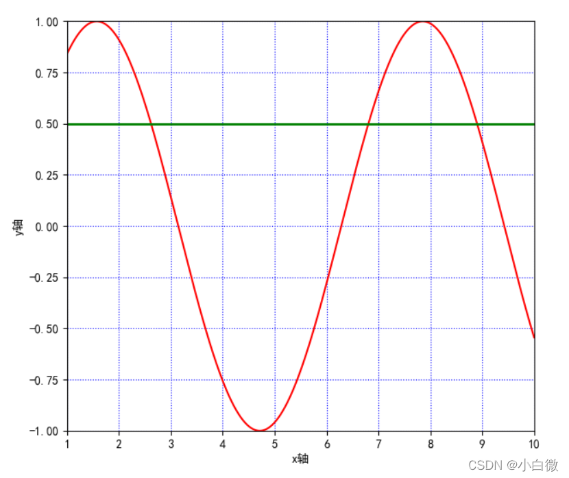
(The green line in the above figure is the reference line added by axjline())
2.6 axvspan(): Draw a reference area perpendicular to the x-axis
- plt.axvspan(xmin=2,
- xmax=5,
- facecolor='r',
- alpha=0.2) # 绘制垂直于x轴的参考区域
That is to get (note: this paragraph is the area)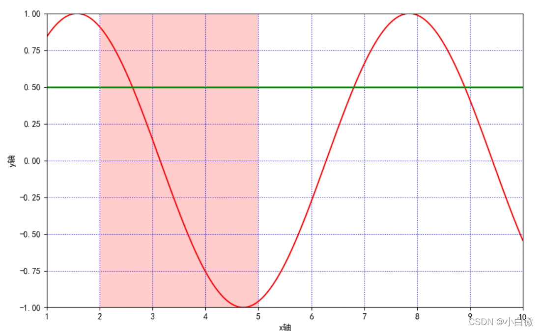
2.7 xticks(),yticks()
Get or set the current x-axis or y-axis scale position and label (that is, set the label of the x or y axis)
It can be understood as setting the same effect as xilim and ylim, but you can specify the range and distance
plt.xticks(list(range(0, 12, 1))) # 调整刻度范围和刻度标签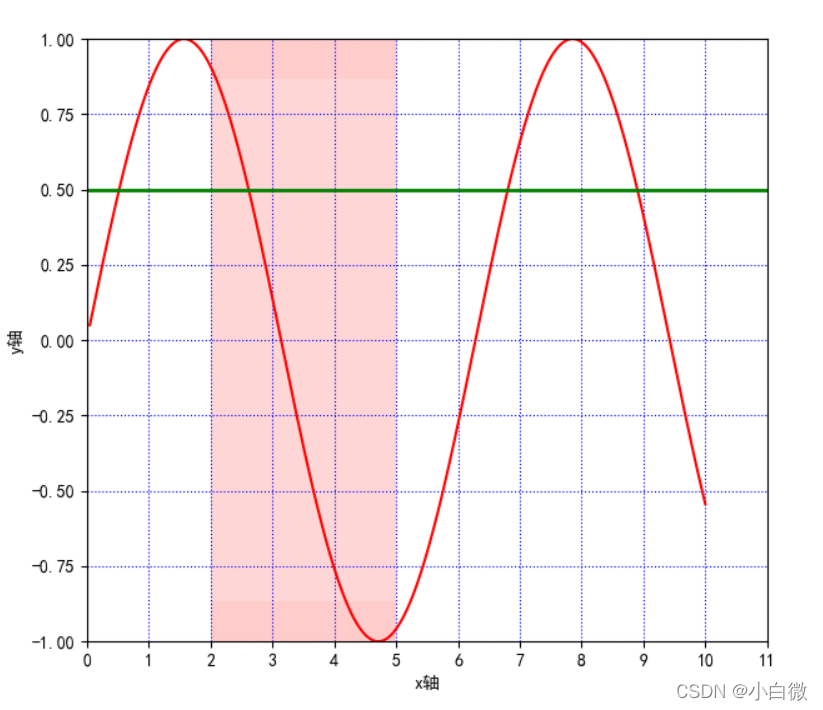
Pay attention to the x-axis, from the original 0~10 to the current 0~11, you can set the step size by setting the third parameter, here it is set to 1
2.8 annotate(): Add point-to-point annotation text for graphic content details
Function method: plt.annotate()
s: Comment text content
xy: the coordinate point to be annotated
- plt.annotate('local',
- xy=(2, 1),
- xytext=(0.5, 0.5),
- weight='bold',
- color='red',
- xycoords="data",
- arrowprops=
- dict(arrowstyle="->", connectionstyle='arc3', color='b'),
- bbox=
- dict(boxstyle="rarrow",
- pad=0.6,
- fc="yellow",
- ec='k',
- lw=1,
- alpha=0.5)
- )
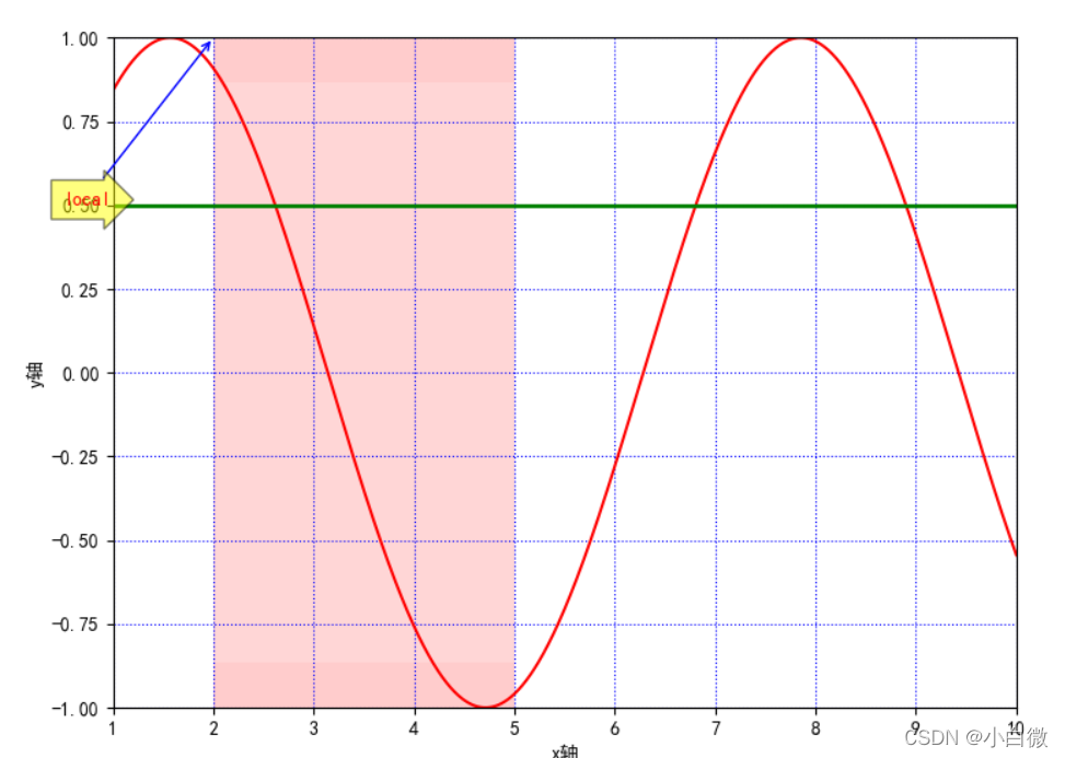
The yellow arrow and the blue slender line here are the parameters added by the parameter method. In the actual use process, it can be used according to your actual needs. It can be considered as adding some explanations to the image.
2.9 bbox: add a frame to the title
(boxstyle: box shape; circle: ellipse; darrow: two-way arrow; larrow: arrow to the left; rarrow: arrow
head to the right; round: rounded rectangle; round4: oval; roundtooth: wavy border 1; sawtooth:
2.10 . text(): A non-pointing comment text (watermark) that adds graphic content details
Function method: plt.text()
- plt.text(1, 1,
- "y=sinx",
- weight='bold',
- color ='b')
Here it is set on the coordinates (1, 1), which is the blue field of y=sinx below the text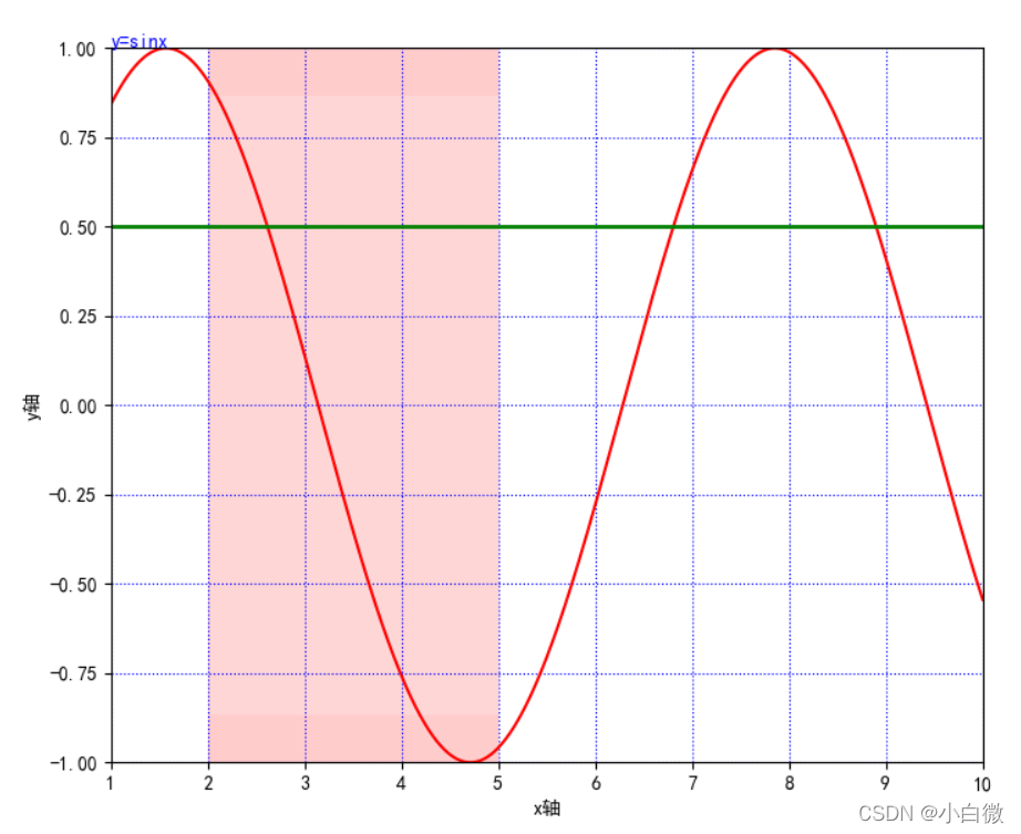
2.11. title(): Add the title of the graphic content
plt.title("正弦函数")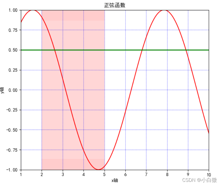
2.12. legend(): Mark the text label legend of different graphics
How to use: plt.legeng()
plt.legend(loc="lower left") # 设置图例位置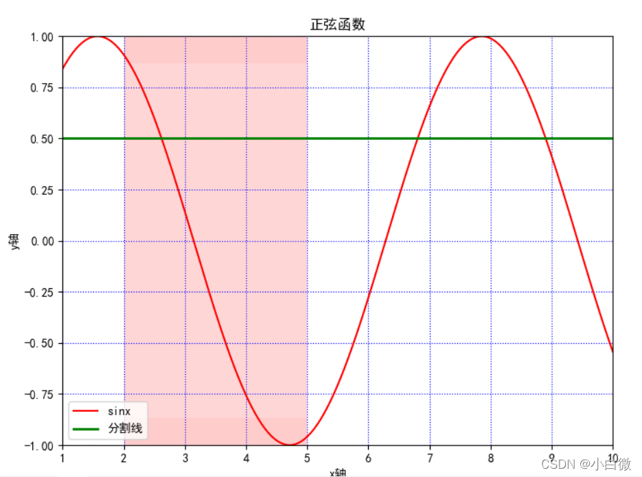
2.13 table(): add a table to the subgraph
3. Complete code display
- import matplotlib.pyplot as plt
- import numpy as np
-
- plt.figure(figsize=(10, 10))
- x = np.linspace(0.05, 10, 1000) # 在0.05到10的区间中,等差选取1000个,端点不属于
- y = np.sin(x)
- plt.rcParams['font.sans-serif'] = ['SimHei']
- plt.rcParams['axes.unicode_minus'] = False
- plt.plot(x, y,
- color='red',
- ls='-',
- label='sinx')
- plt.xlim(1, 10)
- plt.ylim(-1, 1)
- plt.xlabel('x轴')
- plt.ylabel('y轴')
- plt.grid(ls=':',
- color='blue') # 设置网格,颜色为蓝色
- plt.axhline(0.5, color='green', lw=2, label="分割线") # 绘制平行于x轴的水平参考线,绿色,名称
- plt.axvspan(xmin=2,
- xmax=5,
- facecolor='r',
- alpha=0.2) # 绘制垂直于x轴的参考区域
- plt.axhspan(ymin=(-3**0.5)/2,
- ymax=(3**0.5)/2,
- facecolor='w',
- alpha=0.2)
-
- plt.legend(loc="lower left") # 设置图例位置
- plt.annotate('local',
- xy=(2, 1),
- xytext=(0.5, 0.5),
- weight='bold',
- color='red',
- xycoords="data",
- arrowprops=
- dict(arrowstyle="->", connectionstyle='arc3', color='b'),
- bbox=
- dict(boxstyle="rarrow",
- pad=0.6,
- fc="yellow",
- ec='k',
- lw=1,
- alpha=0.5)
- )
- plt.xticks(list(range(0, 12, 1))) # 调整刻度范围和刻度标签
- plt.text(1, 1,
- "y=sinx",
- weight='bold',
- color ='b')
- plt.title("正弦函数")
- plt.show()
This string of codes is used to display Chinese characters
- plt.rcParams['font.sans-serif'] = ['SimHei']
- plt.rcParams['axes.unicode_minus'] = False
No matter what picture is drawn, plt.show() must be used to display the picture at the end, otherwise the output is empty
4. The line style of the line chart
- -:实线样式
- --:短横线样式
- -.:点划线样式
- ::虚线样式
- .:点标记
- O:圆标记
- V:倒三角标记
- ^:正三角标记
- <:左三角标记
- >:右三角表示
- 1:下箭头标记13
- 2:上箭头标记
- 3:左箭头标记
- 4:右箭头标记
- S:正方形标记
- p:五边形标记
- *:星形标记
- H:六边形标记
- +:加号标记
- X:x 标记
- D:菱形标记
- |:竖直线标记
- _:水平线标记
5. Commonly used color abbreviations
- b 蓝色
- g 绿色
- r 红色
- c 青色
- m 品红色·
- y 黄色
- k 黑色
- w 白色
6. Summary
Many parameters are sometimes unusable, but you must know that there are, and it is reasonable to exist. Different parameters have different functions and functions. Do not add too many parameters to any graph. Generally, there are legends, titles, and xy-axis ranges.
No matter which one you use, it is recommended to try it first, practice is the only criterion for testing truth! ! !
I hope readers will forgive me for the bad writing. I am also groping step by step. If you have any questions, please discuss them in the comment area.
Category of website: technical article > Blog
Author:Ineverleft
link:http://www.pythonblackhole.com/blog/article/342/59b087c740f6776a301f/
source:python black hole net
Please indicate the source for any form of reprinting. If any infringement is discovered, it will be held legally responsible.
name:
Comment content: (supports up to 255 characters)
no articles