
Python 之 Matplotlib 柱状图(竖直柱状图和水平柱状图)、直方图和饼状图
posted on 2023-05-21 17:11 read(889) comment(0) like(25) collect(3)
Article directory
- To start, we import matplotlib and numpy libraries.
from matplotlib import pyplot as plt
import numpy as np
- Set the basic configuration, set the Chinese font as bold, excluding the Chinese minus sign, set the resolution to 100, and set the image display size to (5,3).
plt.rcParams['font.sans-serif'] = ['SimHei']
plt.rcParams['axes.unicode_minus'] = False
plt.rcParams['figure.dpi'] = 100
plt.rcParams['figure.figsize'] = (5,3)
1. Histogram
- A histogram is a chart that uses rectangular columns to represent categories of data.
- Histograms can be drawn vertically or horizontally.
- Its height is directly proportional to the value it represents.
- The histogram shows the comparative relationship between different categories, the horizontal axis X of the chart specifies the category being compared, and the vertical axis Y indicates the specific category value

2. Vertical histogram
matplotlib.pyplot.bar(x, height, width: float = 0.8, bottom = None, *, align: str = ‘center’, data = None, **kwargs)
- The specific meanings of its parameters are as follows:
- x represents the x coordinate, and the data type is float type, which is generally a fixed-step list generated by np.arange().
- height indicates the height of the histogram, that is, the y coordinate value, the data type is float type, generally a list, including all the y values for generating the histogram.
- width indicates the width of the histogram, the value is between 0 and 1, and the default value is 0.8.
- bottom indicates the starting position of the histogram, that is, the starting coordinate of the y-axis, and the default value is None.
- align indicates the center position of the histogram, "center", "lege" edge, the default value is 'center'.
- color indicates the color of the histogram, the default is blue.
- alpha means transparency, the value is between 0 and 1, and the default value is 1.
- label represents the label, which needs to be generated by calling plt.legend() after setting.
- edgecolor represents the border color (ec).
- linewidth represents border width, float or array-like, default is None (lw).
- tick_label indicates the tick label of the column, a string or a list of strings, the default value is None.
- linestyle Indicates the line style (ls).
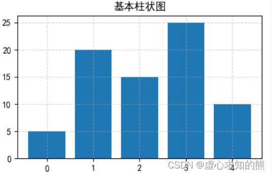
1. Basic histogram
- We can simply draw a histogram for observation, the x-axis data is generated by the range function, and the y-axis data can be set as an array.
import matplotlib.pyplot as plt
x = range(5)
data = [5, 20, 15, 25, 10]
plt.title("基本柱状图")
plt.grid(ls="--", alpha=0.5)
plt.bar(x, data)
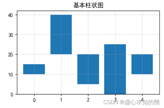
- (1) The bottom parameter.
- The bottom parameter indicates the starting position of the histogram, that is, the starting coordinate of the y-axis, and the default value is None.
- We still use the same data as the above example, but the difference is that we modify the starting point of the y-axis data.
- It should be noted here that the array set by the bottom parameter corresponds to the parameter of the y-axis data one by one, and the shape of the two arrays must be the same.
import matplotlib.pyplot as plt
x = range(5)
data = [5, 20, 15, 25, 10]
plt.title("基本柱状图")
plt.grid(ls="--", alpha=0.5)
plt.bar(x, data, bottom=[10, 20, 5, 0, 10])
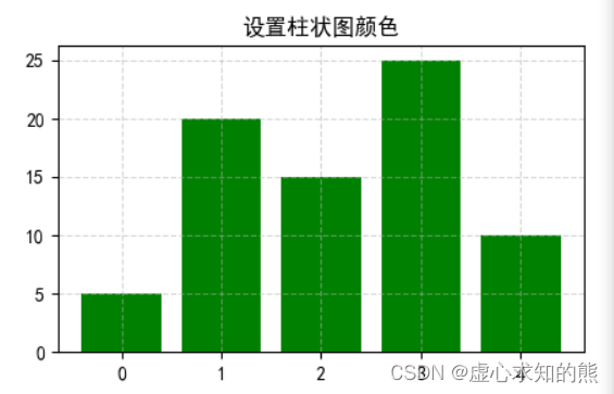
- (2) The color of the histogram.
- Regarding the color of the histogram, we also use the above data to operate. At this time, the bottom parameter of the histogram is not set, and at the same time, the color of the histogram is set to green.
import matplotlib.pyplot as plt
x = range(5)
data = [5, 20, 15, 25, 10]
plt.title("设置柱状图颜色")
plt.grid(ls="--", alpha=0.5)
plt.bar(x, data ,facecolor="green")
#plt.bar(x, data ,color="green")
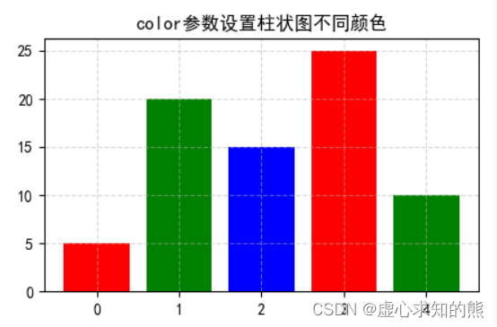
- Then, in some specific cases, the single color of the histogram is not conducive to our subsequent observation. Therefore, we can use the facecolor function to set the color of each histogram separately.
import matplotlib.pyplot as plt
x = range(5)
data = [5, 20, 15, 25, 10]
plt.title("color参数设置柱状图不同颜色")
plt.grid(ls="--", alpha=0.5)
plt.bar(x, data ,color=['r', 'g', 'b'])
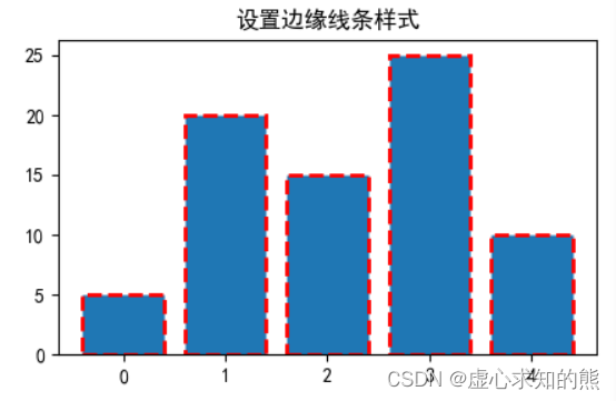
- (3) Histogram stroke.
- The relevant keyword arguments for strokes are:
- edgecolor or ec.
- linestyle or ls.
- linewidth or lw.
- For details, see the following specific examples.
import matplotlib.pyplot as plt
data = [5, 20, 15, 25, 10]
plt.title("设置边缘线条样式")
plt.bar(range(len(data)), data, ec='r', ls='--', lw=2)
2. Multiple histograms at the same position
- Draw multiple histograms at the same x-axis position, mainly by adjusting the width of the histogram and the starting position of the x-axis of each histogram.
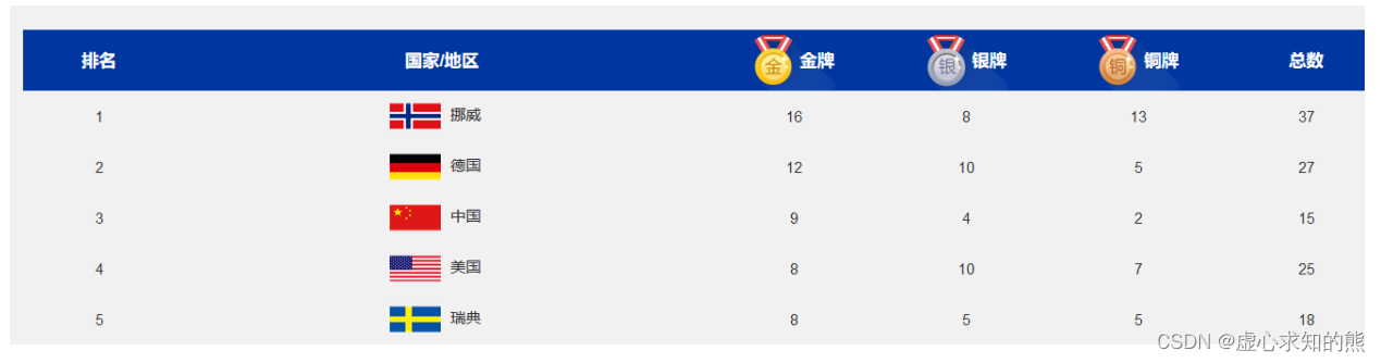
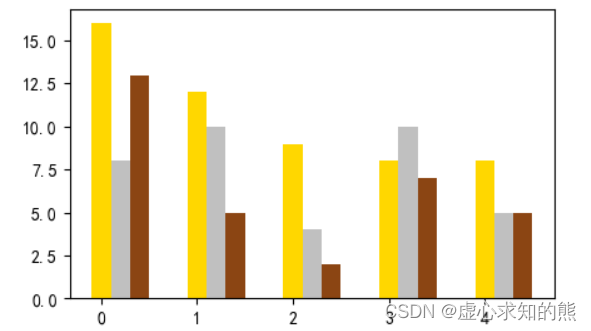
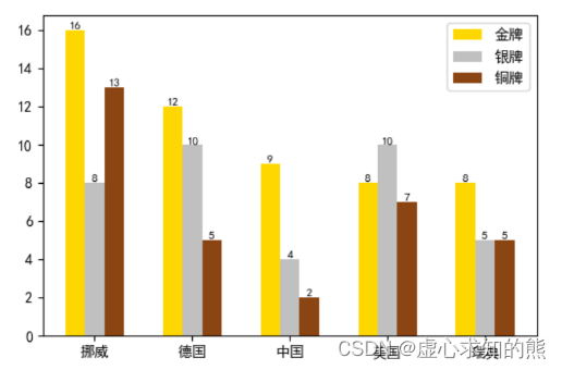
- For example, we have the gold, silver, bronze and total medal counts for Norway, Germany, China, USA, and Sweden in the 2022 Winter Olympics.
- For this, we need to draw the following graph:
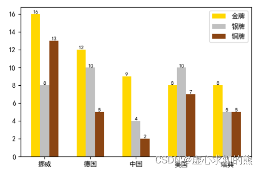
- Analyzing the histogram, we can get:
- (1) This example needs to calculate the x-axis, so the value of the x-axis needs to be rotated.
- (2) Determine the starting position of the x-axis of each histogram in the same x-axis.
- (3) It is necessary to set the width of the graphics.
- (4) The starting position of graphic 2 = the starting position of graphic 1 + the width of the graphic.
- (5) The starting position of graphic 3 = the starting position of graphic 1 + 2 times the width of the graphic.
- (6) The text content needs to be displayed cyclically for each histogram.
- (7) A legend needs to be displayed.
- The specific histogram drawing process is as follows:
- First, we need to import countries and the number of gold, silver and bronze medals for each country.
countries = ['挪威', '德国', '中国', '美国', '瑞典']
gold_medal = [16, 12, 9, 8, 8]
silver_medal = [8, 10, 4, 10, 5]
bronze_medal = [13, 5, 2, 7, 5]
- At this point, if we draw directly, we will find that the medal histograms of each country overlap, and the width of each histogram is too large.
- This is because they all default the starting coordinate of the y-axis, that is, the bottom parameter is 0, and the width parameter is 0.8 by default because it is not set.
plt.bar(countries, gold_medal,color="gold")
plt.bar(countries,silver_medal,color="silver")
plt.bar(countries,bronze_medal,color="red")
- In view of the above-mentioned problems in the drawing process and the sample map of the final result, we need to draw the gold, silver and bronze histograms of each country together, so we need to calculate the coordinates of the country parameters on the x-axis.
- Since strings cannot be directly used for arithmetic operations, we use np.arange to convert them into arrays, and then return the string country, and set the width of the histogram to 0.2
x = np.arange(len(countries))
print(x)
width = 0.2
#[0 1 2 3 4]
- We then determine the starting position of the Gold, Silver and Bronze histograms for each country.
- The starting position of the gold medal is the x value corresponding to each country, the starting position of the silver medal is the corresponding x value of each country plus the width of the gold histogram, the starting position of the bronze medal is similar to the silver medal, plus twice the The position of the gold medal is enough (here we set the width of each histogram to 0.2).
gold_x = x
silver_x = x + width
bronze_x = x + 2 * width
- After the above operation is completed, the graphs can be drawn separately.
plt.bar(gold_x,gold_medal,width=width,color="gold")
plt.bar(silver_x,silver_medal,width=width,color="silver")
plt.bar(bronze_x,bronze_medal,width=width, color="saddlebrown")
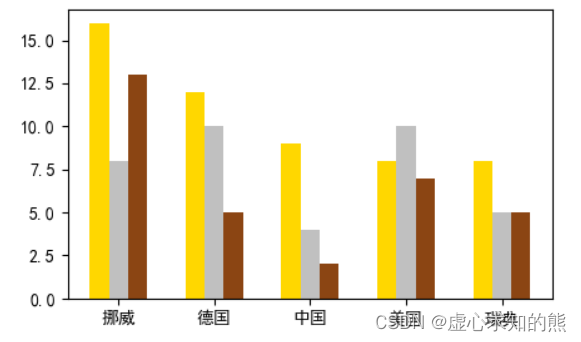
- At this point, we notice that the abscissa of the histogram plotted is the number and has not yet returned our country parameter.
- For this, we need to change the coordinates of the x-axis back.
plt.xticks(x+width, labels=countries)
- Finally, we display the height parameter and legend of each histogram, and we get the image we need.
for i in range(len(countries)):
    plt.text(gold_x[i],gold_medal[i], gold_medal[i],va="bottom",ha="center",fontsize=8)
    plt.text(silver_x[i],silver_medal[i], gold_medal[i],va="bottom",ha="center",fontsize=8)
    plt.text(bronze_x[i],bronze_medal[i], gold_medal[i],va="bottom",ha="center",fontsize=8)
plt.legend()
- Code summary:
#库导入
from matplotlib import pyplot as plt
import numpy as np

#参数设置
plt.rcParams['font.sans-serif'] = ['SimHei']
plt.rcParams['axes.unicode_minus'] = False
plt.rcParams['figure.dpi'] = 100
plt.rcParams['figure.figsize'] = (5,3)

#国家和奖牌数据导入
countries = ['挪威', '德国', '中国', '美国', '瑞典']
gold_medal = [16, 12, 9, 8, 8]
silver_medal = [8, 10, 4, 10, 5]
bronze_medal = [13, 5, 2, 7, 5]

#将横坐标国家转换为数值
x = np.arange(len(countries))
width = 0.2

#计算每一块的起始坐标
gold_x = x
silver_x = x + width
bronze_x = x + 2 * width

#绘图
plt.bar(gold_x,gold_medal,width=width,color="gold",label="金牌")
plt.bar(silver_x,silver_medal,width=width,color="silver",label="银牌")
plt.bar(bronze_x,bronze_medal,width=width, color="saddlebrown",label="铜牌")

#将横坐标数值转换为国家
plt.xticks(x + width,labels=countries)

#显示柱状图的高度文本
for i in range(len(countries)):
    plt.text(gold_x[i],gold_medal[i], gold_medal[i],va="bottom",ha="center",fontsize=8)
    plt.text(silver_x[i],silver_medal[i], gold_medal[i],va="bottom",ha="center",fontsize=8)
    plt.text(bronze_x[i],bronze_medal[i], gold_medal[i],va="bottom",ha="center",fontsize=8)

#显示图例
plt.legend(loc="upper right")

- Other knowledge points: Rotate X-axis tick label text in Matplotlib.
- (1) plt.xticks(rotation= ) 旋转 Xticks 标签文本。
- (2) fig.autofmt_xdate(rotation= ) 旋转 Xticks 标签文本。
- (3) ax.set_xticklabels(xlabels, rotation= ) 旋转 Xticks 标签文本。
- (4) plt.setp(ax.get_xticklabels(), rotation=) 旋转 Xticks 标签文本。
- (5) ax.tick_params(axis=‘x’, labelrotation= ) 旋转 Xticks 标签文本。
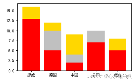
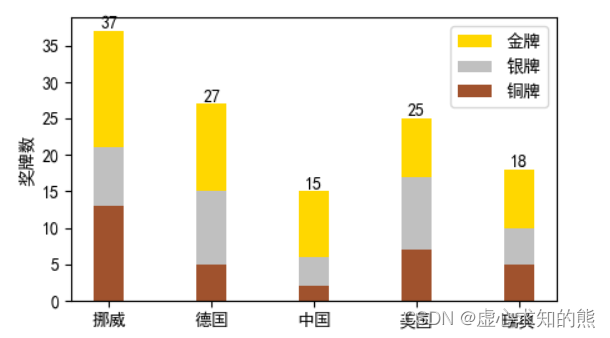
3. 堆叠柱状图
- 所谓堆叠柱状图就是将不同数组别的柱状图堆叠在一起,堆叠后的柱状图高度显示了两者相加的结果值。 如图:
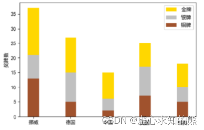
- 对该图进行分析可得:
- (1) 金牌榜的起始高度为:铜牌数据+银牌数据。
- (2) 银牌榜的起始高度为:银牌高度。
- (3) 铜牌榜的起始高度为:0。
- (4) 起始位置的数据相加需要使用 numpy 的相关知识。
- (6) 需要确定柱状图的颜色。
- (7) 显示图例。
- 具体的绘制办法,跟上一个同位置多柱状图是完全类似的,区别在于我们需要注意 bottom 的数值计算,同时,金银铜牌的起始坐标是完全相同的。
#库导入
from matplotlib import pyplot as plt
import numpy as np
#参数设置
plt.rcParams['font.sans-serif'] = ['SimHei']
plt.rcParams['axes.unicode_minus'] = False
plt.rcParams['figure.dpi'] = 100
plt.rcParams['figure.figsize'] = (5,3)
#国家和奖牌数据输入、柱状图宽度设置
countries = ['挪威', '德国', '中国', '美国', '瑞典']
gold_medal = np.array([16, 12, 9, 8, 8])
silver_medal = np.array([8, 10, 4, 10, 5])
bronze_medal = np.array([13, 5, 2, 7, 5])
width = 0.3
#绘图
plt.bar(countries, gold_medal, color='gold', label='金牌',
bottom=silver_medal + bronze_medal,width=width)
plt.bar(countries, silver_medal, color='silver', label='银牌', bottom=bronze_medal,width=width)
plt.bar(countries, bronze_medal, color='#A0522D', label='铜牌',width=width)
#设置y轴标签,图例和文本值
plt.ylabel('奖牌数')
plt.legend(loc='upper right')
for i in range(len(countries)):
max_y = bronze_medal[i]+silver_medal[i]+gold_medal[i]
plt.text(countries[i], max_y, max_y, va="bottom", ha="center")
三、水平柱状图
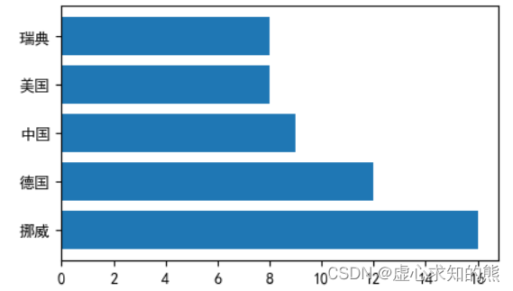
1. 基本的柱状图
- 通过调用 Matplotlib 中的 barh() 函数可以生成水平柱状图。
- barh() 函数的用法与 bar() 函数的用法基本一样,只是在调用 barh() 函数时使用 y 参数传入 y 轴数据,使用 width 参数传入代表条柱宽度的数据。
- ha(horizontal alignment)控制文本的 x 位置参数表示文本边界框的左边,中间或右边。
- va(vertical alignment)控制文本的 y位置参数表示文本边界框的底部,中心或顶部。
plt.barh(y, width, height=0.8, left=None, *, align='center', **kwargs)
- 例如,我们以竖直柱状图当中的国家金牌数为例进行绘制。
countries = ['挪威', '德国', '中国', '美国', '瑞典']
gold_medal = np.array([16, 12, 9, 8, 8])
plt.barh(countries, width=gold_medal)
2. 同位置多柱状图
- 在同一个 y 轴位置绘制多个柱状图,主要是通过调整柱状图的宽度和每个柱状图 y 轴的起始位置。
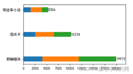
- 例如,我们有最近三天当中 3 部电影的票房变化的数据。
movie = ['新蝙蝠侠', '狙击手', '奇迹笨小孩']
real_day1 = [4053, 2548, 1543]
real_day2 = [7840, 4013, 2421]
real_day3 = [8080, 3673, 1342]
- 对此,我们需要绘制如下图像。
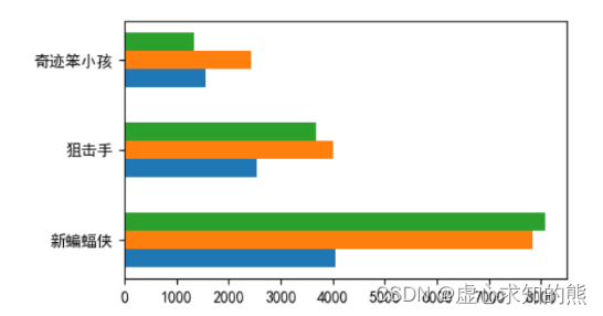
- 对该图进行分析可得:
- (1) 由于牵扯高度的计算,因此先将 y 轴转换为数值型。
- (2) 需要设置同图形的高度。
- (3) 计算每个图形高度的起始位置。
- (4) 绘制图形。
- (5) 替换 y 轴数据。
- 由于牵扯计算,因此将数据转 numpy 数组,水平的用位置多柱状图绘制方法与竖直的完全相同,在此便不过多叙述了。
#库导入
from matplotlib import pyplot as plt
import numpy as np
#参数设置
plt.rcParams['font.sans-serif'] = ['SimHei']
plt.rcParams['axes.unicode_minus'] = False
plt.rcParams['figure.dpi'] = 100
plt.rcParams['figure.figsize'] = (5,3)
#数据的输入
movie = ['新蝙蝠侠', '狙击手', '奇迹笨小孩']
real_day1 = np.array( [4053, 2548, 1543])
real_day2 = np.array([7840, 4013, 2421])
real_day3 = np.array([8080, 3673, 1342])
#y轴转换为数值型
num_y = np.arange(len(movie))
#设置同图形的高度
height = 0.2
#计算每个图形高度的起始位置
movie1_start_y = num_y
movie2_start_y = num_y + height
movie3_start_y = num_y + 2 * height
#绘制图形
plt.barh(movie1_start_y, real_day1, height=height)
plt.barh(movie2_start_y, real_day2, height=height)
plt.barh(movie3_start_y, real_day3, height=height)
# 计算宽度值和y轴值,替换y轴数据
plt.yticks(num_y + height, movie)
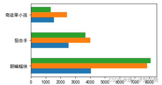
3. 堆叠柱状图
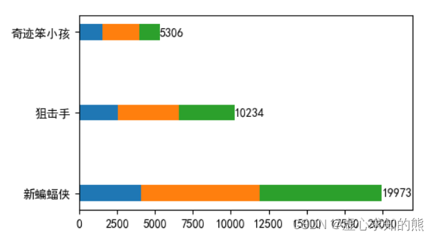
- 水平的堆叠柱状图与竖直的堆叠柱状图类似都是将不同数组别的柱状图堆叠在一起,堆叠后的柱状图高度显示了两者相加的结果值。 如图:
- 对该图进行分析可得:
- (1) 确定图形距离左侧的位置。
- (2) 设置同一宽度。
- (3) 绘制图形设置 left 参数。
- (4) 标注数据。
- 由于过程当中牵扯到计算,因此需要将数据转 numpy 数组。
- 其他部分与绘制竖直堆叠柱状图的过程类似,在此便不过多进行叙述。
#库导入
from matplotlib import pyplot as plt
import numpy as np
#参数设置
plt.rcParams['font.sans-serif'] = ['SimHei']
plt.rcParams['axes.unicode_minus'] = False
plt.rcParams['figure.dpi'] = 100
plt.rcParams['figure.figsize'] = (5,3)
#数据的输入
movie = ['新蝙蝠侠', '狙击手', '奇迹笨小孩']
real_day1 = np.array( [4053, 2548, 1543])
real_day2 = np.array([7840, 4013, 2421])
real_day3 = np.array([8080, 3673, 1342])
#确定距离左侧
left_day2 = real_day1
left_day3 = real_day1 + real_day2
# 设置线条高度
height = 0.2
# 绘制图形:
plt.barh(movie, real_day1, height=height)
plt.barh(movie, real_day2, left=left_day2, height=height)
plt.barh(movie, real_day3, left=left_day3, height=height)
# 设置数值文本,计算宽度值和y轴为值
sum_data = real_day1 + real_day2 +real_day3
for i in range(len(movie)):
plt.text(sum_data[i], movie[i], sum_data[i],va="center" , ha="left")
四、直方图 plt.hist()
- 直方图(Histogram),又称质量分布图,它是一种条形图的一种,由一系列高度不等的纵向线段来表示数据分布的情况。 直方图的横轴表示数据类型,纵轴表示分布情况。
- 柱状图和直方图的区别:
- 直方图用于概率分布,它显示了一组数值序列在给定的数值范围内出现的概率。
- 柱状图则用于展示各个类别的频数。
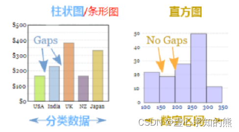
| 柱状图 | 直方图 |
|---|---|
| 柱状图一般用于描述离散型分类数据的对比 | 直方图一般用于描述连续型数据的分布关系 |
| 每根柱子宽度固定,柱子之间会有间距 | 每根柱子宽度可以不一样,且一般没有间距 |
| 横轴变量可以任意排序 | 横轴变量有一定顺序规则 |
- 将统计值的范围分段,即将整个值的范围分成一系列间隔,然后计算每个间隔中有多少值。 直方图也可以被归一化以显示相对频率。 然后,它显示了属于几个类别中的每个类别的占比,其高度总和等于 1。
- 其语法模板如下:
plt.hist(x, bins=None, range=None, density=None, weights=None, cumulative=False, bottom=None, histtype='bar', align='mid', orientation='vertical', rwidth=None, log=False, color=None, label=None, stacked=False, normed=None, *, data=None, **kwargs)
- 其参数具体如下含义:
- x:作直方图所要用的数据,必须是一维数组;多维数组可以先进行扁平化再作图;必选参数。
- bins:直方图的柱数,即要分的组数,默认为 10。
- weights:与 x 形状相同的权重数组;将 x 中的每个元素乘以对应权重值再计数;如果 normed 或 density 取值为 True,则会对权重进行归一化处理。这个参数可用于绘制已合并的数据的直方图。
- density:布尔,可选。如果为 True,返回元组的第一个元素将会将计数标准化以形成一个概率密度,也就是说,直方图下的面积(或积分)总和为 1。这是通过将计数除以数字的数量来实现的观察乘以箱子的宽度而不是除以总数数量的观察。如果叠加也是真实的,那么柱状图被规范化为 1(替代 normed)。
- bottom:数组,标量值或 None;每个柱子底部相对于 y=0 的位置。如果是标量值,则每个柱子相对于 y=0 向上/向下的偏移量相同。如果是数组,则根据数组元素取值移动对应的柱子;即直方图上下便宜距离。
- histtype:{‘bar’, ‘barstacked’, ‘step’, ‘stepfilled’};bar 是传统的条形直方图;barstacked 是堆叠的条形直方图;step 是未填充的条形直方图,只有外边框;stepfilled 是有填充的直方图;当 histtype 取值为 step 或 stepfilled,rwidth 设置失效,即不能指定柱子之间的间隔,默认连接在一起。
- align:{‘left’, ‘mid’, ‘right’};left 是柱子的中心位于 bins 的左边缘;mid 是柱子位于 bins 左右边缘之间;right 是柱子的中心位于 bins 的右边缘。
- color:具体颜色,数组(元素为颜色)或 None。
- label:字符串(序列)或 None;有多个数据集时,用 label 参数做标注区分。
- normed: 是否将得到的直方图向量归一化,即显示占比,默认为 0,不归一化;不推荐使用,建议改用 density 参数。
- edgecolor: 直方图边框颜色。
- alpha: 透明度。
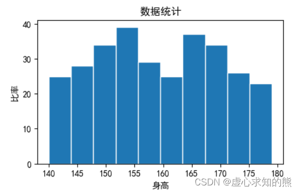
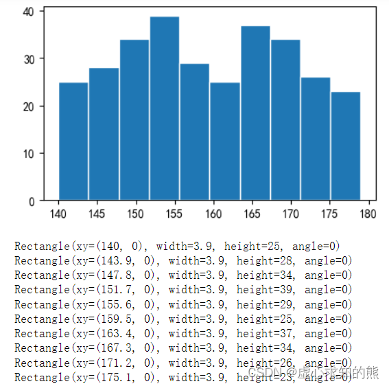
- 例如,我们可以使用 np.random.randint 随机生成 300 个在区间 [140,180](不包含 180)随机数据。
x_value = np.random.randint(140,180,300)
plt.hist(x_value, bins=10, edgecolor='white')
plt.title("数据统计")
plt.xlabel("身高")
plt.ylabel("比率")
1. 返回值
- n:数组或数组列表,返回直方图的值。
- bins:数组,返回各个 bin 的区间范围。
- patches:列表的列表或列表,返回每个 bin 里面包含的数据,是一个 list。
- 以上个例子进行试验,分别对 num,bins 和 patches 的返回值进行观察。
num
#array([25., 28., 34., 39., 29., 25., 37., 34., 26., 23.])

bins_limit
#array([140. , 143.9, 147.8, 151.7, 155.6, 159.5, 163.4, 167.3, 171.2,
#       175.1, 179. ])

for i in patches:
    print(i)
    print(i.get_x())
    print(i.get_y())
    print(i.get_height())
    print(i.get_width())
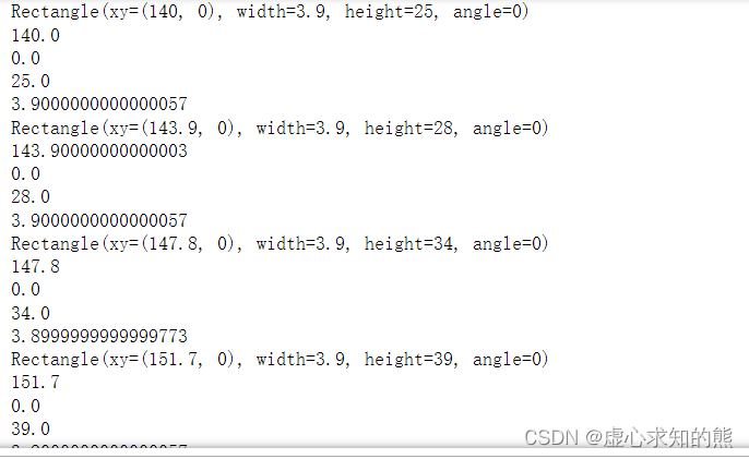
patches[0].get_width()
#3.9000000000000057
- 知识点补充:
- xy:xy 位置(x 取值 bins_limits 是分组时的分隔值,y 取值都是 0 开始)。
- width:宽度为各个 bin 的区间范围(bins_limits 是分组时的分隔值)。
- height:高度也就是密度值(n 是分组区间对应的频率)。
- angle:角度。
- 以最开始的直方图为例,进行上述参数的观察。
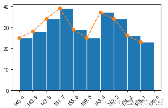
2. 添加折线直方图
- 在直方图中,我们也可以加一个折线图,辅助我们查看数据变化情况。
- 首先通过 pyplot.subplots() 创建 Axes 对象。
- 通过 Axes 对象调用 hist() 方法绘制直方图,返回折线图所需要的下 x,y 数据。
- 然后 Axes 对象调用 plot() 绘制折线图。
- 我们对前面的代码进行修改即可。
#创建一个画布
fig, ax = plt.subplots()
# 绘制直方图
num,bins_limit,patches = ax.hist(x_value, bins=10, edgecolor='white')
# 注意num返回的个数是10,bins_limit返回的个数为11,需要截取
print(bins_limit[:-1])
# 曲线图
ax.plot(bins_limit[:10], num, '--',marker="o")
plt.xticks(bins_limit,rotation=45)
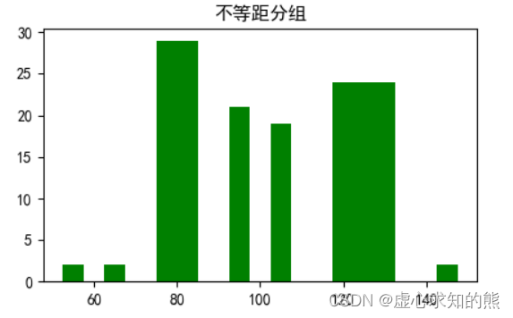
3. 不等距分组
- 面的直方图都是等距的,但有时我们需要得到不等距的直方图,这个时候只需要确定分组上下限,并指定 histtype=“bar” 就可以。
fig, ax = plt.subplots()
x = np.random.normal(100,20,100)
bins = [50, 60, 70, 90, 100,110, 140, 150]
ax.hist(x, bins, color="g",rwidth=0.5)
ax.set_title('不等距分组')
plt.show()
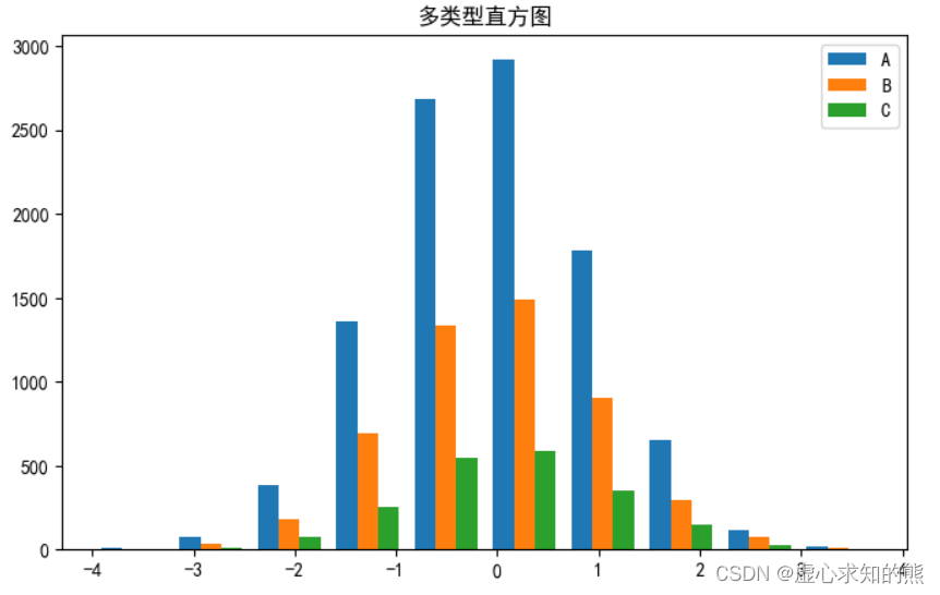
4. 多类型直方图
- 我们在使用直方图查查看数据的频率时,有时候会查看多种类型数据出现的频率。
- 这时候我们可以以列表的形式传入多种数据给 hist() 方法的 x 数据。
- 我们指定 10 个分组个数,每组有 ABC 三类,分别生成 10000,5000,2000 个值,实际绘图代码与单类型直方图差异不大,只是增加了一个图例项,在 ax.hist 函数中先指定图例 label 名称。
n_bins=10
fig,ax=plt.subplots(figsize=(8,5))
x_multi = [np.random.randn(n) for n in [10000, 5000, 2000]]
ax.hist(x_multi, n_bins, histtype='bar',label=list("ABC"))
ax.set_title('多类型直方图')
ax.legend()
5. 堆叠直方图
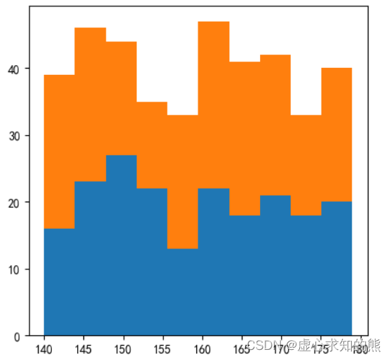
- 我们有时候会对吧同样数据范围情况下,对比两组不同对象群体收集的数据差异。
- 对此,我们准备两组数据:
x_value = np.random.randint(140,180,200)
x2_value = np.random.randint(140,180,200)
- 直方图属性 data:以列表的形式传入两组数据。
- 设置直方图 stacked:为 True,允许数据覆盖。
plt.hist([x_value,x2_value],bins=10, stacked=True)
#([array([16., 23., 27., 22., 13., 22., 18., 21., 18., 20.]),
#  array([39., 46., 44., 35., 33., 47., 41., 42., 33., 40.])],
# array([140. , 143.9, 147.8, 151.7, 155.6, 159.5, 163.4, 167.3, 171.2,
#        175.1, 179. ]),
五、饼状图 pie()
- 饼状图用来显示一个数据系列,具体来说,饼状图显示一个数据系列中各项目的占项目总和的百分比。
- Matplotlib 提供了一个 pie() 函数,该函数可以生成数组中数据的饼状图。您可使用 x/sum(x) 来计算各个扇形区域占饼图总和的百分比。
- pie() 函数的语法模板如下:
pyplot.pie(x, explode=None, labels=None, colors=None, autopct=None)
- pie() 函数的参数说明如下:
- x:数组序列,数组元素对应扇形区域的数量大小。
- labels:列表字符串序列,为每个扇形区域备注一个标签名字。
- colors:为每个扇形区域设置颜色,默认按照颜色周期自动设置。
- autopct:格式化字符串 “fmt%pct”,使用百分比的格式设置每个扇形区的标签,并将其放置在扇形区内。
- pctdistance:设置百分比标签与圆心的距离。
- labeldistance:设置各扇形标签(图例)与圆心的距离。
- explode:指定饼图某些部分的突出显示,即呈现爆炸式。
- shadow:是否添加饼图的阴影效果。
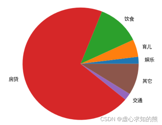
- 例如,我们将大小设置为 (5,5),定义饼的标签,每个标签所占的数量,绘制饼图。
plt.rcParams['figure.figsize'] = (5,5)
labels = ['娱乐','育儿','饮食','房贷','交通','其它']
x = [200,500,1200,7000,200,900]
plt.pie(x,labels=labels)
#[Text(1.09783,0.0690696,'娱乐'),
# Text(1.05632,0.30689,'育儿'),
# Text(0.753002,0.801865,'饮食'),
# Text(-1.06544,-0.273559,'房贷'),
# Text(0.889919,-0.646564,'交通'),
# Text(1.05632,-0.30689,'其它')])
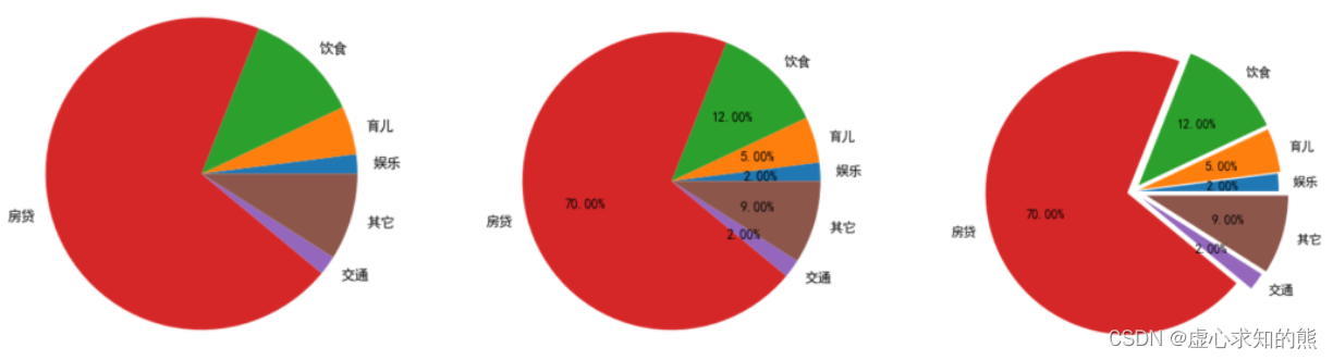
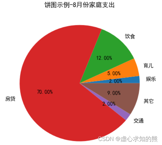
1. 百分比显示 percentage
- autopct:格式化字符串。
- 我们定义饼的标签,每个标签所占的数量,%.2f%% 显示百分比,保留 2 位小数。
labels = ['娱乐','育儿','饮食','房贷','交通','其它']
x = [200,500,1200,7000,200,900]
plt.title("饼图示例-8月份家庭支出")
plt.pie(x,labels=labels,autopct='%.2f%%')
#[Text(1.09783,0.0690696,'娱乐'),
# Text(1.05632,0.30689,'育儿'),
# Text(0.753002,0.801865,'饮食'),
# Text(-1.06544,-0.273559,'房贷'),
# Text(0.889919,-0.646564,'交通'),
# Text(1.05632,-0.30689,'其它')],
# [Text(0.598816,0.0376743,'2.00%'),
# Text(0.576176,0.167395,'5.00%'),
# Text(0.410728,0.437381,'12.00%'),
# Text(-0.58115,-0.149214,'70.00%'),
# Text(0.48541,-0.352671,'2.00%'),
# Text(0.576176,-0.167395,'9.00%')])
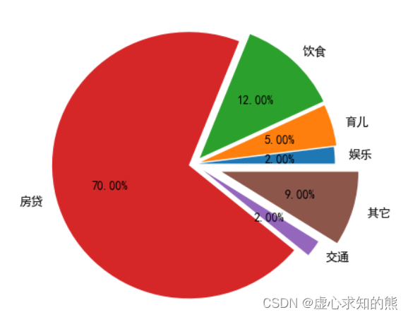
2. 饼状图的分离
- explode:指定饼图某些部分的突出显示。
- 我们定义饼的标签,每个标签所占的数量,%.2f%% 显示百分比,保留 2 位小数。
labels = ['娱乐','育儿','饮食','房贷','交通','其它']
x = [200,500,1200,7000,200,900]
explode = (0.03,0.05,0.06,0.04,0.08,0.21)
plt.pie(x,labels=labels,autopct='%3.2f%%',explode=explode)
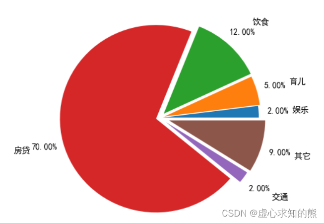
3. 设置饼状图百分比和文本距离中心位置
- pctdistance:设置百分比标签与圆心的距离。
- labeldistance:设置各扇形标签(图例)与圆心的距离。
labels = ['娱乐','育儿','饮食','房贷','交通','其它']
x = [200,500,1200,7000,200,900]
explode = (0.03,0.05,0.06,0.04,0.08,0.1)
plt.pie(x,labels=labels,autopct='%3.2f%%',explode=explode, labeldistance=1.35, pctdistance=1.2)
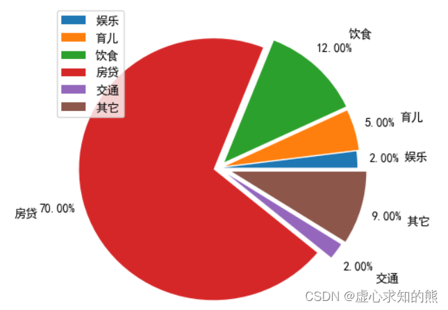
4. 图例
labels = ['娱乐','育儿','饮食','房贷','交通','其它']
x = [200,500,1200,7000,200,900]
explode = (0.03,0.05,0.06,0.04,0.08,0.1)
plt.pie(x,labels=labels,autopct='%3.2f%%',explode=explode, labeldistance=1.35, pctdistance=1.2)
plt.legend()
- You can make the pie chart a perfect circle by setting the scale of x and y to be the same plt.axis('equal').
Category of website: technical article > Blog
Author:Fiee
link:http://www.pythonblackhole.com/blog/article/25328/9fbb1d1c669edf40e0ac/
source:python black hole net
Please indicate the source for any form of reprinting. If any infringement is discovered, it will be held legally responsible.
name:
Comment content: (supports up to 255 characters)
no articles